

 Today we present to our beloved stats addicts a new way to perceive numbers: stats tables! Tabular data is arranged in convenient grids so you can easily compare values along two dimensions: columns and rows. Headings along the top and left edges provide context and orientation. Alternating rows are faintly shaded to improve readability. Surely you have seen these things before.
Three new tables are available today: Months and Years, Average per Day, and Recent Weeks. They were modeled after tables Matt created for displaying top-secret WordPress.com metrics. Each one resembles a calendar in its own way. You probably won’t want to refresh these as often as some other stats pages—only a few of the table cells will be updated—but I won’t try to stop you. I know what it’s like.
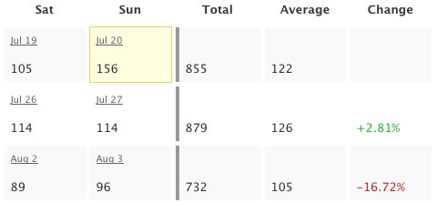 Business folks and aesthetes alike will revel. The math-minded among you can throw away your calculators: the tables already include useful sums and averages, the results of arcane formulas you’d rather forget anyway. And put away your crayons, artistic types: colorful numbers illustrate percent change for recent weeks and a yellow box highlights the greatest value in each table. The other Matt helped with the colors, despite his colorblindness.
I know how some people cling to their calculators and crayons. If you are compelled to verify my computations, please first read the math notes below the tables. They should explain why the numbers don’t always add up. I hope you find the logic logical.
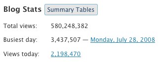 Ah, but how do you get there? The new Summary Tables button reveals tables for the whole blog. Tables for each post are shown on the same page as individual post charts, so just click the little
 ![]() icon to see those. The new tables are available to WordPress.com bloggers as well as bloggers using the WordPress.com Stats plugin (no upgrade required). Please enjoy responsibly.
icon to see those. The new tables are available to WordPress.com bloggers as well as bloggers using the WordPress.com Stats plugin (no upgrade required). Please enjoy responsibly.
Note to 1992: I almost put “Totally” in the title. It was not easy to resist.

Nice! I will try it out. Thanks WP!
Great feature! WordPress is getting better by the day (in fact, every second)
But I had another question – when you show the search engine terms on the ‘blog stats page’, you never mention the search engine along with it too, like google, yahoo, msn. If wordpress would do that, it would be really great as we would know which are the search engines that index and refer ppl to our blog the most.
Regards
Chirag
Totally cool! (Sorry, Andy, I couldn’t resist.)
These Tabular Stats are so totally, like, cool, I’m just beside myself…
Boa. Isto está cada vez melhor.
Thanks for such a nice idea.i am sure to get addicted for this too.
Woah, dude. I’m stoked. Now I can watch the tiny stat beginings of my soon to be dominating blog explode. BTW, I would not have held anything against you for using the word totally in the title. I can see that there perfectly. 🙂
One more spiffy thing to keep me from actually writing anything new…I can continue to get lost in all of the stats from my previous posts! Totally. For sure.
wow, this is a cool one… I love stats. Thanks 🙂
AWESOME! Keep the amazing ideas coming.
Totally awesome!
Wwwwwwwwwoooooooooooooo Like dude, it’s TOTALLY TUBULAR!
I mean knarly tubular.
are those bells I hear…
I like this very much thanks.
feed stats soon?
The scientifically impossible I do right away
The spiritually miraculous takes a bit longer
At last…this statistician who isn’t a geek feels understood.
Love the addition to stats! Thanks!
fabulous! thank you! wouldnt dare say “want more!!” at least not for a couple of months 😛
So much more convenient this way.
Thank you for the upgrade… 🙂
This is wonderful. Thanks!
Hi, my name is anna and I’m a “stataholic”…..thank you!
Note from 1992… Tubular!
Oh, WordPress, Matt 1, Matt 2, and Andy. . . .I bow to you in obeisance ^:)^
awesome…totally
Oh dear… Oh dear…. 😀
Simply awesome. I have been statistics-goer myself, and this is really-really nice. Especially love the “change” % data column. 🙂
Great work! ^^b
I’m so excited about this! I was just writing up a delurking post and contemplating how to figure out my average hits in a day — and now I can throw away the calculator, just as you suggest. 😀
excellent!
I may not be an aesthete, but an ascetic, does that count? I’ll check out the new feature. Thanks for thinking of us.
Awesome! Love the maths!
Cool feature!! Keep it up!
Good work guys! really appreciate these kind of stuff, which makes wordpress.com different then others.
I so totally love stats. Thanks, kids.
Thx I like it
Hey.. That’s a great update,Andy.
Its really nice to get the complete view at a single place & that too in a tabular form..Earlier, I had to go through various stats on each post to approximate the visits but now i have it in a single place along with % increase/decrease.
Thanks a lot
this is awesome…. I am playing around in the stats page a lot more these days….
Wow! This looks very interesting! Thanx!
what a clever boy!
thanx
Is there a SOCD therapist in the WP team? [stats obsessive compulsive disorder] 🙂
must dash got my stats to look at – still trying to fathom what determines a peep/hit
how many seconds does one need to hover over a post with out clicking it but scrolling past it to show up on most popular posts?
can you answer this or is it confidential?!
Brilliant. Thank you very much.
Wordpress is always getting better and better.
Karen.
i like wordpress! you are good people.
Nice! Another addition to my list of ‘why I’m glad to be in WordPress’ 🙂
Yet another reason to not only use WordPress – but to recommend this amazing platform too!
It’s refreshing to see WordPress continuing to develop and improve. By coincidence, I just blogged about WordPress, saying how superb it is!
Jim Connolly
Oooooooh, NICE! Where’s the button that prints it out on a t-shirt though?
Nice indeed. My inner geek is raging with multifarious arithmetic, numerology and cybernetic algorithms. My wife thanks you for the extra hour and a half I will be spending in front of my PC doing “research”.
Peace.
Quality feature! I like it already.
Cool! Now I can finally boast “all 5 of my regular readers” and not just “all 3”. 🙂 Thanks!
Another great innovation from wordpress team. Good job
Brilliant. As a stats addict this is just what I was looking for!
Thank you
Tansy
Awesome well done cool stuff i realy needed this.
Matt, I love you! Muah!
Thank you ! All the team, to improve this handy stats module ! -Finish with excel copy’n paste 🙂
Do you think it could be possible to get : returning visit log and their origin; visit length…
No, this is not a stats wishlist 😀
– Alexis
great!!!
Awesome Updates 😉
Thank you very much from an statics addict.
YEP totally COOL
Magnifico! Numeri, numeri, numeri del mio amato blog. Adesso parto alla conquista della blogosfera.
very great!! this is what i need
Good job!
this is really really really grrreeeaaatttt…..
mantab akhi!
I’ve got only black zeroes but no gray ones – so there must be someone visiting my posts … 😉
Thank you very much.
Very nice! I might just turn the plugin back on at my main, .org blog. Thanks much.
Thanks this is Really nice
I like this upgrade, in particular the Summary Tables button.
Thank you!
Very nice, thanks!
Great idea. Thanks
wowee! thanks guys! =)
thank you for summary
Very Nice , that’s really good job
Thank you WP 😀
I love it. Stats are such a hoot. You write your heart out for one or two kindred souls and get barely a ripple, you dash off a couple lines and it is an all-time high stat producer. And then later that little ripple post keeps going and going – this will help us see some overall trends. Thank you!
Stats are essential! Thank you 🙂
Wow, this was a pleasant little surprise for me when I went to go check my self-hosted blog’s stats. Thanks! 😀
looks great! you are the best!
Good.. thanks,.
Very nice. I have just seen them and found them most interesting. I wish I paid attention yesterday when writing a year-anniversary post to my blog. 😀
This is so cool, I was checking my stats and I found the summary table! And it turned out that it saved my views for everyweek which is so good 😀
keep it up!
Hmmm, I discovered this today while checking out the stats and got a pleasant surprise. Now easier to keep a tab on trends. Thanks for the feature.
Thank you for this!
wonderful.. 🙂
Tremendous, I don’t think you could ever have too much stats information and this greatly reduces my need to use a spreadsheet for certain data.
wowwwww… thank you so much. It’s a wonderful feature, now we have another excuse to see the stats, which I do a lot. haha. 😀
Very useful. Thank you!
good stuff.. very nice
personally i would find percentage changes much more useful for Months & Years….. weeks are too small a period.
Even better than tracking baseballs stats! 🙂
thank’s…..
Now, this is what I have been waiting for!! Love the numbers… love to see how the blog and separate articles compare… Finally, I do not have to use my calculator any more!! Woohoo! 🙂
Love it…love it!!!
I’m a “stat-geek”, and I think it’s a great measuring tool you’ve supplied – great job!
Keep up the great work!
Thank you much for this news! Very nice 🙂
Greets from germany
Thank you!
Fan”Tabulous”
It would be nice if there was a way to ‘export’ the stats table…mebbe as a CSV file. You know, for keepsake!
WoW! WoW and WoW!
thanks for feeding the stats beast!
🙂
I’ve been waiting for this. Great job! Thank you so much!
Excellent!!, Is more than we expect!!
This is such a great Idea! Thanks!
Very cool. I love it! 🙂
thanks for the tabular stats it is really helpful.
Absolutely GREAT.
I’m at perlpoint . wordpress and now I can really see how my website is increasing.
Thanks once again WP!!
it’s great i love it :))
nice,thanks
Cool. This is very, very appealing! Thanks! 😀
Thank’s