

 Today we present to our beloved stats addicts a new way to perceive numbers: stats tables! Tabular data is arranged in convenient grids so you can easily compare values along two dimensions: columns and rows. Headings along the top and left edges provide context and orientation. Alternating rows are faintly shaded to improve readability. Surely you have seen these things before.
Three new tables are available today: Months and Years, Average per Day, and Recent Weeks. They were modeled after tables Matt created for displaying top-secret WordPress.com metrics. Each one resembles a calendar in its own way. You probably won’t want to refresh these as often as some other stats pages—only a few of the table cells will be updated—but I won’t try to stop you. I know what it’s like.
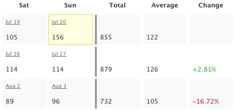 Business folks and aesthetes alike will revel. The math-minded among you can throw away your calculators: the tables already include useful sums and averages, the results of arcane formulas you’d rather forget anyway. And put away your crayons, artistic types: colorful numbers illustrate percent change for recent weeks and a yellow box highlights the greatest value in each table. The other Matt helped with the colors, despite his colorblindness.
I know how some people cling to their calculators and crayons. If you are compelled to verify my computations, please first read the math notes below the tables. They should explain why the numbers don’t always add up. I hope you find the logic logical.
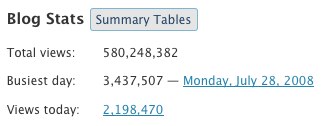 Ah, but how do you get there? The new Summary Tables button reveals tables for the whole blog. Tables for each post are shown on the same page as individual post charts, so just click the little
 ![]() icon to see those. The new tables are available to WordPress.com bloggers as well as bloggers using the WordPress.com Stats plugin (no upgrade required). Please enjoy responsibly.
icon to see those. The new tables are available to WordPress.com bloggers as well as bloggers using the WordPress.com Stats plugin (no upgrade required). Please enjoy responsibly.
Note to 1992: I almost put “Totally” in the title. It was not easy to resist.

VERY MUCH CONFUSING TO READ IT BUT A BIT INFROMATIVE FOR OTHER PEOPLE
I like!!! 😉
Ooh fancy! I’m loving all these numbers 🙂
i love wordpress and really like this new feature, thanks so much 🙂 i need to add that my curiosity will be fully satisfied if i can see my visitor’s country/state of origin! 🙂
These upgrades have been amazing and surprisingly addictive. Keep it up, WordPress guys!
Super !!!
Hey buddy, thanks! Enjoy your weekend!!
Cool.
Andy it is dandy. wonderful.
Incredible, Amazingly WordPress is going peerless. Really love this option, you won my heart. Lovin’it
wow….my god…is very good…
Cool, I really like the new stats tables, thanks guys
And to think that, being as it is the last day of the month, I was about to collect the usual graphic stats and break them down into averages and summations in MS Excel — just to offer growth tables to my http://cidadelouca.wordpress.com editing partners. You’ve just relieved my Sunday of a sizable portion of obsessive handiwork! Thanks, WP!
(Now I have to find *another* sort of obsessive handiwork to apply my Sunday morning to…)
Nice 🙂
Thanks dude.
You guys just blow me away. You are so user oriented!
WORD PRESS . COM – I REALLY LIKE YOUR NEW MORE STAT`S CHART`S – I LIKE KNOWING HOW MANY VIEW`S I GET DAILY ON MY SITE ! THANK`S FOR YOUR GOOD WORK !
Good …
cool and wonderful.
wowawiwa!
Really awesome! Great feature!
-Woton
nice,very nice!
Thanks! This is a nice feature.
Exactly what I was hoping for. Thanks!
Really cool. Thanks!
Gooooooooooo…. WORDPREEESSSSSSSS…..
lol
Thanks – finally, some stats that have meaning!!!
I’m addicted to it!!!! thanks a lot:)
I noticed the new theme!
Thanks again
Peace…peace…peace…peace…
I Love Yu all
thanks a lot
Hey. This is great. WordPress is improving daily. I have a question, can you please make a Status map, showing people from which country’s are they coming from.
Thank’s.
~dark~
I kind of a newby. But The more I learn the more I want to start my own blog!
This is beautiful, i like it. Thanks for your continuous support.