Note: This survey has closed.
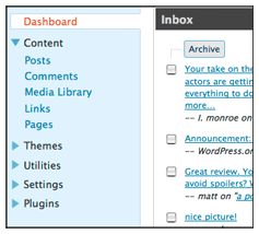
 WordPress 2.7 is currently in development and as some people already know, it features a revised layout with a left-hand navigation column that was designed in response to user feedback regarding the use of screen real estate. Because the navigation came straight from the Crazyhorse prototype that was developed quickly for usability testing, it is still a work in progress.
Navigation sections and labels are being decided now, and as usual there are lots of good ideas floating around. As part of the mission to increase user involvement in design decisions, we’ve created a survey intended to give WordPress users the ability to play a part in deciding how the navigation options should be grouped and labeled. If you use WordPress and want to add your opinion, take the survey.
Update: WordPress 2.7 Navigation Options Survey has closed as of 04:00 UTC on Friday, September 19, 2008.

Coollll, I like the new navigation. It easier than before. Thanks for it and I give the credit also.
How about folding the Ozh Admin Drop Down Menu plugin into core?
very great… bravo!!
I am still new at this and it all sounds greek and latin to me, but since so many people are enthusiastic about it, i guess its a good thing! 🙂
This is a brilliant idea..
Can’t wait for the release!
very excellent… good job…
Clubpenguin Rocks And WordPress Does too!
The Navigation is a lot easier to use now!
lookin’ good!
A professional way to go about it. Shows you guys want to be even more user friendly.
It’s nice !
It is 11pm in Samara (6 pm in London) on the 18th, but the survey is said to be already closed.
Recently I printed a list of my posts (categorized as Angry Political Optimist rants). I heavily use links to refer to reference material and noted how useful it would be to have a print option which would print the post with an end note reference appended in-line with the link, followed by a reference section that explicitly set out the link URLs as endnotes.
Today would be Thursday, the Nineteenth? TIME PARADOX!!!!!
i prefer this 🙂
Survey closed 😦
At 15:46 UTC the survey has closed – early
Good….
you will be the best if you let us use the old dashboard 😀 i still cant navigate myself through the new one! :S . anyway, its cool
Aw I swear I logged in yesterday, again tonight – and missed out – I feel left out of the community. *sniff sniff*
Nice…
coooOoOo000oo0oO0O0o0oO0o0O0ool
I enjoyed…
thanx
Cool is this for wordpress.org or wordpress.com ?
Very good Idea!!!
thanks for all you do
I agree leave it the way it is. No need for change
hank you for Survey
I would prefer Horizontal navigation, it occupy less screen space… anyway what ever u ppl decide will be best for us. 🙂
This looks like one of the nicest additions to WordPress in a while. It seems it will make things a lot more manageable and a lot easier to navigate through. Just as it was intended to be. 😛
Very clean.
Looks quite pretty actually!
I like left navigation, hate top navigation. Looks nice and clean!
nice survey. 2.7 🙂
Cool, new and fresh dashboard 🙂
thanx , Jane
Excellente!!!….Will be looking forward to it………
I swear WordPress gets better by the day: no joke.
Not bad idea..
Thanks, Jane.. 🙂
Cool I wonder what it will be like.
great………………………….??????
Kool!!! Thanks for letting us know
really its cool
You might want to revise the post to indicate the survey is now closed.
Nice and user friendly.
I’m new to wordpress and still surf around its feature hope fit the need of my desire in create a page that can display foreign fonts.
Gr8
good!!verygood!
This is one of the reason why I moved to wordpress 🙂 you guys rocks!
We are a team work
go for left side column navigation menus
Ienjoyed…
thanx
coollllllllllllllllllllllllllll
hmm. cool babe. thx
nice …very nice
likes it!…
oh more layout pls…
WHAT ???!! THAT’S INCREDIBLE INVENTION ON THE WEB. I’M REALLY SURPRISE !!