

Every day, you blog, you create, and you make things with your WordPress.com site. Meanwhile, behind the scenes, the code that runs WordPress.com gets updated dozens of times a day, as we deploy improvements. While you can’t see the vast majority of those changes, there is one improvement we can’t wait for you to see: a brand-new, redesigned WordPress.com dashboard featuring better contrast and the lovely Open Sans typeface.
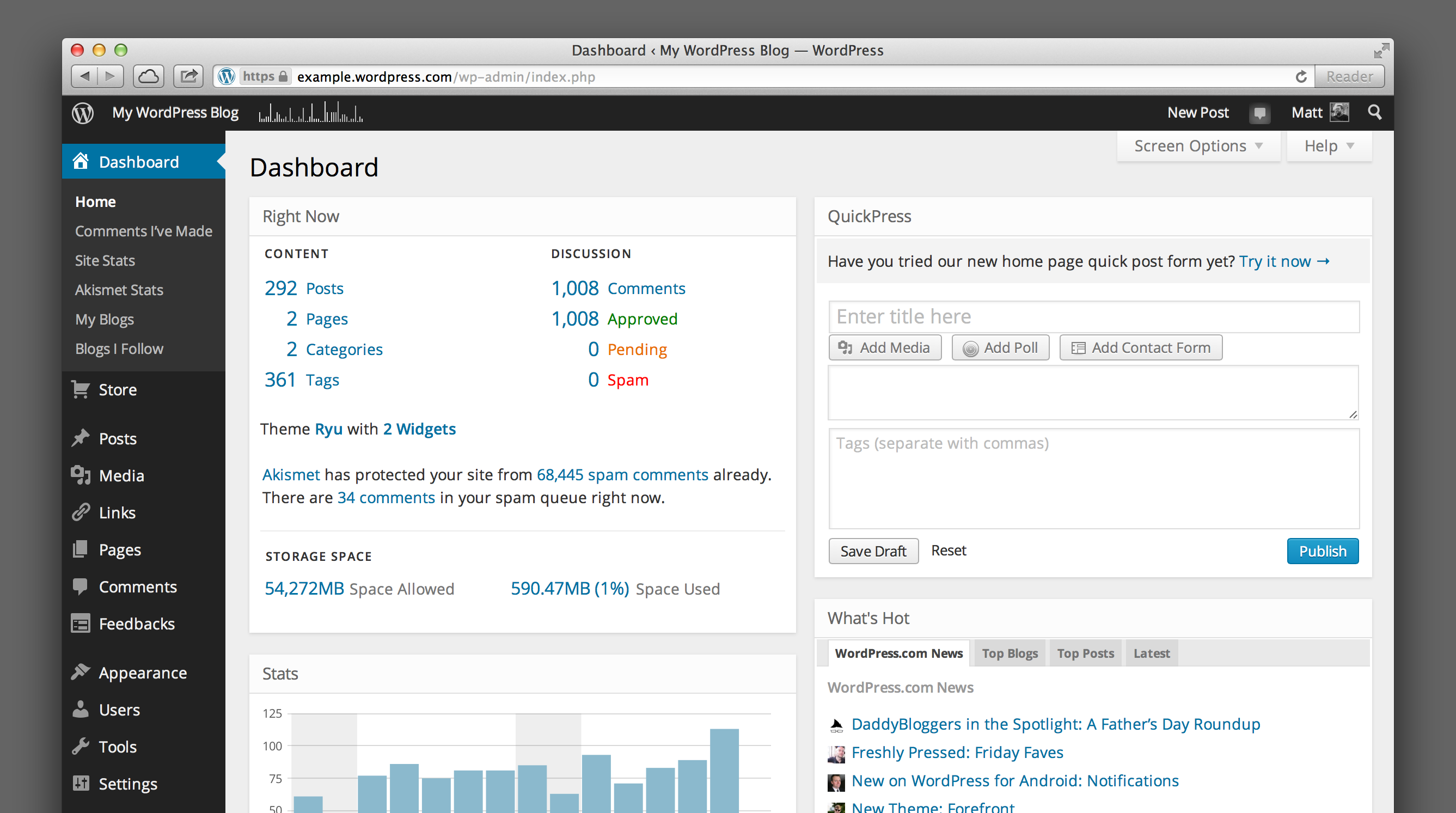
Back in April, I shared our goals for the WordPress.com dashboard redesign:
- It should have a simple, uncluttered design; free of excessive decoration and focused on your content.
- It should use webfonts for modern, legible typography that’s consistent in every browser.
- It should have a responsive design that’s tailored to desktop computers, tablets, and smartphones.
- It should do all this while retaining the familiar, user-tested dashboard interface that millions of users already understand.
We’ve redrawn all the icons, opened up spacing, moved to Open Sans as our default typeface, and increased contrast to make the dashboard as beautiful on the inside as your blog is on the outside:
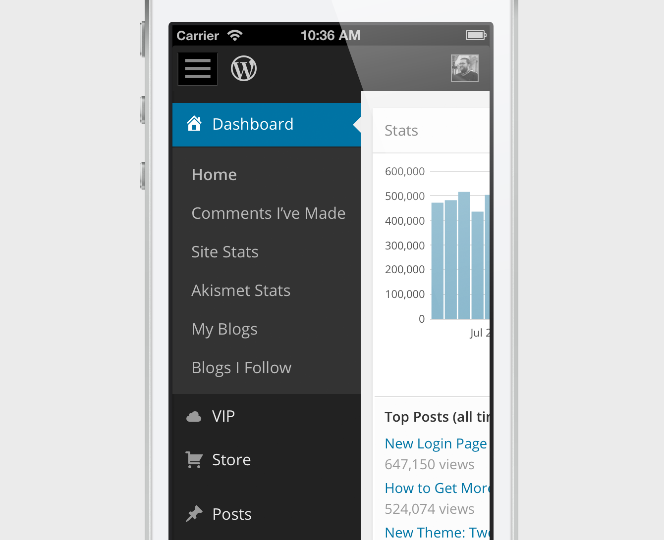
Opt in to responsive goodness
We’re also hard at work on a responsive design, so you can view and work in your WordPress.com dashboard on your smartphone or tablet. It will be available for everyone later this year, but you can preview it today. To enable the responsive dashboard, go to Users → Personal Settings and click the checkbox next to: Enable experimental responsive design (MP6). If you’ve previously opted in to our design preview, you’ll have this enabled by default.
We hope the redesign makes creating things with WordPress even more enjoyable.
Special thanks to the early adopters who took the new dashboard design for a spin and took the time to share their feedback — your thoughts and ideas were a big help as we iterated on the design and fixed bugs.

@Matt Thomas It’s not about “digging it” or not. Not everything Wp does, is perfect and fantastic… I’d like as several back to have the possibility to choose my own colours and fonts… as for Blastedgoat … Just sayin’
We hear you loud and clear. We believe the new design is an improvement for most users, but understand it won’t be for everyone. We’ll take all your feedback into consideration as we continue our work.
Loving the new design it feels fresh but o’ so familiar 😀
Looks slick. Any chance of this getting into self-hosted WP as part of the options?
Definitely; you can try this on a self-hosted blog by installing the MP6 plugin: http://wordpress.org/plugins/mp6/
muy buenoo—!
Love the new design.
Reblogged this on art practices and blogging for the first time.
Clean and tidy and easier to find what you are looking for, when you need it! Just the way any good dashboard should look like and making it easy for the user! Thanks Matt & Team
Reblogged this on Wil Divine of Concessions Int..
Everything is so much more easier to read. I love it. Way to go, wordpress!
Well, I’m a Newbie here on WordPress.com and I have to say, I love what you have done!! It makes things way easier, and more streamlined, and it looks Good! I just set up my New Recovery Blog here a few weeks ago when my eBook launched, my old blog site, which I’ll leave Nameless….lol……didn’t even come CLOSE to all the addictions for Links, Widgets, customizing that you all have here! So I do Appreciate the changes you have Made!! **Author, Catherine Lyon* http://catherinelyonaddictedtodimes.wordpress.com 🙂 🙂
After 24 hours with the newness I have to offer my thanks for increased readability – which hopefully translates into better writability. 🙂
Thank you, thank you. Easier on these old eyes.
How do I access “visual mode” when typing a new post? I can find the tool box that allows me to insert picture, change fonts to bold, underline, spell check, ect..?
Take a look at this information if the visual editor isn’t showing up for you: https://wordpress.com/support/missing-visual-editor/ — and if you continue to have trouble, let us know.
I neither love nor loathe the new design, it seems OK to me and not likely to be so different I get irritated trying to find things. But having read the comments I just don’t really understand why such changes have to imposed unilaterally, without leaving an option for people to keep using the old system if they prefer it. Not just here, but every single blooming thing to do with computers and the internet. I know many people love change, new things, keeping up with the times and all that, and I guess the kind of people involved in the design and innovation area are firmly in that category, but I do wish they could understand and care that probably half of their users are of the opposite type that hate change and prefer things to just stay the same, even if that means missing out on improvements. I think WP are better than most as the functionality has been kept pretty similar. But is there really a good reason not give people the option to keep the old system?
Thanks for the feedback. I can assure you that we definitely understand that change isn’t for everyone. But while it may seem simple to keep the old design around as an option, it’s actually really complex to support and maintain two separate designs. So we have to switch everyone over at once (this is why we’ve offered the new design as an opt-in option for a while; to let folks have a chance to get used to it).
That’s one of the relative advantages of WordPress.com vs hosting your own WordPress blog — on WordPress.com we’ll always keep you up to date, and with a self-hosted WordPress blog you get to decide when your site is updated (but at the expense of having to do the work yourself, of course).
There was no lack of clarity at all in the earlier version. So it must have been created for phones and other tiny screens. Like others above me I would like an option to get the old back. There was absolutely nothing wrong with it.
Really like the new style…it might even make my own blog better now!!
remember old version UI 😀
Legal!
I like the clean look. But I was happy with the old one too. I’m not seeing the difficulty in reading on the gray background that others have mentioned. Good job.
Loving the new look and feel. Simple yet modern!
Nice… cleans things up a bit. I think the contrast was much needed… not everyone embraces change, so I wondering if maybe you’ll have plans down the road for a light/dark option. No need to answer… I can keep posted. I have faith y’all know what yer doing… lol 😉
Love the new look. (I don’t like a lot of blue)
I hate the new design. The reverse type is hard on my eyes, and I find the pink/orange/black color contrast to be bizarre and depressing. Why can we not keep the old, clean easy to read blue and white?
People are always concerned about ergonomic furniture and tools. Were experts in readability and eye strain consulted in the design? Any page that you’re going to work at for lengths of time should be as easy to read as possible. I find it impossible to believe that this is easier on the eyes than the old dashboard.
I logged in this evening expecting to quickly update a draft post and schedule it for next week while I’m away. Needless to say, I was shocked to find everything looked different. I tried to edit my post and could not get changes to take. After a couple of tries I could not get a preview of changes. I can only say that I am discouraged and my last post will just have to stay up for the next week. My blog has posted every Monday morning for over three years. What a disappointment to find so much changed and familiar features hard to find.
I find light text on dark always difficult to read and would prefer an option to change that, please. Thanks!
Very distracting that big print when writing a post. Indeed. Maybe you guys don’t know it, but big print is actually worse to eyes than small print. (Read Dr. Bates book “Better eyesight without glasses” and you learn all about big print versus small print.) The black on the left is also very distracting. I now click it “close”, because it disturbs when writing. I don’t like the new design.
I absolutely love the new design!
Hello,
I notice the changes yesterday and i’m basically an easy-going person so it’s okay. I even like the dark feature a bit. But I must say this changes makes loading time longer for me. I am in a fast net connection and usually opening the wp-admin never took too long.
Secondly when I’m trying to open my Posts directory today, my admin just went into a mess! I try going to another directory and it’s all the same except for Dashboard. Everything looks messy in the way that all .css are failing to load. So all I see is messy text and white background. I can’t update my post moreover publishing it. I usually publish 3 posts a week and this is utterly frustrating. I don’t mind going back to old version or even simple html as long as I can do my usual admin thing. I think have things work is more important than how it looks. Just my opinion.
Please have it fix soon…Keep up all the good work, guys
From your description it sounds like your problem might be related to having Compatibility View enabled in Internet Explorer. If you see a blue broken page icon in your browser’s address bar when you’re in your WordPress dashboard, try clicking it to disable Compatibility View (the icon should turn white when you do). If you need more help finding Compatibility View, look here: http://windows.microsoft.com/en-us/internet-explorer/use-compatibility-view#ie=ie-10. If you continue having trouble, please contact Support or post in our Forums and we’ll take a deeper look.
Nicer, cleaner, clearer contrast. I love it. Thanks!
I like the new theme better too, it’s clearer and much me user friendly thanks.
Love the new design, but have one grouse. I am not able to insert pics when I using the Distraction free writing mode. I could do that earlier.
Any chance you’re using Internet Explorer in Compatibility View mode? We’ll take a look at that issue, in the meantime try disabling Compatibility View mode if you are. http://windows.microsoft.com/en-us/internet-explorer/use-compatibility-view#ie=ie-10
Actually I’m using a Mozilla Firefox browser.
Thanks — we reproduced this bug in Firefox and we’ll have a fix in place just as soon as we can.
Thanks for newer “look & feel”.
Its good see dashboard with new & big font , but when i switch to other pages like “my- state” its still older one.
But its strange that when we click on “site state”(link on left panel of dashboard) and “view all”(button under stats area of dashboard), it gives different look!!!!!!!!!!!!!
I find the new design to be a major step backwards. The blurry box-shadows, large fonts (in general) and lack of contrast (Not text contrast), makes it look less sharp and professional than the old design. I can’t see why you need those huge fonts in the menubar. Approx. 13px should have been enough.
While Open Sans is a beautiful font, I don’t think it is very suitable in an admin gui.
I also would like some contrast betwen the wp-admin-bar and the left sidebar, and a clear visual distinction between the left menu sections.
Also, those flat icons look far to big, and the medium grey colors on icons looks dull. And, since everything else now is pretty flat, why do the buttons still have gradients, borders and shadows?
I must say, after working daily with WP for four years, this is the biggest disappointment so far.
For all it is worth, this has really inspired me to create a rollback-to-old-design-plugin, which I think would become quite popular.
Thanks for your feedback, Andreas. “Flat design” is a nice concept, but we believe users still benefit from buttons that are clearly defined, which is why we retained a gradient there (but no drop shadow). The text in the dashboard has increased from 13px to 14px in some places, and from 12px to 13px in others, mostly because of the difference in the geometry between Open Sans and Helvetica/Arial — Open Sans benefits from the larger size. We hope you’ll start to see the virtues of the new design the more you use it — and, as always, we’ll continue to refine it as we go.
I’m seeing a bit of an alignment problem when in collapsed mode. It looks find until I touch the left side scroll bar on my browser, then the icons are half covered by the scroll bar. Could this be theme related? I didn’t switch to another to further investigate.
Thanks Jim — we’ll take a look and try to reproduce that issue. Just in case you’re using Internet Explorer, you may want to ensure that Compatibility View mode is disabled. For more, see: http://windows.microsoft.com/en-us/internet-explorer/use-compatibility-view#ie=ie-10
I’m using Firefox 20.0 … sorry should have mentioned
Reblogged this on Nikhil Dave and commented:
Hello Everybody Here,.@};- This is Really, a Wonderful Post and The WordPress.com Dashboard Gets a Beautiful Makeover,.@};- I Really, Like This,.@};-
I don’t like it. Too contrasty. The old version was easier on the eyes.
The upgrade is not compatible with my windows 7 using ie 10. The contrast is non-existent and now I can’t edit my pages.
Take a look at these instructions for turning off Compatibility View mode in Internet Explorer — it sounds like you may have it enabled, which can cause some problems with the new dashboard. http://windows.microsoft.com/en-us/internet-explorer/use-compatibility-view#ie=ie-10
Reblogged this on The Daily Random and commented:
It does look better!
Awesome! Thank you 🙂
I am not sure if its the fault of Safari (with some extensions) the “liked” button on top part of the site is not horizontally aligned.
Great work for readability of the dashboard btw!
I’ve deployed a tweak to the toolbar Like button to center it better between Follow and Reblog. Is that what you were referring to, or are you seeing something else?
The extra space is nice, and it looks cleaner but I find the light text on a dark background harder to read. I get a moire pattern effect happening and things start to blur together. Perhaps increasing the kerning a bit would make it easier to read?
On a related note, the combined Activities page under review is really, really bad. If it is imposed across the board it will pretty much destroy the ability to carry on the sorts of long-running dialogs across blogs that many of us use WordPress for. Light type on dark background is just plain a pain on the eyes after a while. We’re not all basement dwellers out here.
I’m having trouble with writing new posts – like when I add a hyperlink the full address of the hyperlink appears within the text I’m typing. It didnt used to do that. It seems like I’m seeing alot more of the internal code when I’m writing a post, as opposed to the old version where it looked more like it was actually going to look when its posted. Am I doing something wrong or is this just the new format?
Dan Joyner
Hey Dan — it sounds like you accidentally switched from the Visual to the Text (or HTML) editor. If you click the “Visual” tab in the upper right corner of the editor, it’ll switch back to the format you’re used to. You can find screenshots and more detailed instructions here: https://wordpress.com/support/visual-editor/
I really HATE the new look. I gave it a few days, and just do not like it one bit. It wasn’t broken, why fix it? grrrrrr
The new design is okay, probably better for some than others. I’m one who prefers a white background and wouldn’t choose a black background ever. It would be nice to have a choice.
Press This puts all selected text in one paragraph and changing the Press This popup window is changed when you change the main window distorting one or the other. Can you fix that and make the windows independent again?
Hi there,
I noticed the Press This widget has some issues with the experimental responsiveness: we’ll fix that as soon as we can.
In the mean time, if you go to Users > Personal Settings and turn off “Enable experimental responsive design (MP6)”, are you still seeing the issue you describe?
Thanks.
Hi there, I am just one of the happy and grateful WP bloggers who applaud this bright and cosy dashboard makeover ; )
Thanks !
I really do like the look of the new dashboard, but understand people concern about the Grey on Black, could it be a tad lighter? Also in widgets the shading defines the widget titles nicely, but nothing else seems to work…I can’t see the widgets I already have or pick up a widget to place it….Is this happening all over or just me?
I don’t know about everyone else, but just a smidge of colour on the dash would be nice, soft tones just to help areas stand out maybe? Or not! lol Thanks for the work though .
Hi there,
Glad you like it!
Adding and removing widgets works fine for me. In Appearance > Widgets, I can both drag and drop new widgets to available widget areas as well as remove them. Is this not working for you? Can you provide a screenshot? Also, which browser are you using? If Internet Explorer, make sure you’re not in Compatibility Mode (broken page icon in the address bar).
Great improvement. Love it! Simple, effective, elegant and clean. Well done team WordPress – 10/10!
Reblogged this on From WP to WP and commented:
Clean and simple icons in the new WordPress Dashboard UI 🙂
It looks much better, less gradients and more flat colors. I think is in a good way but not more simple, this happends when a sistem grows from simple blogging to a full CMS I think.
Clicking on Feedback title opens the Pools page (probably because Pools is the first subtitle instead of Feedback)
Hiya,
That’s the intended behavior, and not related to the new design.
I really like the new font, the black sidebar and the clean look. But as mentioned by Wendy Brydge everything is oversized. I’m very shortsighted, but even for me this is too big 😉 I loved the good overview of the old dashboard – now I just want to have a distance of 3meters between me and my notebook and scrolling seems neverending. This is especially annoying when writing a post, because I only see half of the text field.
Hi Kathrin,
One of the benefits of the new icons is that they’re infinitely scalable, both ways. Which means if you zoom out, everything gets a little bit smaller, showing more content. To zoom out, press CMD – (command minus) on a Mac, or Ctrl – (control minus) on a PC. To zoom in again, it’s CMD + or Ctrl +. CMD 0 or Ctrl 0 resets zoom. Hope that helps!
Thank you for implementing a nice redesign WITHOUT making it disruptive or difficult for us bloggers. I love WordPress.
This is a new design? I thought, that there was some mistake in WP.
so amazing
Reblogged this on Ramanan's Blog and commented:
This new design is elegant and very user friendly. Check this out in wordpress.com
I bless the name of the Lord for the day He led to me to WordPress. You guys are awesome !!!
Hey Matt – thanks for another wonderful update – and of course a big thank you to WP for providing everything! Great job guys.
This new interface doesn’t work for me. The black is so in your face and the grey writing difficult to read. The old interface was streamlined and calm, very relaxing to work with, but this new black wedge down the side is hideous. I guess you’ve redesigned for all those people with back lit HD screens, but on my monitor it doesn’t work well at all. Pity we weren’t given an option to opt out. Let’s just say that your focus group you asked about these changes were probably saying yes to certain changes to please you, but were not designers, and have led you astray.
Absolutely love the new design. When is it coming to the standalone installs?
You can get it today by installing the MP6 plugin! http://wordpress.org/plugins/mp6/
Rad!
That dashboard is beautiful!
I see that you asked back in April for feedback on the new black dashboard design. Sorry that I was dealing with personal issues back then and unable to keep up with proposed changes. I’m not the only one who finds black to be hard on my eyes (hIgh contrast or no) and hard on my soul. I even find it difficult to deal with blogs that have black backgrounds. I feel a depressing weight to them even if they are about fun subjects. Please offer a light background option.
Joen A.
Press This has issues with the responsive option checked or unchecked…it was not on in the user profile.
We’re aware of a few issues with Press This still, thanks, and we’re working on improving that. If you can provide a screenshot of what you see, it would be very helpful, thanks.
really the template is nice and now day i liking wordpress.com very much because it is alway give updated themes… and new thing for user…
Nice!
In the white areas, the lines delineating the input fields are so fine and pale they barely show up, unless the field is selected. It makes it slower and much less intuitive to move from field to field, and when trying to find the little triangle that expands the input boxes, well, it’s guess-the-spot. This on a MacBook Pro screen, at a normal resolution, no matter what the brightness or contrast of the screen. Strange that you have increased the contrast of the sidebar to the extent that it’s harsh on the eye, and increased the font size so much that it eats up screen space – and yet so decreased the contrast in the white area, that its contents are hard to see. Did you have any legibility experts involved in this redesign? It seems more conceptually-driven, without considering usability. Some shades of grey would really help.
Thanks for the feedback. We’re continually working to improve this design, and will take note of your suggestions on contrast in panels.
If you feel the fonts are too big, the new icons can scale to any size, which means you can zoom out in your browser to make the font size smaller. Simply press CMD – (command minus) on a Mac, or CTRL – (control minus) on a PC, and the fonts will become smaller.
Man, this new “makeover” blows. Stop trying to fix things that aren’t broken!
How can I return to the previous look and feel? The new design has overlapping sections on my PC screen. It hides part of my edit window.
It may be better for mobile computing but it certainly isn´t to my liking.
The increased font size, while great for vision impaired, may not be the best for everyone, and does take up more space on some screens. For that reason, we made sure this new design scales well, so you can zoom, and get the size that’s just right for you. To zoom out and make everything a little bit smaller, simply press CMD – (command minus) on a Mac, or CTRL – (control minus) on a PC, and the fonts will become smaller.
Well, I love the new look! I love it way better now than before. Keep on improving! 🙂
I’ve given it some time to get used to it and I still don’t like it. As yet another person who can have physical difficulty visually focusing, the white-on-black and grey-on-black are just not good design at all for people with intermittent or consistent issues similar to mine. I have also found it to sometimes be difficult to collapse or un-collapse the sidebar since the sidebar doesn’t seem to align precisely with the screen as you scroll up or down. While I am not going to stop using WordPress after all these years, the new design certainly makes the site more difficult for me to use.
We’ll keep improving this design, and hope to win you over with some of the benefits this design has allowed us to introduce, such as making it easily zoomable (simply press CMD – (command minus) on a Mac, or CTRL – (control minus) on a PC, and everything will become smaller, or substitue + and it’ll become bigger).
May I ask what browser you’re using? The sidebar should align precisely, and we’d like to fix any bugs if it doesn’t.
I didn’t know it could happen, but I have fallen more in love with using wordpress. THANK YOU!
Don’t like the font, is there any way to change it?
I love the new look keep up the great work. Charlotte V Nash http://www.delessentials.com
Thanks! 🙂
my eyes thank you! Now it is even more pleasant to run my site…Great job
I love the new dashboard design! Will it be pushed out to wordpress.org dashboards as well?
That’s the plan, but you can add it to your own self-hosted WordPress site by installing the MP6 plugin: http://wordpress.org/plugins/mp6/
To make it simple, i don’t like the new dashboard design. I don’t particulary like the new colors and I expecially HATE the new bigger font – not because of the font itself, but because it’s TOO BIG. Why don’t let us customers chose between at least a few color combinations, and let us make the font bigger or smaller? Ah yes, “it’s actually really complex to support and maintain two separate designs”. Meh. Sorry, but i don’t think it would be sooooooo difficult to make such a change, hence making many more people happy.
That said, i still love WordPress. For now. XD
One of the most important aspects of the new design was that we wanted to make it more readable for more people — vision-impaired and not! Which is why, with the new vector icons, you can seamlessly zoom out the dashboard, so everything becomes smaller. To zoom out, press CMD – (command minus) on a Mac, or CTRL – (control minus) on a PC.
@Joen A.
I’m sorry to intervene again since it seems my previous comments bothered Matt and it was not my intention… but I have to say that Visual Impaired (and believe me I know about it) doesn’t need just the possibility to zoom in or out. There are at least 5 charatheristics needed.
One is the contrast has to be 100% and the another is about the use of colours, Negative settings then are not useful since it is easiest to read a black font on a white screen that the opposite.
So please, could you not tell me again that this is for the visual impaired. It’s you choice, I do not agree with it but it’s your choice… but it’s not what a visual impaired person would choose… I’d never chose this.
Thanks
Hi Godot,
We appreciate your feedback. It’s impossible to make a design that makes everyone happy. We do believe this design will benefit the vast majority of users, that’s why we worked on it. We have tested the design with vision impaired, and font sizes and color contrasts are picked according to accessability standards. In most cases the new design has more contrast than it ever did before. We will keep improving as much as we can, and we hope to win you over one day.
I have No problems with the New dashboard look; of course I have No problems with windows 8 either. Maybe you have to be 71 to appreciate them both 🙂
It seems very clean and clear. I can not wait to try this new admin !
Yes ! l like the new dashboard design, many thanks.