

Your website’s dashboard should be as welcoming to you as your website’s home page is to your visitors. One way to do that? Customize your WordPress.com dashboard with color schemes.
Today, you’ve got three new options for adding a little behind-the-scenes zing: introducing Powder Snow, Nightfall, and Sakura, designed especially for you by our Art Director, Eriko Kawakami.
Whether you prefer the gentle monotone of Powder Snow, the darker and soothing colors of Nightfall, or the vibrant, cherry-blossom-inspired Sakura, we hope you’ll find a look you love.
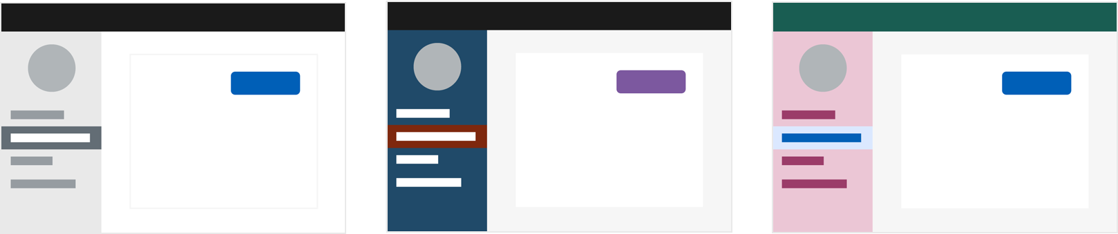
As part of our commitment to inclusive design, the new palettes are optimized for contrast and increased legibility. Whichever color scheme you choose, your dashboard will be stylish and readable.
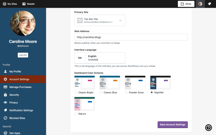
Here’s how to customize your color scheme:
- On your desktop, sign in to the WordPress.com account that you’d like to customize.
- Click your account avatar in the upper right corner.
- Select Account Settings
- Select one of the options under Dashboard Color Scheme
- Click Save Account Settings to apply the change
More color schemes are coming, and we want your feedback! What colors do you want to see in your WordPress.com dashboard?

Thank you for updating. I totally agree color schemes are very important. It gives new life and energy.👍
Getting ready for the Nightfall scheme! 👍
I want a bright color on my Dashboard
Caroline I LOVE this! Thank you for an awesome tip!!!!
I’m very pleased you listened to the comments we made when you released the first two colour schemes. I like neither of those. I’m off to try the other three. 🙂
A lovely selection, thank you for adding these – I’m going with the Nightfall scheme too. 💜
Well that’s some exciting update! The new color schemes would definitely bring new energy and enthusiasm amongst both bloggers and reader’s.
I want a pastel color on my Dashboard. Thank you.
I loved Nightfall!
Could you actually just let us modify the existing colour schemes rather than adding more?
I made a suggesting this year that was took up quickly. But unfortunately, someone switched it back and it really helped me.
My suggestion was that when I was on my dashboard and clicked on the bell icon when new notifications shown was to make the unread a shade darker than what it is. As I say, this was quickly changed accordingly when I suggested and now been taken back. I love these colour options and out of them one I would use as well as classic, but it still needs to be a shade darker for the unread, to make it easy for me to tell the difference.
OM gosh, I love the deep blue. It makes my dash pop and so much nicer to work with. Thanks!
I love all the colors 🙂 ❤
I can not find the new color schemes in the desktop app.
You’ll find the new color schemes on the web-based dashboard in your browser, not in the WordPress app. Hope this clarifies!
Nice 😃
It seems like whoever is coming up with those color pairings is either color blind, or has absolutely no idea which colors go together (and which ones clash). Or both. Sticking to the lesser of those evils.
We welcome feedback on what colors you’d like to see on your Dashboard. Hopefully you’ll find a palette that appeals to you in a future update!
Thank you, Caroline for being so gracious.
How about the colors that we had before these crazy changes? I’d be fine with that.
Maybe blue and turquoise? Green and purple? Green and brown?
I think that color combination is one thing, but color intensity is another. Some of these combinations are better in a lighter shade.
Do you know if this can be done on a phone through chrome?
Sure! Click on the user settings in your toolbar, then click the back arrow, go to Account Settings, and you’ll find the color schemes if you scroll down a bit.
Count me in the blues and greys camp.
Deep teal, silvergray, black and Chinese temple red.
Gold, new-leaf green, deep indigo, and May sky/robin’s-egg blue.
Nice schemes, especially Nightfall and Sakura. They really brighten things up! Thank you!
Very useful for the creating visually appealing colors for the eyes to behold. Thanks for sharing.
I love features like this. Thank you!
Ooh! Gorgeous picks. Thanks!
How disappointing to see this new color scheme available ONLY in the left-hand column, and ONLY with the “updated” interface. I am an older blogger who has never found WP particularly user-friendly, even with the newer “improvements,” and I simply continue to do what I’ve learned to make work for me over ten+ years. I was momentarily excited to find a promised improvement, but like most WP “impvovements,” it was less than impressive.
Thank you!!
Wow! This is exciting. I am excited to try my new dashboard .
Thanks for the post about these. I’m finding Power Snow to be less perceptually demanding than the two “Classic” themes — which helps.
Powder Snow looks cool. 🙂
The cover photo is so pretty!
I loved Nightfall!! 🙂 Waiting for rest, to experiment..
Thank you for beautiful colors
Freedom to choose the Dashboard colors individually is something WordPress should’ve done ages ago.
I never thought that pink and turquoise would go well together. I still don’t.
Thank you! 🙂
Thanks for the update! While all three color combos are really nice, my favorite is Sakura! The pairing of pink and blue is really cute! Cannot wait for the arrival of the other selections!
now my account looks better!
Nice one.
Well, you learn something new every day 😀
Thank you for the update.
Our mood is dark and dull, so let’s paint everything dark and dull. Let even the highlights be greyish and broken. Really, folks?
Go, get some inspiration! There are different seasons of the year, different demographics, different cultures, and different personalities!
And test-screen the palettes before you release them! We are really in need for some Happiness Engineers, here.
Some great themes!
Thanks for this post! will certainly use the tips for my blog!
Thanks
Love Sakura!
I love the picture of the rainbow arches. Rainbow color scheme would be amazing!
The rainbow color is beautiful!
All colors are beautiful
Can we use it for free accounts?… thanks
This is great, can’t wait to customize mine..
The new colour scheme is really nice. Thank you so much making all the new inventions giving us better and wider choices ❤