Aquene theme
-
hi there,
I am using the Aquene theme and would like some help with CSS:
1. Is there a way that I can have some text on my front page, and the tag “read more” it looks bare with only the title on the front page
2. Is there a way that I can have my instagram fee across the bottom of the page, the footer. at the moment it sits on one widget and I would like to have this across the footer.
3. the full width option does not work as shown in the demo, please can you help with that.
4. Is there a way that I can have images spread wider than the text, so the image is aligned with the full width but the text stay the same width as they are now?
thanks
AnnalisaThe blog I need help with is: (visible only to logged in users)
-
Hi Annalisa,
1. Is there a way that I can have some text on my front page, and the tag “read more” it looks bare with only the title on the front page
We could use CSS to add a bit of text somewhere on the home page, but what is available to us is for adding just a little bit of text, and we cannot add linked text such as a Read More. What you might want to consider is adding a text widget to the sidebar and put your text into that. I know that would narrow the content area, but it would be the best way if you need additional information on that page.
2. Is there a way that I can have my instagram fee across the bottom of the page, the footer. at the moment it sits on one widget and I would like to have this across the footer.
This will widen the instagram widget to full width.
#wpcom_instagram_widget-3 {
	width: 100% !important;
}
If the images are too large for you, I would suggest going to “8” images in the widget and then go to Customize > CSS, delete all the informational text in that window, and paste in the following custom CSS, which will take the images to two rows of four.
.wpcom-instagram-images img {
	width: 23%;
}
The images do get pretty tiny on a phone-sized screen at 4 across though.
3. the full width option does not work as shown in the demo, please can you help with that.
I’m seeing your site main page looking substantially similar to the demo main page. I don’t see any other static pages, but when I compare one of your posts to a post on the demo site, again I’m seeing them substantially similar. Can you be a bit more specific and perhaps give me a link to where it differs from the demo site?
4. Is there a way that I can have images spread wider than the text, so the image is aligned with the full width but the text stay the same width as they are now?
Can you give me a link to where you want this to occur?
-
hi Sacred Path,
thanks for coming back to me on this.
1. if we cannot add read more, that is fine but I would rather some text lines on the post on the front page. is that possible without a side bar?
2. Thank you for the css for the instagram. You are right the images are too big, I tried it to the other way but the width does not extend so it looks a little disjointed. Is there a fix for this to make it 2 layers with eight images spread across the entire footer?
3. here is the aquene demo page; http://demo.themesharbor.com/aquene/
the posts take up all the space on the page, the width but mine doesn’t is what I mean. Is there a work around?4. here is an example of what I mean;
http://www.atelierdore.com/photos/summer-breeze-2/thanks so much I appreciate your help
-
Hi there Annalisa,
1. if we cannot add read more, that is fine but I would rather some text lines on the post on the front page. is that possible without a side bar?
Yep, we can help you add text without adding a sidebar. Could you share some more details on your vision for this? It would help us to know where exactly you would want the text to appear. Feel free to make a screenshot and upload that to your media library if you like.
Is there a fix for this to make it 2 layers with eight images spread across the entire footer?
After you set your widget to show 8 images, add this to your existing CSS:
/* Remove padding from Instagram widget */

#colophon .widget-area .widget_wpcom_instagram_widget {
    padding: 0;
}
/* Remove margin from Instagram images and set width */

#wpcom_instagram_widget-3 img {
    margin: 0;
    width: 25%;
}
/* Move widget title to the right (where it was before) */

#wpcom_instagram_widget-3 .widget-title {
    padding-left: 30px;
}
here is the aquene demo page. the posts take up all the space on the page, the width but mine doesn’t is what I mean. Is there a work around?
Here is a screenshot of the demo and your home page in the same browser at the same size:
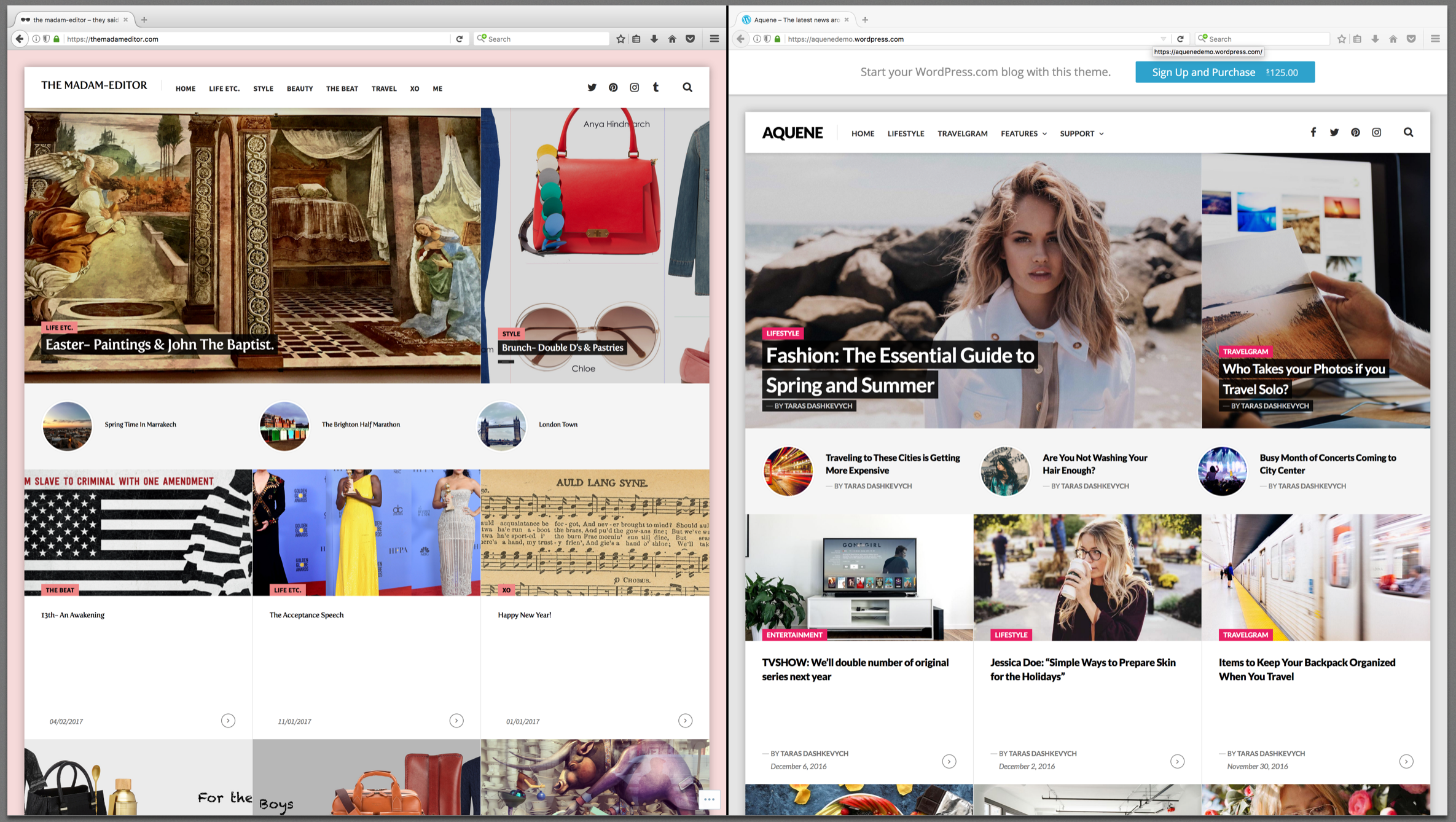
I see space to the left and right of the demo site’s posts as well as your own. Let me know if I’m misunderstanding the area that you’re referring to.
4. here is an example of what I mean;
http://www.atelierdore.com/photos/summer-breeze-2/I’ll check with @thesacredpath to see if if this can be done.
-
4. here is an example of what I mean; http://www.atelierdore.com/photos/summer-breeze-2/
Ok, I have something for you on this. I should mention up front that this will require you to use the HTML tab in the editor each time you want to make a narrow section, but once you do it a few times, it should get more comfortable.
The first step is to widen the content area a bit so you have room for larger images.
To do that, add this to your CSS:
/* Widen content area */
.single .site-main .hentry .hentry-wrapper,
.page .site-main .hentry .hentry-wrapper {
    max-width: 1024px;
    padding: 45px 0;
}
Then add this to give the page titles some breathing room like they had originally:
/* Add padding back to page titles */
.single .site-main .hentry .entry-header,
.page .site-main .hentry .entry-header {
    padding: 60px 45px 48px 45px;
}
The next thing to do is set the Media Width to 1024. You’ll find the media width box just under the large CSS box that you’ve been pasting into. Setting the media width to 1024 allows your images to grow up to that size in pixels.
Next, we need something to tell your site to show certain content as more narrow and centered on the page. Paste the following CSS in, but note that it won’t do anything just yet:
/* Makes selected content narrow and centered */
.wp-narrow-row {
    max-width: 600px;
    margin: 35px auto 0 auto;
}
That last bit of CSS defines a class called wp-narrow-row. The class name can really be anything, but that is what I chose for this example. The important thing is that you will need to apply that class to an HTML div, and then add your text inside of that div. It would look something like this:
<div class="wp-narrow-row">
    YOUR TEXT GOES HERE
</div>
To enter the div, you’ll want to use the HTML tab in the editor, as I mentioned earlier. When you add a div with the wp-narrow-row class, the CSS will automatically make everything inside that div fit inside of a 600px width. You can of course change the width to your liking.
Here’s a more involved example that you can copy/paste into a post or page on your site to see how it will look:
<h1>This Is The First Heading</h1>
<p>This is a paragraph that is not inside of a narrow div. It is able to span the entire width of the content area because it is not inside of a narrow div.</p>
<img src="https://s0.wp.com/wp-content/themes/pub/twentyseventeen/assets/images/header.jpg?m=1732887868i">

<div class="wp-narrow-row">
    <h2>This Is The Second Heading</h2>
    <p>This content lives inside of a narrow div, so it doesn't span the width of the page like the paragraph above did.</p>
</div>

<img src="https://s0.wp.com/wp-content/themes/pub/twentyseventeen/assets/images/header.jpg?m=1732887868i">

<div class="wp-narrow-row">
    <h3>This Is The Third Heading</h3>
    <p>You can still put images inside of a narrow row, and they will shrink to fit.</p>
    <img src="https://s0.wp.com/wp-content/themes/pub/twentyseventeen/assets/images/header.jpg?m=1732887868i">
</div>
Let me know if you run into any issues.
-
sincere apologies on the delay I have been away travelling.
thanks so much for the tips I will give this a whirl and come back to you.
thank you
Annalisa
-
hello again
thank for this I truly appreciate it.
4. I have tried the html but it does not seem to minimise the text content it only wraps it the same width as the image. I am not sure if i am doing it right to be honest but I have made an example with this post https://themadameditor.com/2017/03/19/spring-time-in-marrakech/
1. Apologies if I am not explaining myself clearly, but all I would like is for there to be text after the title on the posts on the homepage, simply because it looks a little bare with just the post title. so something like this http://galmeetsglam.com
basically the post title and a few line of text.thanks so much
annalisa -
Hi again,
It looks like you still need to add the CSS into your site from My Site > Appearance > CSS.
The first three blocks of code from my last reply are the CSS that you’ll need to copy/paste.
Once you do that, you should notice a change with your example post.
You can also try a draft post using the example HTML (the final block of code) to see a few different ways of using this in your posts/pages.
-
hi dcoleonline,
Thanks for the code. I actually like the current look with the image and text all aligned so i think I will stick with the way you have helped me get it looking. thank you so much
the one last thing I need is to figure out adding a but more text to the posts on the homepage… if you have any ideas I would greatly appreciate it.
thanks so much
annalisa -
Hi Annalisa,
So this theme only shows the category, post title, author, and date for each post on the front page.
Although we could add some text using CSS, I wouldn’t recommend it, because you would need to add to the CSS for every post. Over time, that would make your CSS file lengthy, difficult to navigate, and potentially cause your site to load more slowly.
Your content should live in the post editor itself, rather than in the CSS area. Keeping it in the editor allows search engines to see it.
If you need to have more text on the posts, it would be better to switch over to a different theme that has this feature built-in.
- The topic ‘Aquene theme’ is closed to new replies.
 WordPress.com Forums