Baskerville 2 – Menu in the phone looks strange
-
I think the baskerville 2 theme is the best for me , but I have only one issue, the header menu looks strange when I see in my phone. The principal pages looks nice, but when I put a secondary page (that depends on the previous page because it is a related subject) it goes to left, when it was supposed to be in the center. If the secondary page (named “mahouka”) were right below the principal one (“projetos”), it will be nice. I want to tell the author, but I don’t know his email. Please look at my blog and zoom in to see the problem. But when I zoom out it looks nice.
novelstarsblog.wordpress.com
P.S.: It is a brazilian blog.The blog I need help with is: (visible only to logged in users)
-
Hi there,
It sounds like you don’t prefer how the site handles sub-menu items in the mobile view:
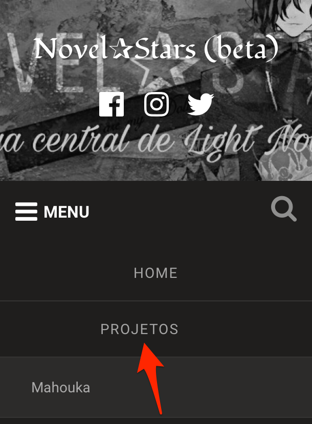
The theme is designed this way to show a difference between main menu items and sub-menu items.
Changing this would require Custom CSS which becomes available when upgrading the site to WordPress.com Business or Premium.
If you decide to upgrade and would like help with the change, just make a post in the CSS Customization forum, and we can assist you there.
- The topic ‘Baskerville 2 – Menu in the phone looks strange’ is closed to new replies.
 WordPress.com Forums