Big Brother theme. Can't use CSS and make screen fit on iPhone
-
Hi
I’ve applied some CSS to this site and previewed the changes before paying for the CSS to be applied permanently. This is the result on an iPhone.

I’ve changed margin-left and other margin values to put things where I want them but, as you can see, it looks awful on a phone. All the text is sent to the left of the screen instead of being resized. This is meant to be a responsive theme.
How do I fix this please?
The blog I need help with is jpremovals.wordpress.com.
The blog I need help with is: (visible only to logged in users)
-
-
Yes but I clearly said I haven’t applied the CSS fully yet. Click on my link to see the preview. Clearly my margin-left values etc are messing up how the site looks on a smaller screen.
-
Could you please tell which margin-left that you are cleared? .hentry?
I think it’s easier if you apply your css first, then we can inspect and try to fix it. -
This is the code…
body{font-family:arial;font-size:17px;width:100%}
#masthead{background-color:#524fa2}
#page{background-color:#00ac5c}
.site-header{height:250px}
.menu-jp-removals-container{background-color:#524fa2;margin-top:-5px}
.entry-header h1{margin:0 -200px 30px}
.content-area{width:auto}
.entry-content{margin:0 -200px 30px}
.custom-background
.site-footer{background-color:#524fa2;border:none;height:25px;margin-bottom:-6px}
.site-info{font-size:5px;line-height:.5px;margin-left:500px}
.site-logo{margin-top:-33px}
.site-title{margin-top:4px;font-family:arial;text-transform:capitalize}
.site-description{font-family:arial;font-size:17px;font-style:normal}
.alignright{border-width:5px;border-style:solid;border-color:#00ac5c;border-radius:20px}
.site-info:before{content:”OFFICE CLEARANCE | OFFICE MOVES | HOUSE CLEARANCE | MAN AND VAN SERVICE | PACKING | STORAGE | DELIVERIES | WASTE / REMOVAL”;display:block;margin-bottom:10px;color:#00ac5c;font-weight:700;font-size:15px;min-width:1100px;margin-left:-455px;margin-top:-5px}
-
Hi there,
Please try to use this code. I just modified your code and I hope it will helps you.
body{font-family:arial;font-size:17px;width:100%}

#masthead{background-color:#524fa2}

#page{background-color:#00ac5c}

.site-header{ height:250px;}
@media screen and (max-width: 640px){
  .site-header{ height: auto;}
}

.menu-jp-removals-container{background-color:#524fa2;margin-top:-5px}

.entry-header h1{/* margin:0 -200px 30px */}

.content-area{width:auto}

.entry-content{/* margin:0 -200px 30px */}

.custom-background .site-footer{background-color:#524fa2;border:none;/*height:25px;*/margin-bottom:-6px}

.site-info{font-size:5px;line-height:1.5;/* margin-left:500px */max-width: 100%;float: none;text-align: center;}

.site-logo{margin-top:-33px}

.site-title{margin-top:4px;font-family:arial;text-transform:capitalize}

.site-description{font-family:arial;font-size:17px;font-style:normal}

.alignright{border-width:5px;border-style:solid;border-color:#00ac5c;border-radius:20px}

.site-info:before{content:"OFFICE CLEARANCE | OFFICE MOVES | HOUSE CLEARANCE | MAN AND VAN SERVICE | PACKING | STORAGE | DELIVERIES | WASTE / REMOVAL";display:block;margin-bottom:10px;color:#00ac5c;font-weight:700;font-size:15px;/* min-width:1100px; *//* margin-left:-455px; *//* margin-top:-5px */}
Let me know if you need another helps.
-
Wow. That works beautifully.
I have two questions. How did you make it work? I can see a media query inclusion but I don’t understand how that works.
And secondly, why isn’t the footer text showing anymore?Thanks.
-
I need to add media query to adjust the css for particular screen (in this case is mobile screen). That code works for Header section. I will show you the difference;
Here is the Header preview without media query https://cloudup.com/cHzgh3CSrr9
Here is the Header preview with media query
https://cloudup.com/cTWmWh8pirsSorry, I don’t really understand which is the footer text? WordPress credit text or this text “OFFICE CLEARANCE | OFFICE MOVES | HOUSE CLEARANCE | MAN AND VAN SERVICE | PACKING | STORAGE | DELIVERIES | WASTE / REMOVAL”?
-
Thank you.
i will return home tonight to my laptop to apply the changes you suggested.
The footer text is: “OFFICE CLEARANCE…” etc. that isn’t showing up with your changes. What do I do with this?
Thanks again.
-
Hmm.. it’s weird. The footer text is showed in my preview
http://www.awesomescreenshot.com/image/156204/11dce321535a51e5f39bf048aa764f82
http://www.awesomescreenshot.com/image/156257/23db59d6ef857c00b90c76af1bd42353Please try to add that changes then we can fix if there any css bugs are showing up.
-
This is working beautifully. Thank you so much.
Just one more question please. I want the main text under HOME to be positioned further left so there are smaller white margins down the left and right side of the screen. What CSS do I use to do that whilst allowing it to show properly on a mobile device?
Thank you.
-
You want bigger space on it? like this preview http://www.awesomescreenshot.com/image/178963/e829308fe69a3e30f9154b89cfe35d93
If I’m wrong could you give me explanation through the image?Thanks.
-
I want to reduce that space so the text is closer to the left and right of the screen of the screen instead of too central down the middle.
-
-
Works brilliantly. Thanks so much.
Can you recommend a good learning resource so I can learn media queries?
-
Yeay! Glad that works!
So many resource on the internet about media query. Here are some resource from good sites on the internet https://www.ugurus.com/responsive-design-media-queries.
If you enjoy learning with video you can learn from Treehouse -
Thanks for this.
Just one last question (I promise)…
All the CSS I’ve written works across the entire site. Is there a way to apply CSS on just one particular page, or perhaps even one specific paragraph? In other words, is internal and inline CSS possible on WordPress.com?
-
Use web inspector or Firebug (for firefox) to select which part do you want to change. Then find the body class via web inspector as the root selector (every page template has different body class. eg: home page, blog, single page). If you want to change the paragraph in home page so the selector should be
.home .entry-content p {
...
}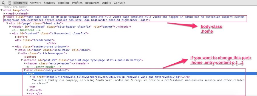
In other words, is internal and inline CSS possible on WordPress.com?
Yes it’s possible. You can add your css in “Text” mode https://en.support.wordpress.com/editors/
-
Hi, in addition to the body CSS classes that @ mentions, there are also page specific classes that would look something like page-id-179 or in the case of a single post page, post-id-117, so you can get very specific with CSS.
-
Hello
I’m so sorry for dragging this up again but I’m really stuck.
The site is nearly finished (see http://www.jpremovals.wordpress.com) but there is a big problem with every page apart from the home page. All the pages have an annoying side menu sticking into my custom menu from the left under the purple bit. I’ve tried using the following to remove it but it doesn’t work…
.breadcrumbs {
display:none;
}Any ideas?
Thanks
- The topic ‘Big Brother theme. Can't use CSS and make screen fit on iPhone’ is closed to new replies.
 WordPress.com Forums