Big Brother Theme CSS to reduce header size and maintain copy position
-
I’m trying to reduce my header size so that the copy shows up on a standard smallish screen. When tech support gave me the code, it tweaked my header copy and wasn’t good. I need a work around to decrease the header height and maintain the position of the copy with respect to the header.
Copied below is my CSS so far, I’ve been dabbling, looking for the solution and may have ended up putting in some contradictory code…thanks in advance for some guidance!
#branding {
margin-top: 5px;
}/*navigation pages*/
.nav_wrapper {
position: relative;
height: 36px;
padding-top: 125px;
z-index: 6;
}#catnav li a {
display: block;
float: left;
padding: 10px 10px 0;
width: 114px;
border: none;
text-decoration: none;
line-height: 17px;
outline: none;
min-height: 30px;
}#top #catnav ul {
display: none;
position: absolute;
top: 20px;
width: 172px;
left: -2px;
}.site-logo {
height: 200px;
width: 350px;
}.site-branding {
padding-top: 5px;
padding-bottom: 5px;
}.site-description {
color: #000080;
font-size: 1.5rem;
}body.home h1.entry-title {
border: none;
padding-bottom: 0;
margin-bottom: 0;
}body.home .entry-header {
margin-bottom: 5px;
}The blog I need help with is: (visible only to logged in users)
-
Hi, when I narrow down my browser window, and also when I view your site on my iPhone 5s, this is what I see: https://cldup.com/U5hqZi0907.png
Is this not what you are seeing, or have you gotten this resolved? I’ve scrolled down and clicked around on your site and all content is readable and not cut off in anyway. If I have missed something, or misunderstood, please let me know.
-
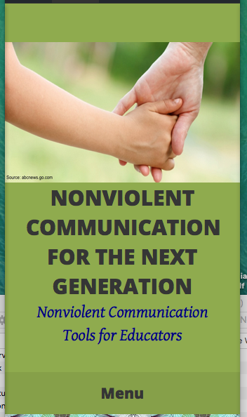
Hi, You’ve misunderstood me. I’m trying to get the bar of solid green in the header (with the site title, logo and description) to take up less of the splash page space, so that a sentence or 2 of the first paragraph’s copy comes on screen without scrolling, whether on a tablet/device or computer. Is this possible? Thanks
-
Given what is in your header (logo, title and tagline/description there is a limit on how much we can reduce the area unless we were to make the text for the title and description smaller, or reduce the size of your logo image, which in reality would not gain much. Add the following to the bottom of your existing CSS and see what you think.
.site-branding { margin-top: 0; margin-bottom: 0; padding-bottom: 0; } -
Hi,
I tried that and you were right, it didn’t seem to make much difference. It seems like the header copy needs to be smaller, but I don’t know now based on what you said.I wonder why it is so difficult for this template to allow some copy to show on the landing page (in addition to the header, tabs and tags). Do you think there is a more appropriate template to meet this need? Thank you for your help. Stephanie
-
I have some ideas, but are you planning on using a sidebar? Right now your content is off to the left because you aren’t using a sidebar. If you aren’t going to use the sidebar, we can center your content area and then that would give me an easier time with the ideas I have.
-
Hi, We are not planning on using a sidebar.
Would you share with me how to center the content, and decrease the header size after that?
Will this be reversible if it’s not what my clients want?
Thank you
-
Thanks for the clarification, and yes this is reversible. Add the following at the bottom of your custom CSS below your existing CSS. If you don’t like it, just delete it.
/*Center content and rework header*/ @media screen and (min-width: 768px) { .primary { float: none; margin-left: auto; margin-right: auto; padding-left: 0; } .site-logo { float: left; } .site-branding { height: 150px; max-width: 60%; margin-left: auto; margin-right: auto; } .site-title, .site-description { margin-left: 300px; text-align: left; } } @media screen and (max-width: 1380px) and (min-width: 767px) { .site-branding { max-width: 70%; } } -
Thanks for that code!
Though I like the look of the centered copy much better, but it still is not allowing the copy to show up on the splash page screen without scrolling. Is there a way to get this effect? I’m starting to wonder if there is not, or I just don’t know how to express what I’m looking for.
Thanks again,
Stephanie -
You know what, once I pressed “save” and then looked at my site’s splash page and other pages, it is actually now showing about 2 lines of copy. If that is all I can expect from that template, it’s better than none.
But I really don’t like the super large H2: “Nonviolent Communication for Educators”, is there a way to reduce the size of this?
Thanks so much
-
We can make some further adjustments. Currently the image you are using as your logo is a bit distorted. Find .site-logo in your custom CSS and change the height from 150px to auto.
Next, in the code I gave you above, in the .site-branding section change the height from 150px to 130px.
Then add this at the bottom after the code I had given you.
.site-branding {
    margin-top: 20px;
    margin-bottom: 25px;
}
You can make the post titles smaller with the following CSS. Originally it was 2em. Just adjust as desired.
h1.entry-title {
    font-size: 1.5em;
}
We could also gain some by making the entry meta (date, categories, etc.) under the title smaller (it’s 14px right now).
.entry-meta {
    font-family: "Open Sans",Helvetica,Arial,sans-serif;
    font-size: 12px;
}
See what you think with these changes. As you found, save the changes and then view your actual site to get a real feel for the changes.
-
Oh yes, now we’re talking! This is what I was needing, thanks so much for facilitating it. If my clients don’t like how narrow the green header bar is, I’ll ask you how to widen it. Thanks again.
-
- The topic ‘Big Brother Theme CSS to reduce header size and maintain copy position’ is closed to new replies.
 WordPress.com Forums