Can you help me with the twenty fourteen theme?
-
Hi there, I already have some questions submitted in another thread but as I continue to work setting up my new theme, twenty fourteen I have a few more questions:
1- I figured out how to get my grid/slider to show, does it only work if I have a featured image chosen? Is there a way to make the whole picture show because the pictures I chose as the featured image are cut off (for example some don’t show my added overlay text). Also, if I choose a tag that is in pretty much all my posts, will it just show the newest 6 posts with that tag? And does it update with every new post I do, i.e will it put the newest post in that slider and bump out the oldest of the 6?
2- Can my left sidebar widgets be above the ad or is the ad fixed at the top of the left sidebar? Are there only 2 ad positions in this theme? And if so, is there another theme that has more ad positions?
3- Is there a way to change the color of the box that the top menu items and also writing in grid/slider are in?
4- What is CSS to change the color of post titles and the date, comments, etc underneath titles? I thought I added it but only the titles are my blue color once you click to that recipe, they are still black on my front page. I added some CSS I found in the forums so if there is a way you can see if some of it is not doing anything because I did it wrong let me know.
5- Is there a way to make boxes of recipe results when you click a category instead of just the posts one after another, I had the CSS for this with my last theme.
6- Why doesn’t the text font I picked show the same when I open my site on my browser? It shows in my customize preview.
7- Can I change the size of my menu titles? Again, I thought I put the right CSS in there but it doesn’t seem to work.
8- I need help with the CSS to hide my title. I don’t want to simply delete it because then it won’t show up in the WordPress reader. I had the CSS code to do this with my last theme.
9- When I add my grid/slider, my logo up top seems to distract from the neatness of it. Is there a way to put my logo to the left of my menu bar perhaps, but still keep it on the larger side? I would also like my tagline to be along the top or right below the menu on one line instead of how it is now in a paragraph of small font on the top of the left sidebar.
10- Is the “About me” widget the one that would add a small pic of me with a simple paragraph? I tried it but it didn’t show up, then I saw something about needing an about me page, which I thought I had on my site. It is in the menu.
11- Is there a way to get my custom background image to show more? Like perhaps changing the size of the content/sidebar areas?
Thank you in advance!
The blog I need help with is: (visible only to logged in users)
-
Oh and one more:
12- How do I get my menu/submenu titles, widget titles, etc. to not be all caps?
Thanks!
-
Ok, one more and then I’m quitting for the night. Can I have the Widget titles in all areas, be an orange box with white writing? The color code for the orange on my site is E47526.
Logging off now!
-
Hi there,
Please see answers to all of your questions below. Just a note, I’ve provided quite a bit of CSS in this response. For CSS codes that address the same element, it’s best to combine them. So, for example, if two different codes address div.entry-meta, you can combine the attributes into one grouping.
I figured out how to get my grid/slider to show, does it only work if I have a featured image chosen?
Are you referring to the image shown above the post here?
If so, yes, you will need to enable a featured image for that to work.
Is there a way to make the whole picture show because the pictures I chose as the featured image are cut off (for example some don’t show my added overlay text).
The image in that post example above is displaying just as it is uploaded in your Media Library. You have a similar image that has a text overlay. In your post slider here:
The image overlays are appearing correctly. Is this working on your side as well?
Also, if I choose a tag that is in pretty much all my posts, will it just show the newest 6 posts with that tag?
Yep! It will display your latest six posts tagged with the tag you choose.
And does it update with every new post I do, i.e will it put the newest post in that slider and bump out the oldest of the 6?
Yes – provided you mark your newest post with the appropriate tag.
Can my left sidebar widgets be above the ad or is the ad fixed at the top of the left sidebar?
The ad is fixed in that position.
Are there only 2 ad positions in this theme? And if so, is there another theme that has more ad positions?
For the TwentyFourteen theme, the ad units are on the left sidebar and underneath the post. So, yes, this theme is limited to two ad positions. We do have some themes that support three ad positions (the additional unit would be a header above the site) among our WordAds themes here:
http://theme.wordpress.com/themes/features/wordads/
However, even though a theme may support three ad units, the ads may not necessarily fill each time. Currently, we do not have our themes broken down into how many ad units they support.
Is there a way to change the color of the box that the top menu items and also writing in grid/slider are in?
I believe this is the CSS you’re looking for for the menu items:
div.header-main {
	background-color: #E47526;
}
I’m not sure what you mean by “also writing in grid/slider are in”
What is CSS to change the color of post titles and the date, comments, etc underneath titles?
h1.entry-title a {
        color: ###;
}

div.entry-meta {
	color: ###;
}

span.cat-links a {
	color: ###;
}
Is there a way to make boxes of recipe results when you click a category instead of just the posts one after another, I had the CSS for this with my last theme.
I’m sorry – I don’t think I understand your question. Can you explain a bit more about what you mean by “boxes”?
Why doesn’t the text font I picked show the same when I open my site on my browser? It shows in my customize preview.
Currently, your two fonts set (Tekton Pro and Puritan) are displaying correctly on my side. Are you still having trouble with this?
Can I change the size of my menu titles? Again, I thought I put the right CSS in there but it doesn’t seem to work.
This is the CSS you want:
.nav-menu {
	font-size: 24px;
}
I need help with the CSS to hide my title. I don’t want to simply delete it because then it won’t show up in the WordPress reader. I had the CSS code to do this with my last theme.
This should do the trick:
h1.site-title a {
	display: none;
}
When I add my grid/slider, my logo up top seems to distract from the neatness of it. Is there a way to put my logo to the left of my menu bar perhaps, but still keep it on the larger side?
AFAIK, the only way to do this would be to upload a header image where your site logo is pushed over to the left rather than centered in the middle of the theme.
I would also like my tagline to be along the top or right below the menu on one line instead of how it is now in a paragraph of small font on the top of the left sidebar.
This is a question best served up to the CSS gurus in the forum thread here:
https://en.forums.wordpress.com/topic/converting-css-from-an-old-theme-to-a-new-one?replies=9
I don’t believe this is possible, but they may have a workaround.
Is the “About me” widget the one that would add a small pic of me with a simple paragraph?
That widget does display your About.me profile as explained here:
http://en.support.wordpress.com/widgets/about-me/
If you don’t have an About.me profile, you may want to use the Gravatar widget instead as explained here:

Is there a way to get my custom background image to show more? Like perhaps changing the size of the content/sidebar areas?
I believe that changing the width of the content/sidebar areas is going to skew how your content appears on mobile devices. I see you have a forum thread open in CSS customizations here:
https://en.forums.wordpress.com/topic/converting-css-from-an-old-theme-to-a-new-one?replies=9
They may have a better suggestion for you. Currently, I don’t think it would be prudent to shrink the content width.
How do I get my menu/submenu titles, widget titles, etc. to not be all caps?
This should cover all of it:
.content-sidebar .widget .widget-title {
 text-transform: none;
}

.widget .widget-title {
	text-transform: none;
}

.nav-menu a {
	text-transform: none;
}

div.entry-meta {
	text-transform: none;
}

span.cat-links a {
	text-transform: none;
}

#page div.sharedaddy h3.sd-title {
	text-transform: none;
}
Can I have the Widget titles in all areas, be an orange box with white writing? The color code for the orange on my site is E47526.
This should do the trick:
.widget .widget-title { background-color: #E47526; color: #fff; } .content-sidebar.widget-area .widget .widget-title { color: #fff; } -
Hi there, thanks so much for getting back to me! I tried all these CSS codes and here are a few follow ups:
– Can we move the widget titles over just a tad so they don’t start right at the beginning of the blue box?
– The CSS for post titles and categories worked, but the info under didn’t change (date, etc.). Also can we change the color of those tag labels at the bottom of the post? I have the following CSS that I was trying to use before to change all this, do I still need it?
.content-sidebar .widget .widget-title {
color: #E47526;
}.milestone-header .event {
color: #059E9B;
}.milestone-header .date {
color: #059E9B;
}p {
color: #000;
}h1.entry-title {
color: #059f9c;
}.post-navigation .meta-nav {
color: #059f9c;
}.post-navigation a {
color: #059f9c;
}.comment-reply-title {
color: #059f9c;
}– Can we make the writing in the menu become white now since if I change the bar color to orange the black does’t show as much. Also I had this css for the font size in the menu:
#menu-top-menu {
font-size: 120%;
}But I changed to yours since it seemed better, right?
.nav-menu {
font-size: 24px;
}As for addressing your questions:
– I am slowly updating my posts to include featured images without text overlays and once I am done I will enable the slider…thanks for confirming that info.
– by “writing in the grid/slider” I mean the grey boxes at the bottom of the pics…wanted to see if that was able to change to a color other than grey
– by “boxes” I mean that when you click a category it currently lists all the posts in that category one after another. I was wondering if it is possible to show the results in a series of boxes, almost like the grid on this theme. I had some css that did this in my old theme…
– I think I am seeing the fonts correctly now…it just looks a little different in the preview area of my dashboard…
– For my logo in the header, if I created an image where the logo was pushed to the left, is there a way to place the grid/slider up top on the right side of the header? The problem now is that all that space, the grid is put below it and then by the time you get to the posts its pretty far down.
– As for my tagline, I will wait for them to get back to me, hopefully soon. I really would like to find a way to do this as the tagline isn’t really prominent right now and I would like it to be.
– If I do the gravatar widget, then the picture that is displayed is my gravatar correct? I think I am wanting a pic of me versus my gravatar. I like the way this widget displays it better though…the about.me picture is just so big. Can I shrink that? If I change my gravatar under my public profile to a picture of me then does that also change the little icon next to my url up top or is that a different gravatar? It looks like it is only the veggies now and my gravatar is the veggies plus my blog name but I could be seeing it wrong.
– I understand what you mean about changing the content area…maybe the others will have a suggestion when they get back to me, hopefully they will soon. I would like my custom background to show more but not if it ruins the look in other places.
So, a few more questions:
-On my posts I have created recipe boxes to display my recipes. Is there a CSS code to change the color of that little line under the recipe title in that box?
– I also just want to make sure that I have the CSS correct to change every part of my background to white:
.site,
.site-content .entry-header,
.site-content .entry-meta,
.site-content .entry-content,
.site-content .entry-summary,
.page-content {
background: #99;
}Thanks for your help!
-
Hi there!
Please see my answers below:
Can we move the widget titles over just a tad so they don’t start right at the beginning of the blue box?
Can you try adding this attribute to the widget title CSS codes?
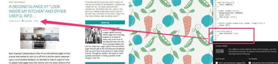
text-align: center;The CSS for post titles and categories worked, but the info under didn't change (date, etc.)Are you referring to transforming the post meta from all caps? If so, the following code is working for me:
div.entry-meta {
	text-transform: none;
}
This is demonstrated here:
Also can we change the color of those tag labels at the bottom of the post?
This should work for that purpose:
.entry-meta span.tag-links a {
	background-color: #fff;
	color: #000;
}
I have the following CSS that I was trying to use before to change all this, do I still need it?
You should not need the following as the default for the site is to have paragraph text be black:
p {
color: #000;
}
As for the rest of the CSS, you’ll need to look at each element you have input into the customizer and see if it’s still needed. It looks like you may be able to eliminate some of the codes there.
– Can we make the writing in the menu become white now since if I change the bar color to orange the black does’t show as much. Also I had this css for the font size in the menu:
#menu-top-menu {
font-size: 120%;
}
You should just be able to use this instead:
div.header-main {
	background-color: #E47526;
}

div.header-main a {
	color: #fff;
}
This string of code we’re using to increase the font size however looks like an issue:
.nav-menu {
	font-size: 17px;
}
It affects how your menu displays on mobile devices like this:
Basically, it pushes the menu down, which is certainly not optimal. Increasing the font size of the menu would be a better question for the CSS gurus in CSS Customizations.
by “writing in the grid/slider” I mean the grey boxes at the bottom of the pics…wanted to see if that was able to change to a color other than grey
Try these two codes in conjunction:
.grid .featured-content .entry-header {
	background-color: #fff;
	border: #fff;
}
by “boxes” I mean that when you click a category it currently lists all the posts in that category one after another. I was wondering if it is possible to show the results in a series of boxes, almost like the grid on this theme. I had some css that did this in my old theme…
I’m not sure about this. This is best left to the CSS gurus!
For my logo in the header, if I created an image where the logo was pushed to the left, is there a way to place the grid/slider up top on the right side of the header? The problem now is that all that space, the grid is put below it and then by the time you get to the posts its pretty far down.
I am 99% sure this is not possible as it would require a large redesign of the theme, which would affect how it displays content everywhere (on mobile devices for example). The CSS customizations are really meant for minor site tweaks rather than larger layout changes.
– If I do the gravatar widget, then the picture that is displayed is my gravatar correct?
Yes
I think I am wanting a pic of me versus my gravatar. I like the way this widget displays it better though…the about.me picture is just so big. Can I shrink that?
I’m not entirely sure, but I don’t think using CSS to shrink the photo is your best bet in this case. I would rather you either use the Gravatar widget or just create your own widget using a Text Widget and some HTML.
Basically, you can create a post draft with the content you want in the widget. Then, you can align the image and resize it to how you want it to look. Then, just copy and paste the content from the Text Editor into a Text Widget and you’ll have your own “About Me” widget.
If I change my gravatar under my public profile to a picture of me then does that also change the little icon next to my url up top or is that a different gravatar? It looks like it is only the veggies now and my gravatar is the veggies plus my blog name but I could be seeing it wrong.
I believe you’re referring to the Blavatar, which is explained here:
http://en.support.wordpress.com/avatars/blavatars/
That’s separate from your Gravatar.
On my posts I have created recipe boxes to display my recipes. Is there a CSS code to change the color of that little line under the recipe title in that box?
This should do the trick!
h3.jetpack-recipe-title {
	border-bottom: #fff;
}
I also just want to make sure that I have the CSS correct to change every part of my background to white:
It looks like the site default background is white. I tested removing the code (the color would need to be #fff instead of #99 as well), and the site didn’t look any different. When you remove the code, is something not looking correct on your side?
-
Hi there! Thanks for getting back to me.
– I tried to put this “ext-align: center;” in the widget title css and it didn’t work. I tried it in a few different places and it just turns red. Let me know what I am doing wrong.
– I am not referring to the all caps CSS I am referring to the color changes. The color change for titles in posts works as does for the categories about the titles. But the date and comments, etc. stuff below the title won’t change colors.
– The color to change the tags worked except that the tip is still grey…also it doesn’t work on the iPhone version, just see grey there. I changed the text color to white too, did I do that right?
-I eliminated the code for paragraph text since I want the default black. I also looked at all the others and deleted to see what happens (hard because it can affect main page or post pages…) and I eliminated one of them…question though, I saw while I was doing this that on my computer version it says “I’d love to hear from you” before the comments box but on the iPhone version it says “Leave a reply”, do you know why?
– Ok, so I changed the CSS for the menu area, however when I do it and save the HOME menu item still remains black when looked at on a separate window even though in my preview it shows white.
– As for the menu title size, I saw that it dropped down when I added the change in box/title color (CSS from above item) even on my preview. I changed the size from 17 to 16 and it seemed to correct the problem for me. How does it look on your end? I didn’t see the problem on my iPhone with either size…If it looks ok, then I can stick with size 16 but if not let me know where I should post the question. On the other hand, after playing around with changing the color/text of the menu box, I am kind of liking the original grey menu box with black writing. Looks a little cleaner, what do you think? Does the menu drop down happen if I leave it in original grey box/black writing or is it only if I mess with the box color?
– I used the CSS to change to grid box color and it goes to white…do I just change the color codes to make them something other than white? I played around with it and was able to get them to black but not another color. However I’m trying to decide if keeping the grey boxes, instead of white like the background, is nicer looking? It kind of creates a separation for the grid…what do you think?
-Where do I post the question about creating a grid like organization for the results of posts when clicking on a category?
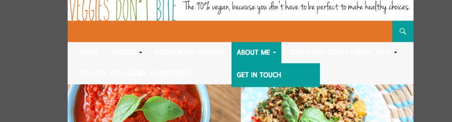
– If you noticed, I created a new header image and uploaded it. it now includes my tagline and my logo is on the left. I think this solves my problem with what I wanted before. Does it look ok? If I chose to use the slider instead of the grid, will the slider be smaller if I use smaller images for my “featured image” or is it fixed on size? What is the optimal size for “featured images” if so?
– I found both the gravatar and the blavatar and changed my gravatar pic to a personal pic. Not ideal but works for now so I can use the gravatar widget…I can do the html text widget if I need later :) Great idea!
– The CSS for the line under my recipe tittle in the recipe box only worked to remove the line, not change the color. I tried adding my color code in place of the fff but it didn’t work. I added this:
h3.jetpack-recipe-title {
border-bottom: #E47526;
}Instead of this that you wrote:
h3.jetpack-recipe-title {
border-bottom: #fff;
}– I also removed the CSS code for the background and all looks good. I have changed the 1st accent color to white, is that why?
Thanks again for all your help!
-
Hi!
Just a note – I have responded to a handful of your requests below. However, for the more detailed CSS questions, please direct them to your thread here in the CSS Customization forum:
https://en.forums.wordpress.com/topic/converting-css-from-an-old-theme-to-a-new-one?replies=9
If you have any additional questions regarding specific features, I’m more than happy to answer them here!
I saw while I was doing this that on my computer version it says “I’d love to hear from you” before the comments box but on the iPhone version it says “Leave a reply”, do you know why?
That looks like a slight bug with how the theme displays on mobile devices. I’ve reported this to our theme developers, and I will let you know as soon as a fix is in place.
The CSS for the line under my recipe tittle in the recipe box only worked to remove the line, not change the color. I tried adding my color code in place of the fff but it didn’t work.
I apologize – that’s my fault. I didn’t include the full CSS code. You can use this here:
h3.jetpack-recipe-title {
border-bottom: 1px solid #ff5e5e;
}
If I chose to use the slider instead of the grid, will the slider be smaller if I use smaller images for my “featured image” or is it fixed on size? What is the optimal size for “featured images” if so?
The featured images are automatically expanded to fit the area, but that area does adjust depending on the photo size. According to the theme documentation, Featured images work best with images that are least 1038 wide. I attempted to upload an image that was around 500×500, and it didn’t fill the entire content width or look very good. I would stick with images that are at least 1000px wide.
I also removed the CSS code for the background and all looks good. I have changed the 1st accent color to white, is that why?
It looks like that accent color controls the background of the sidebars so making that white likely changed the background of the majority of your site.
I think your site is looking great right now! I know you asked my opinion on the grey in the menu bar and in the grid with your featured images. I prefer the grid to brighter colors only because my personal opinion is that the bright colors tend to pop out too much. Ultimately though, it’s up to you!
Please feel free to drop any additional theme or WordPress-related questions here. The CSS thread is going to be much better for color and CSS customizations!
-
Thank you! So I am assuming all the css issues I gave you in my previous post that I was having trouble with getting to work I should ask on the other thread…No prob, will do!
Thanks for dealing with the bug. I got the line under the recipe title to work now, so thank you!
I think that I agree with your feelings about the grey in the menu bar and grid, the colors almost overpower my logo and tagline header. And I have my bright boxes in the widget area…
Let me know if they are able to fix that bug!
-
I will indeed! And, yes, the CSS Forum will be a better place for those CSS-related questions. Please let me know if you need anything else!
-
Hi!
It actually looks like the mobile comment prompt isn’t a bug. The current string of code that activates those comment settings is not active on mobile browsers right now. It will be something we’re looking to include in the future!
-
Ah. Got it. Thanks for getting back to me. It’s no big deal, but would be an added perk if they figure it out one day! Thanks again.
-
It will be implemented sometime in the future, but unfortunately, we don’t have a timeline just yet. We’re working on it though!
-
-
- The topic ‘Can you help me with the twenty fourteen theme?’ is closed to new replies.
