Centering layout in Sandbox
-
here’s where I’m stuck
I’m making my own wordpress.com blog using the sandbox theme with the two column (sidebar left) skin and writing the CSS from scratch but I’m having some problems aligning everything, I’m still new to web design and trying to get my head around it.
here’s what its looking like at the moment…
http://merlinmasondesign.wordpress.com/
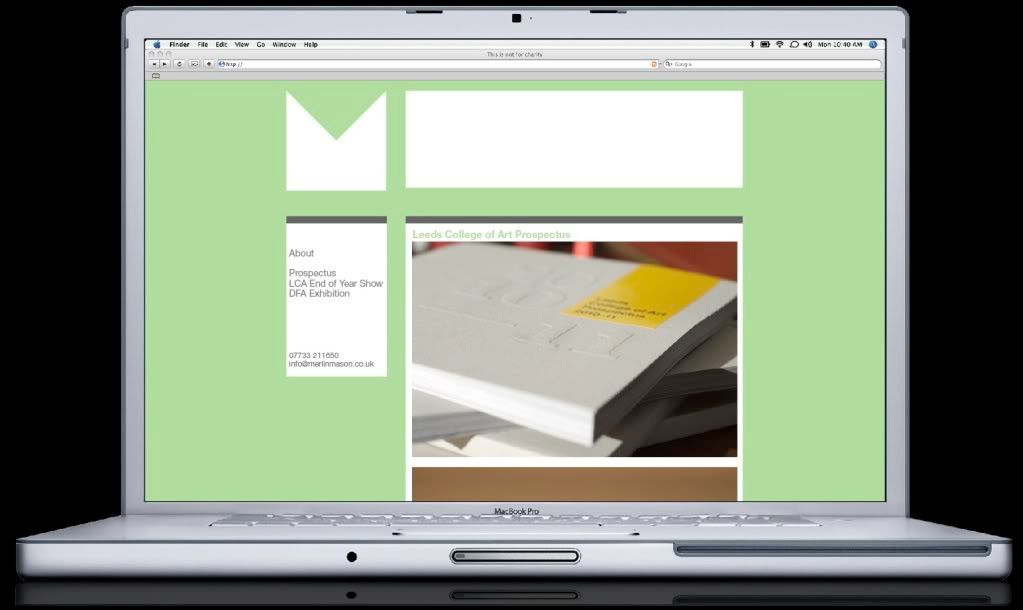
And it should look something like this…
I’ve managed to center the header but can’t seem to get the main content to align to the right side of it or the sidebar to align to the left side of it.
Any suggestions would be much appreciated!
Thanks, Merlin
The blog I need help with is: (visible only to logged in users)
-
It seems you’re using the old version of Sandbox. Since you’re writing everything from scratch, don’t use it… instead, use Sandbox 1.6.1.
One of the things that is “not helping” in the current version you’re using is the predefined left column layout, and you have to code your CSS around it.
By switching to version 1.6.1, you would not only have more control on your layout but it would be a lot easier to make modifications in the future since there is no “other” code to take into consideration.
-
Thanks, I’ve changed to the 1.6.1 version and it’s getting a bit closer to what I was after.
I’ve added a wrapper the same width as the header and floated the sidebars left and the content right but it still doesn’t quite line up on the right hand side
Where am I going wrong?
Thanks so much for your help!
-
-
-
I noticed that you want to put both “primary” and “secondary” sidebars on the left; the “primary” on top of the “secondary”. Is this what you want to do?? Wouldn’t just be better to use only one sidebar?
Please confirm this.
In the mean time, following are a few recommendations. I’ll post more if needed:
Don’t define font sizes in pixels, it’s of bad practice; use em or % units instead. Pixel units are for spaces.
Once you define “globally” a font property, you don’t need to do in every selector definition, unless you want a specific selector to be different from the rest. In other words, this is not necessary:
a {
font-family:Arial,Helvetica,sans-serif;
font-size:10px;
text-align:left;
color:#666666;
text-decoration:none;
border-bottom:1px dotted;
}

a:hover {
font-family:Arial,Helvetica,sans-serif;
font-size:10px;
text-align:left;
color:#666666;
text-decoration:none;
border-bottom:1px solid;
}
That’s an overkill.
This is more efficient:
a {
color:#666;
text-decoration:none;
border-bottom:1px dotted;
}

a:hover {border-bottom:1px solid;}
Is always good practice to set the background color to your background definition. Instead of this:
background: url('http://i228.photobucket.com/albums/ee46/merlinmason116/header.png') no-repeat;write it like this:
background: #B0DD9E url('http://i228.photobucket.com/albums/ee46/merlinmason116/header.png') no-repeat;Always write your properties alphabetically. It’s easier to find a property like that. Which looks better?
#header {
background: #B0DD9E url('http://i228.photobucket.com/albums/ee46/merlinmason116/header.png') no-repeat;
height:180px;
margin: 0;
text-indent:-9000px;
width:878px;
}
or
#header {
background: #B0DD9E url('http://i228.photobucket.com/albums/ee46/merlinmason116/header.png') no-repeat;
height:180px;
width:878px;
text-indent:-9000px;
margin: 0;
}
More soon.
-
Thanks for such an in-depth reply, I’m starting to get my head round the logic of the code.
I’ve made those changes you suggested, tidied the code up a bit.
In regards to the primary secondary side bars, ideally I’d like to keep them separate because I may want to style them separately at some point to help differentiate them. Unless this makes things more complex layout wise?
Thanks
-
Try this code:
body {
background:#B0DD9E;
color:#666;
font: normal 1em Arial,Helvetica,sans-serif;
margin: 0;
}

a {
text-decoration:none;
border-bottom: solid 1px dotted;
}

a:hover {
text-decoration:none;
border-bottom: solid 1px solid;
}

#wrapper {
clear: both;
font-size: 62.5%;
height: 100%;
margin: auto;
overflow: hidden;
padding: 0;
width: 878px;
}

#header, #footer {
clear: both;
overflow: hidden;
width:878px;
}

#header {
background: #B0DD9E url('http://i228.photobucket.com/albums/ee46/merlinmason116/header.png') no-repeat;
height:180px;
margin: 20px 0 40px;
overflow: hidden;
padding: 0;
text-indent:-9000px;
}

#container {
clear: both;
float: right;
overflow: hidden;
 width: 610px;
}

#content {
background-color:#fff;
border-bottom: 5px solid #666;
border-top: 10px solid #666;
float:right;
padding:10px;
width: 590px;
}

#primary, #secondary {
background: #fff;
border-bottom: 5px solid #666;
border-top: 10px solid #666;
float: left;
padding: 0;
width: 230px;
}

#secondary {margin-top: 20px;}

#primary li {
margin-bottom:5px;
}

#secondary li {
margin-bottom:5px;
list-style-type:none;
}

#footer {
border-bottom:1px dashed #666;
border-top:1px dashed #666;
padding:10px;
text-align:center;
}

.skip-link{display: none;}
I believe this code will make your blog look pretty much like your screenshot. You’ll need to modify your header image, though. You’ll have to extend the white part to the right so that it aligns with the contents column.
Regarding the sidebars, I was just being curious.
HTH
-
Damn! I forgot to add the color property to your “a” selector (tiredness is not pretty). Please, replace the a selectors from the code above with the following:
a {
border-bottom: dotted 1px #666;
color: #666;
text-decoration:none;
}

a:hover {border-bottom: solid 1px #666;}
Also, you may want to make your email address an image, that way spam bots won’t be able to harvest it. Here’s an email image generator if you’re interested:
-
wow thanks for all that, everythings lining up a treat now!
Very indepth :)Any idea how to remove the page link from above the #primary box?
Also the twitter feed in #secondary box seems to be slung over to the right…
Thanks for the link about the email… I’ll have a look into it :)
-
-
Add the following right below the “#primary, #secondary” definition:
#primary ul, #secondary ul {
margin: 0;
padding: 0;
}
Replace your current “#primary li, #secondary li” definition with this one:
#primary li,#secondary li {
list-style-type:none;
margin: 0 5px 5px;
}
Add this at the end of your CSS:
.tweets li {
margin: 5px 5px 10px !important;
}
That should format your sidebars nicely.
-
-
- The topic ‘Centering layout in Sandbox’ is closed to new replies.
