Colinear Theme – CSS modifications
-
I’m in the process of migrating my site from the old Coraline theme on WordPress.org to the Colinear theme on WordPress.com and need some help to try to keep the site looking as similar as possible to the old one. Specifically I need help with:
– Left adjusting the site title
– Making the site title bold, but without causing the rest of the post/page titles to be boldface as well
– make the post/page titles smaller without changing the size of the site title
– adjust the sidebar/content percentages to make the content portion larger and the sidebar narrower
– remove the side bar completely from all pages except the homepage
– change the hyperlink and visited link colour to #ff6600I realize this is a whole laundry list of requests, and my apologies if I should have requested each of these items individually.
Thanks!!
The blog I need help with is: (visible only to logged in users)
-
Hi there — it’s looking good so far!
I can help with your tweaks — I’ll do that in batches and not necessarily in order. :)
Left adjusting the site title
I used a browser inspector to find the element to target with CSS:
.site-branding .site-title {
  text-align: left;
}
Learning how to target your site’s CSS will help you make certain design and layout changes. Here are some very helpful posts that will help you customize your site with CSS:
http://en.support.wordpress.com/custom-design/how-to-find-your-themes-css/
-
– Making the site title bold, but without causing the rest of the post/page titles to be boldface as well
Give this a try:
.wf-active .site-title a {
    font-weight: 600;
}
The wf-active portion is needed since you’re using a custom font for the site title, and it was necessary to target this more specific element to override the defaults. Again, this is something you can see with a browser inspector.
-
– make the post/page titles smaller without changing the size of the site title
This targets post titles on the blog page, single blog posts, and static pages:
.entry-title a, .entry-title {
  font-size: 20px;
}
Adjust the pixel value as you like.
If you’d like to target any of those three items (blog, posts, pages) separately in order to have different sizes for each, let me know and we can split them up.
-
– change the hyperlink and visited link colour to #ff6600
I would strongly suggest you keep different colours for visited and unvisited links. The colour differentiation is an important usability feature for visitors, to allow people to keep track of which pages they’ve visited and which they haven’t while browsing a site.
The easiest way to change the link colour is to open the Customizer’s Colors & Backgrounds panel. Click the second palette circle (Links) and click “pick your own color.” Add your colour code in the field I’ve circled in red here:
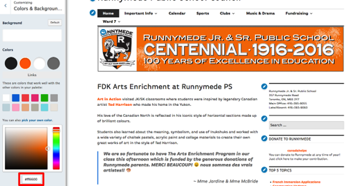
Save changes in the Customizer.
-
– remove the side bar completely from all pages except the homepage
This one has a few steps and gets even more complicated since you also want to change column widths.
1. Go into the widget Visibility options for each Right Sidebar widget. For each one, select these criteria:
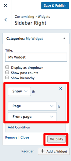
By opting to show each widget only on the front page, you’re preventing it from displaying anywhere else.
2. Now we need to modify the width of the main column on all pages, since the empty sidebar space is still there, and then reset the default only on the homepage:
.content-area {
  width: 100%;
}

@media screen and (min-width: 1380px) {
  .home .content-area {
    width: 776px;
  }
}
Note that for the homepage, I’ve used a media query to match the Colinear default for large screens. You can learn more about using media queries that target certain screen sizes here:
http://en.support.wordpress.com/custom-design/custom-css-media-queries/
http://webdesignerwall.com/tutorials/responsive-design-with-css3-media-queriesYou will need to add a few more media queries for screens of different sizes, repeating the
.home .content-areadeclaration but for different screen sizes. Check out the default Colinear stylesheet to see what those sizes are, and the content-area widths for each:https://s0.wp.com/wp-content/themes/pub/colinear/style.css?minify=false
For example, for screens greater than 1272px, the content-width is 704px.
– adjust the sidebar/content percentages to make the content portion larger and the sidebar narrower
3. Once you’ve got all your media queries set up, you’ll need to make more adjustments to the content-area width and the right column width to widen one and narrow the other. Try using a browser inspector and looking at the Colinear stylesheet to make those changes, and have a look at the media query documents to help understand how they’re done.
Column resizing can be tricky in a theme with this many breakpoints, but do give it a go and see how you get on. We’re here to help if you get stuck along the way.
-
OK wow!
@kathrynwp I can’t thank you enough for the time you have taken to help me work through my blog issues!!Thank you as well for the instruction docs you linked to. On wordpress.org I was used accessing the site CSS through the Editor tab and was at a loss for how to view the code via the .com site – so thank you!!
I’ve completed all of the edits from the first few posts and I’m trying to tackle the edits required for changing the content widths.
In terms of the media queries, it appears there are 6 built into the Colinear theme: 480 – 768 – 864 – 1056 – 1272 – 1380.
Of the 6 I don’t think I need to touch the >= 480px and the >= 768px because the sidebar naturally converts to a footer on those screens. Is that correct?
For the >= 1056, 1272 and 1380px screens it appears as though the content areas and widget areas are a consistent proportion of the total screen size with content being ~68% of the screen and widget area ~32%.
Can I simply convert the pixel numbers to percentages, then play around with them until I get the proportions I want or is that a terrible idea?
@media screen and (min-width: 1380px) {
.home .content-area {
width: 68%;
}
.widget-area {
width: 32%;
}
}I have no idea what to do with the 864px default as it is not clear to me from the CSS code how the sidebar behaves at that width…
-
I can’t thank you enough for the time you have taken to help me work through my blog issues!!
You’re welcome!
Of the 6 I don’t think I need to touch the >= 480px and the >= 768px because the sidebar naturally converts to a footer on those screens. Is that correct?
The sidebar actually goes into the footer — and the main column becomes full-width — below 1056px.
For the >= 1056, 1272 and 1380px screens it appears as though the content areas and widget areas are a consistent proportion of the total screen size with content being ~68% of the screen and widget area ~32%.
Can I simply convert the pixel numbers to percentages, then play around with them until I get the proportions I want or is that a terrible idea?
Generally it’s good practice to match the theme’s breakpoints, and units. In this case, you can certainly try percentages if you prefer — just be sure to test at different screen sizes to make sure the results are what you want.
- The topic ‘Colinear Theme – CSS modifications’ is closed to new replies.
 WordPress.com Forums