• Plans & Pricing
  • Log in
  • Get started
  • WordPress Hosting
  • WordPress for Agencies
  • Become an Affiliate
  • Domain Names
  • AI Website Builder
  • Website Builder
  • Create a Blog
  • Newsletter
  • Professional Email
  • Website Design Services
  • Commerce
  • WordPress Studio
  • Enterprise WordPress 
  • Overview
  • WordPress Themes
  • WordPress Plugins
  • WordPress Patterns
  • Google Apps
  • Support Center
  • WordPress News
  • Business Name Generator
  • Logo Maker
  • Discover New Posts
  • Popular Tags
  • Blog Search
Get started
  • Sign up
  • Log in
About
  • Plans & Pricing
Products
  • WordPress Hosting
  • WordPress for Agencies
  • Become an Affiliate
  • Domain Names
  • AI Website Builder
  • Website Builder
  • Create a Blog
  • Newsletter
  • Professional Email
  • Website Design Services
  • Commerce
  • WordPress Studio
  • Enterprise WordPress  
Features
  • Overview
  • WordPress Themes
  • WordPress Plugins
  • WordPress Patterns
  • Google Apps
Resources
  • Support Center
  • WordPress News
  • Business Name Generator
  • Logo Maker
  • Discover New Posts
  • Popular Tags
  • Blog Search
Jetpack App
  • Learn more
  • Support Center
  • Guides
  • Courses
  • Forums
  • Contact
Search
  • Support Center
  • Guides
  • Courses
  • Forums
  • Contact
Forums / CSS Code to Update Logo Size on Mobile

CSS Code to Update Logo Size on Mobile

  • Unknown's avatar
    givememeatloaf · Member · Nov 23, 2017 at 2:26 am
    • Copy link Copy link
    • Add topic to favorites Add topic to favorites

    I was able to add the CSS code below to make my logo bigger, and it looks great on site + tablet, but it’s way too big on mobile so that you can’t even read it. I’ve tried numerous codes I’ve found online and nothing seems to stick other then the code at the bottom that at least has allowed me to hide it on mobile until I can find a fix – any ideas? Help SO appreciated!

    .site-branding a img {
    display: none;
    }

    .site-branding {
    height: 200px;
    background-image: url(‘https://givememeatloaf.files.wordpress.com/2017/11/2018-meatloaf-logo-transparent.png’);
    background-size: 400px;
    background-repeat: no-repeat;
    background-position: center;
    }

    .header-info {
    top: 40%;
    }

    @media (max-width: 480px) {
    .site-branding {
    background: url(‘//givememeatloaf.files.wordpress.com/2017/11/2018-meatloaf-logo-transparent.png”’) no-repeat scroll center center / contain rgba(0,0,0,0);
    margin-top: 3px !important;
    width: 250px;
    }
    }

    The blog I need help with is: (visible only to logged in users)

  • Unknown's avatar
    baldfreud · Member · Nov 23, 2017 at 10:57 am
    • Copy link Copy link

    Hi @givememeatloaf. Try by commenting out your background for max-width 480px as your logo is already defined under .site-branding. Then add a line with: background-size: contain;

    @media (max-width: 480px)
    
    .site-branding {
     /* background: url(https://givememeatloaf.files.wordpress.com/2017/11/2018-meatloaf-logo-transparent.png”) no-repeat scroll center center / contain rgba(0,0,0,0); */
        margin-top: 3px !important;
        width: 250px;
        background-size: contain;
    }
    
    .site-branding {
        height: 200px;
        background-image: url(https://givememeatloaf.files.wordpress.com/2017/11/2018-meatloaf-logo-transparent.png);
        background-size: 400px;
        background-repeat: no-repeat;
        background-position: center;
    }

    Hope this helps.

  • Unknown's avatar
    kathrynwp · Staff · Nov 23, 2017 at 4:16 pm
    • Copy link Copy link

    Thanks for pitching in, baldfreud! I edited your reply to remove an extraneous bit (“?custom-css=1&c…e=6&csrev=25:1”) and put your CSS between code formatting tags for easier reading/copy-pasting.

    givememeatloaf – let us know how this goes or if you need further help.

  • Unknown's avatar
    givememeatloaf · Member · Nov 23, 2017 at 5:21 pm
    • Copy link Copy link

    Thank you so much for trying to help, I’ve posted this exact thing and it’s still not sizing right on mobile, I just can’t figure this out!

  • Unknown's avatar
    kathrynwp · Staff · Nov 23, 2017 at 5:45 pm
    • Copy link Copy link

    I just looked at baldfreud’s code more carefully and there are some syntax errors in it. Let’s fix it up. :)

    First, I’d suggest clearing out your current custom CSS so we can start fresh.

    Now, let’s look at your original CSS.

    I don’t think you need these parts:

    .site-branding a img {
    display: none;
    }
    .header-info {
    top: 40%;
    }

    I’m not sure what you were trying to accomplish with that, but removing those bits has no effect, so I would just omit them.

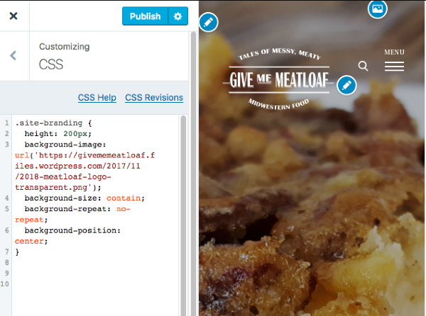
    Now, let’s look at the rest of your original CSS. Instead of setting a fixed 400px background size, let’s try changing that to contain instead. It seems to work well, even at small screen size.

    .site-branding {
      height: 200px;
      background-image: url('https://givememeatloaf.files.wordpress.com/2017/11/2018-meatloaf-logo-transparent.png');
      background-size: contain;
      background-repeat: no-repeat;
      background-position: center;
    }

    That seems to look good, without the need for a media query.

    Customize GIVE ME MEATLOAF tales of messy meaty midwestern food

    Give this a try in your Customizer and let me know how it goes for you!

  • Unknown's avatar
    givememeatloaf · Member · Nov 23, 2017 at 8:17 pm
    • Copy link Copy link

    You are a rockstar! Thank you, that worked – okay one last ask! :D The logo is showing on my post pages but it’s transparent so you can’t see it – is there a way for me to remove from my post pages, or change the color? Thank you!!!

  • Unknown's avatar
    kathrynwp · Staff · Nov 23, 2017 at 8:26 pm
    • Copy link Copy link

    In that case, why don’t we restrict the logo to just your homepage, by removing what I gave you before and adding this instead:

    .home .site-branding {
      height: 200px;
      background-image: url('https://givememeatloaf.files.wordpress.com/2017/11/2018-meatloaf-logo-transparent.png');
      background-size: contain;
      background-repeat: no-repeat;
      background-position: center;
    }
  • The topic ‘CSS Code to Update Logo Size on Mobile’ is closed to new replies.

Tags

  • adjust mobile logo size
  • css logo size
  • css mobile logo size
  • mobile logo

About this topic

  • In: CSS Customization
  • 3 participants
  • 6 replies
  • Last activity 8 years
  • Latest reply from givememeatloaf

Couldn't find what you needed?

Contact us

Contact us

Get answers from our AI assistant, with access to 24/7 expert human support on paid plans.

Browse our guides

Browse our guides

Find step-by-step solutions to common questions in our comprehensive guides.

WordPress.com

Products
  • WordPress Hosting
  • WordPress for Agencies
  • Become an Affiliate
  • Domain Names
  • AI Website Builder
  • Website Builder
  • Create a Blog
  • Professional Email
  • Website Design Services
  • WordPress Studio
  • Enterprise WordPress
Features
  • Overview
  • WordPress Themes
  • WordPress Plugins
  • WordPress Patterns
  • Google Apps
Resources
  • WordPress.com Blog
  • Business Name Generator
  • Logo Maker
  • WordPress.com Reader
  • Accessibility
  • Remove Subscriptions
Help
  • Support Center
  • Guides
  • Courses
  • Forums
  • Contact
  • Developer Resources
Company
  • About
  • Press
  • Terms of Service
  • Privacy Policy
  • Do Not Sell or Share My Personal Information
  • Privacy Notice for California Users
DeutschEspañolFrançaisBahasa IndonesiaItalianoNederlandsPortuguês do BrasilSvenskaTürkçeРусскийالعربيةעִבְרִית日本語한국어简体中文繁體中文English

Mobile Apps

  • Download on the App Store
  • Get it on Google Play

Social Media

  • WordPress.com on Facebook
  • WordPress.com on X (Twitter)
  • WordPress.com on Instagram
  • WordPress.com on YouTube

Automattic

Automattic
Work With Us
    • WordPress.com Forums
    • Sign up
    • Log in
    • Copy shortlink
    • Report this content
    • Manage subscriptions