CSS for Twenty Eleven theme – my site is not responsive
-
1. The site is not responsive in mobile units?
2. I would also like to remove the smiley face at the bottom of my site.
3. And if you could help me to remove the grey line on first page “VÄLKOMMEN” under the text “…åstadkomma och LedarPorten vill vara stödet för att nå dit”
Maybe it should be on the sidebar “Aktuellt” but vertically? And thats ok.The theme I’m using is: Twenty Eleven
The site I need help with is: https://ledarporten.wordpress.com/Thank you! Josefina in Sweden
The blog I need help with is: (visible only to logged in users)
-
Hallo again… if I enable mobile theme here:
https://ledarporten.wordpress.com/wp-admin/themes.php?page=mobile-options
The site looks wierd?
-
-
Hi Josefina, and sorry this somehow got lost.
1. The site is not responsive in mobile units?
I viewed your site both on my iPhone and on my iPad and it is displaying as it should be. Are you still having issues with this? If so, can you be more specific on what you are seeing, or not seeing?
2. I would also like to remove the smiley face at the bottom of my site.
Add this CSS to hide the stats smiley at the bottom of your site.
#wpstats {
    display: none !important;
}
3. And if you could help me to remove the grey line on first page “VÄLKOMMEN” under the text “…åstadkomma och LedarPorten vill vara stödet för att nå dit”
.hentry, .no-results { border: none; } -
Hi and thanks!! The smiley and the grey line is gone.
But its strange with the mobile theme? In our Iphones and Ipads the layout is the same as on the desktop?
If you reduce the screen on the desktop it looks fine, and the menu headlines placed diagonally.
-
Twenty Eleven was designed before the big switch to touch device style menus for mobile devices. What I’m seeing on your site is consistent with the Twenty Eleven demo site.
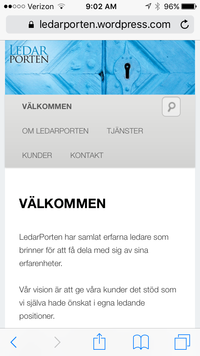
Your site on my iPhone: https://cldup.com/NNnkjiFNG6.PNG
Demo site on my iPhone: https://cldup.com/tmiCzYT5DS.PNG
To change your site using Twenty Eleven to a touch device menu for mobiles isn’t possible with CSS only. It would require some changes to the theme php script files, and that is not possible here at WordPress.com.
You may want to consider Twenty Twelve, or possibly look through our Theme Showcase filtered for Responsive Layouts and see if you can find another theme you like that has the touch device menu.
-
Hi and thanks!
…but as it looks on your iPhone https://cldup.com/NNnkjiFNG6.PNG its ok!! On my iphone the layout is the same as on my desktop. Do you have an e-mail address I can use to send a picture to you on?
Regards Josefina
-
Which iPhone do you have and what version of iOS?
You can upload a screenshot to your media library and I can then look at it there, or you can post the URL of that uploaded image here.
- The topic ‘CSS for Twenty Eleven theme – my site is not responsive’ is closed to new replies.
 WordPress.com Forums