Custom header cropped on mobile device
-
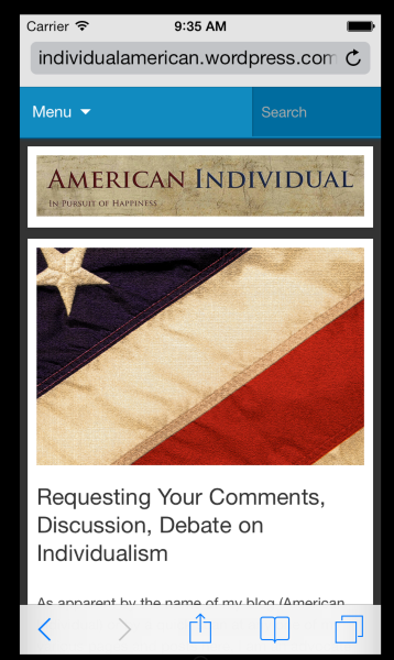
My custom header gets cropped when viewed on my Kindle Fire HD. I have the Expound theme, and I used the suggested header width. My custom header has text built into it, and when it is cropped on my mobile device the text is cut at both ends. What can I do so that It simply resizes the header to fit whatever screen it is on?
The blog I need help with is: (visible only to logged in users)
-
Expound is a responsive width theme. Responsive width means the layout adapts depending on the size of the device being used to view your site. When responsive width themes are viewed on mobiles sidebars appear below the posts in order to provide as much space as possible for reading.
When using responsive width themes we go here and disable the mobile theme > Appearance > Mobile
-
I just checked my own blog wearing the same theme and IO do have the mobile theme disabled. I am seeing the same cut-off header issue using Firefox 24 and I have tagged this thread for Themes Staff attention as this needs to be fixed – again.
-
Hi jccarmichael and timethief – I’ve looked into this, as it’s something our theme developers have had a look at this in the past.
I’m going to give you a bit of a technical explanation – if you have any questions, just let me know. Like some older responsive themes, Expound uses a background image for the custom header, instead of an img tag within the HTML, which is how newer responsive themes are coded.
Since background images cannot be scaled effectively for different screen resolutions, this means that header graphics in themes that use this background method are better off not including any text, as it may get cut off, as you’ve seen. A decorative, abstract, or photographic image without text works best in these cases.
With a theme that’s already live like Expound and has thousands of of folks using it, unfortunately we can’t make a major change to its header functionality without negatively affecting many people who would have to redo their headers, so the theme is going to stay as is for now. I’m truly sorry for the inconvenience.
If you have text in your header graphic, I recommend using the mobile theme in Expound, as jccarmichael is doing now. The header will look like this:
Please do let me know if you have any questions.
-
Thank you both, Kathrynwp and timethief. If I understand correctly, using “mobile” mode in the Expound theme does result in the example you linked to with the IOS simulator. If so, then I suppose it is just with Android and/or Kindle Fire that it doesn’t seem to work. Right?
-
At small screen sizes, the mobile stylesheet should kick in and visitors should see something similar to the iPhone screenshot.
If you’re still seeing the header graphic cut off on your Kindle Fire, could you try refreshing or clearing the browser’s cache? Do you know the viewport (screen) size of the Kindle Fire? If it’s fairly large it may not be triggering the mobile stylesheet, in which case you’d need to tweak the design of your custom header graphic accordingly.
Do you know which model you have – is it one of these?
Kindle Fire 2
Kindle Fire HD
Kindle Fire HD 8.9 -
-
Hi there, looks like the Kindle Fire HD 7″ likely has a resolution of 1280px x 800px, which wouldn’t be narrow enough to activate the mobile stylesheet, but which should in theory be wide enough to display your header graphic in landscape mode.
https://developer.amazon.com/sdk/fire/specifications.html
Would it be possible to provide a screenshot of what you’re seeing so I can have a look? Here’s a guide to taking a screenshot on a Kindle Fire. You can upload the screenshot – in a graphic format like JPG, PNG, or PDF – in your Media Library, and provide a link so I can see it, or upload it with a service like Droplr or Imgur.
-
Vertical screenshot – http://wp.me/a1RyYn-dm
Horizontal screenshot – http://wp.me/a1RyYn-dlI just noticed that the header displays properly using the WordPress App on my Kindle Fire HD. It is only in the Silk browser that it does not. The screenshots are from the Silk browser.
-
Thanks for this. I’ll pass along the screenshots to our developers so they can have a look.
-
When responsive width themes are viewed on mobiles sidebars appear below the posts in order to provide as much space as possible for reading.When using responsive width themes we go here and disable the mobile theme > Appearance > Mobile
Thanks
- The topic ‘Custom header cropped on mobile device’ is closed to new replies.
 WordPress.com Forums