Customizing "Spun" theme
-
I am using the “Spun” theme on WordPress.com. I just signed up with the custom design and want to:
1) Display the tagline just under the title. Right now it appears that there is no way to display the tagline.
2) Change the font size of just the site title. When I change the heading text to a good size for everything else, for some reason only the site title looks way too small.
3) Change the header image so that I can use a wider aspect ratio image as a banner, something that stretches across the top of the page rather than just a square thumbnail in the corner. Is this possible?
Thank you very much in advance! -Rob
The blog I need help with is: (visible only to logged in users)
-
Howdy Rob!
Please see below:
Display the tagline just under the title. Right now it appears that there is no way to display the tagline.
There isn’t a way to do that through CSS unfortunately. That would require editing the theme template files, which isn’t possible at WordPress.com.
Change the font size of just the site title. When I change the heading text to a good size for everything else, for some reason only the site title looks way too small.
It looks like you’ve hidden the site title and are now using an image for the header instead. Are you happy with the way this is looking?
Change the header image so that I can use a wider aspect ratio image as a banner, something that stretches across the top of the page rather than just a square thumbnail in the corner. Is this possible?
Sheri, one of our CSS gurus provides two possible workarounds here:
https://en.forums.wordpress.com/topic/center-header-for-spun-theme?replies=14#post-1909610
It looks like you could use something like this:
.site-header {
	padding-top: 290px;
}
.header-wrapper > a {
	background: url(URL HERE) top center no-repeat;
	position: absolute;
	top: 0;
	width: 600px;
	height: 290px;
}
.header-wrapper > a img {
	display: none;
}
I gave that a try, and it seemed to work pretty well. You would just need to enter the URL of the image you want as a header in place of URL HERE. Can you give that a try?
-
Hi Jeremy,
Thanks for the help. I’ll try that code.
As for the site title, it’s only hidden now because it looks too small. To get my post titles to fit in the thumbnails, I had to reduce the size of the header font, and this also changes the site title font, but it is actually much, much smaller. So if there’s is a way to make just the site title font bigger, I’d prefer to do that and use it for the tagline, and remove the tagline from my header image.
I’m also wondering if there is a way to change the color of the font in the post titles in the thumbnails, or ideally to set it somehow to be dark if the image behind is bright, and bright if the image behind it is dark.
Thanks!
-Rob
-
Howdy Rob!
See below:
So if there’s is a way to make just the site title font bigger, I’d prefer to do that and use it for the tagline, and remove the tagline from my header image.
Ah – I understand. This code should do the trick!
.site-title a {
font-size: 24px;
line-height: 1.0;
}
I’m also wondering if there is a way to change the color of the font in the post titles in the thumbnails
This will change the color!
.hentry .thumbnail-title {
	color: #fff;
}
Ideally to set it somehow to be dark if the image behind is bright, and bright if the image behind it is dark
Unfortunately, that’s not possible with just CSS. That would take some other magic in files not accessible on WordPress.com.
-
Hi Jeremy,
Thanks again for your help!
I tried the code for the header image and like the way it looks on a notebook, but on mobile the site size conforms to to the window and everything besides the header image is squashed into a corner. Is there a way to make my header image conform to the same site width as the other elements?
The font color change works just fine, thanks)
I tried the bigger site title font but then realized what I wrote there would be listed on browser listings and so forth so decided not to use the tagline there.
Thank you!
-Rob
jeremeylduvall replied to a forum topic that you subscribe to
in response to the topic “Customizing “Spun” theme”:
Howdy Rob!
See below:
So if there's is a way to make just the site title font bigger, I'd prefer to do that and use it for the tagline, and remove the tagline from my header image.
Ah – I understand. This code should do the trick!
.site-title a { font-size: 24px; line-height: 1.0; } I'm also wondering if there is a way to change the color of the font in the post titles in the thumbnails
This will change the color!
.hentry .thumbnail-title { color: #fff; } Ideally to set it somehow to be dark if the image behind is bright, and bright if the image behind it is dark
Unfortunately, that's not possible with just CSS. That would take some other magic in files not accessible on WordPress.com.
Reply View forum topic
Want less email? Unsubscribe from this topic
Thanks for flying with WordPress.com
-
Hey Rob,
Can you try wrapping the CSS you’re using in a media query? This tells the CSS only to apply when the screen is a certain size or larger. Give this a try:
@media screen only (min-width: 800px) {
	.site-header {
	padding-top: 215px;
}

.header-wrapper > a {
	background: url('//robcorpuz.files.wordpress.com/2014/08/rob-corpuz-images-re-brand-16l-185-logo-height-235x570-total-behind-pupil-no-camera.png') top left no-repeat;
	position: absolute;
	top: 0;
	width: 600px;
	height: 290px;
}

.header-wrapper > a img {
	display: none;
}
}
Just replace the elements of code mentioned above with the new CSS code including the media query.
-
Hi Jeremy, thanks, I tried it but now it only shows whatever I had saved as the original header image in the normal “Customize” section. The header added to the css disappears on both mobile and notebook, even if I change the number of minimum pixels. Any suggestions?
-
Hey Rob,
This would certainly work better if I formatted it correctly! I apologize for that. Can you give this a try?
@media only screen and (min-width: 800px) { .site-header { padding-top: 215px; } .header-wrapper > a { background: url('//robcorpuz.files.wordpress.com/2014/08/rob-corpuz-images-re-brand-16l-185-logo-height-235x570-total-behind-pupil-no-camera.png') top left no-repeat; position: absolute; top: 0; width: 600px; height: 290px; } .header-wrapper > a img { display: none; } } -
Hi, Jeremy, no worries) Thanks for that. It’s an improvement, because now the CSS header logo shows on the bigger screens (it didn’t before) and the default header shows on mobile. One problem though, is that the logo on mobile looks super tiny and the text of my logo will be unreadable.
Is there a way that I can set just my logo without text as the default (which will get shown on smaller screens/mobile) and then get the the site title to show up at the same time (when the screen is small) but stay hidden when the screen is big? Either that or be able to have say, three or four different sized logos/headers saved to show at different screen sizes, if that makes any sense. Thanks!
Also (separate issue), I’m wondering if there is any way to reverse the default opacity/fading behavior of the header and thumbnails. Right now, they start faded and go to full opacity on hover. I would like to reverse this behavior, so that they are at 100% opacity normally and then fade when the cursor hovers over them.
-
Just to clarify what I meant about the first part of the second paragraph of my previous message, just in case it was incomprehensible :^) I’d like to have the following:
When screen size > 800px:
1) The logo I have saved now on CSS that includes the text appears
&
2) The site title is hiddenWhen screen size < 800px
1) The logo I have saved as the default (in the regular template, not on CSS) appears
&
2) The site title is visibleHope that makes things more clear. Thanks again!
-
Hey Rob,
Let’s try this:
1. Navigate to Appearance -> Customize -> Site Title and enable the header text.
2. Now, we’re going to remove the header text for screens larger than 800px:
@media only screen and (min-width: 400px) {
	.site-header {
		padding-top: 215px;
		padding-left: 3px;
	}

	.header-wrapper > a {
		background: url('//robcorpuz.files.wordpress.com/2014/08/rob-corpuz-images-re-brand-16l-185-logo-height-235x570-total-behind-pupil-no-camera.png') top left no-repeat;
		position: absolute;
		top: 0;
		width: 600px;
		height: 290px;
	}

	.header-wrapper > a img {
		display: none;
	}

.site-branding {
	display: none;
}
}
That’s the same code as before just with the site branding (title) hidden.
Now, the site title should appear on mobile devices along with the logo.
Let me know if that works!
-
Ok, thanks, we’re moving in the right direction) Now I’d like to know:
1) How do I add padding (want to do it to the top and left) of the site title : right now it’s smashed right up against the header logo, and I’m trying to get the logo to be as close to the same size as possible as the thumbnails so I don’t want to make it smaller.
2) Is there any way to get the site title (and the header, for that matter) to stretch across the screen rather than run into a margin the middle of the screen?
Thanks again!
-
Hey Rob!
How do I add padding (want to do it to the top and left) of the site title : right now it’s smashed right up against the header logo, and I’m trying to get the logo to be as close to the same size as possible as the thumbnails so I don’t want to make it smaller.
Try adding this:
.site-branding {
	padding-top: 20px;
	padding-left: 20px;
}
That will bump the site title down and to the right a bit, which is how I interpreted your padding tot he top and left. Let me know if I’m mistaken!
2) Is there any way to get the site title (and the header, for that matter) to stretch across the screen rather than run into a margin the middle of the screen?
Sorry – between the mobile and desktop layout, I’m not 100% sure what you’re referring to here.
Are you asking about centering the header area on the desktop version shown here?
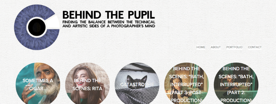
Or, are you asking to move the site title on the mobile version up and over to the right of the image as shown here?
-
Thanks! I would love to make my mobile site look more like what you showed in the photo, with the title to the right of the logo. Ideally I’d also love to have my logo more often than not be the same size as the thumbnail circles and aligned with them. Right now it looks like this:
http://www.robcorpuz.com/Info/LOGO/n-3QBN2/i-Wm4hc2s/A
What I was originally asking was that I wanted to have the title/logo be able to stretch across the width of the screen, instead of the way it is now, where it goes to the next line before the midway point of the screen.
-
Hey Rob,
Can you try adding this?
@media only screen and (max-width: 320px) {
.site-branding {
  padding-left: 150px;
  margin-top: -150px;
  margin-bottom: 50px;
}
}
The sticky part here is that while we’re adjusting the smartphone layout, we’re also changing stuff like the layout on iPad, hence the new media query.
Honestly, if you need additional help with moving this around, I’m going to suggest you direct the questions to the CSS Customizations forum here:
https://en.forums.wordpress.com/forum/css-customization
We have some CSS gurus there that will be able to make sure the CSS you’re using is on point!
-
Thanks so much for your time, Jeremy. You’ve been a great help. Just one more little question. I’ve now got the site title on the on the top right, next the logo, which is great, but I can’t get the main part of the title (Behind the Pupil) to all fit on one line, even if I reduce the font. How do I widen the text block? Thanks!
-
Hey Rob,
This should expand the width of the site title area and allow the “Behind the Pupil” text to all fit on the same line:
.site-branding {
width: 125px;
}
Just add that attribute (width: 125px) to the CSS code for mobile screens mentioned above!
-
-
Of course! Like I mentioned before, if you have any further CSS questions, I would advise you to direct them here:
https://en.forums.wordpress.com/forum/css-customization
The CSS wizards there know far much more than I do! I’m glad we got this looking great for you though.
- The topic ‘Customizing "Spun" theme’ is closed to new replies.
 WordPress.com Forums