Differences in Desktop and mobile/tablet views
-
Hi,
I am using the Entrepreneur theme. A couple of questions:1) I added a CSS footer text to the website. The footer appears fine in Desktop version – but the footer on the Home page rides up when viewed on a mobile phone and tablet. Is there a way to ensure that the footer stays sticky in all 3 viewing modes?
Here’s the code I’m using –
.site-info::after {
content: “Copyright Message”;
}2) I removed the Search option from the menu. The Desktop version does not show Search option anymore — but both mobile and tablet versions still show Search option. Is there a way to disable it those two modes as well?
The blog I need help with is: (visible only to logged in users)
-
Hi there, this will take care of #2 for you.
.main-navigation-wrapper.toggled-on .search-form {
  display: none;
}
On the copyright, the text added is long enough that there isn’t a way to keep it and the social icon on the same line. What I would suggest is for screens 480px and narrower, that we center everything using the following Media Query.
@media screen and (max-width: 480px) { .social-navigation { width: 100%; text-align: center; } .info-nav-wrap { text-align: center; width: 100%; } } -
Hello!
Thank you for solving the Search issue for me. That works!
As for the footer issue… I added the code and I do see the wrapping now. However, the footer still rides up on the Home page, in mobile/tablet view mode. I just checked it on my iPhone.
Is there a way for the footer to stay put, just like it does on other pages? -
Woohoo on the search.
Perhaps I’m not understanding on what you mean when you say it “rides up” on the home page in mobile. On my iPhone 6s Plus, it is at the bottom of the home page.
-
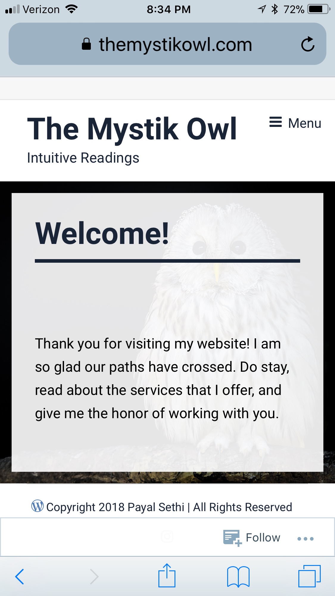
Hi!
When I look up the website on an iphone or ipad… the footer on the Home page appears either on the center of the screen, or at about 3/4ths. The area below the footer shows up as the teal color background. Its worse on an ipad, than the iphone!
The footer on other pages doesn’t move, and stays at the bottom of the screen.
I hope I was able to explain the issue.
-
Thanks for the clarification. Which iPhone and which version of iOS are you on?
I’m on an iPhone 6s + and this is what I see when I visit your site on my phone: https://cldup.com/hKW90pKsoy.jpg. It appears to me that the footer section is at the bottom, partially hidden by the Safari bar at the bottom. If I visit your about page, I do not see the footer area until I scroll down to the bottom of the page, and then it is at the bottom. I also checked in my Samsung with Android and Chrome and it is like I describe above.
Can you take a screenshot of what you are seeing on your phone and then upload it to your media library or onto a file sharing service and give us a link to it?
In iOS on most versions of the iPhone you can take a screenshot by pressing the on/off button and the home button at the same time and then releasing.
-
Hello!
I have iPhone 8 Plus with iOS 11.2.6 (most recent version of iOS). Also, I have an iPad Air with iOS 11.2.6.
I have uploaded the screenshots in my media library. The links to the pics are given below. Please let me know if you need any further info.
Link to iPad screenshot – https://i2.wp.com/themystikowl.files.wordpress.com/2018/03/ipad_a1566_ios_11-2-6.jpg?ssl=1&w=450
Link to iPhone screenshot – https://i0.wp.com/themystikowl.files.wordpress.com/2018/03/iphone_8_plus_ios_11-2-6.png?ssl=1&w=450
-
Thanks a lot for the screenshots. The content of a page determines the overall height of that page, and what it boils down to is that your content is shorter than the available height on an iPad or iPhone 8 Plus, so the page actually ends before the bottom of your screen. The teal color is the color set as the background color on the body html element. It shows since the actual page content ends before the bottom of the screen. Let’s try the following. Paste it in at the bottom of your custom CSS. What I have done is to set the height of the #content area to 100vw instead of the 56%-ish original value which pushes things down and increases the size of the image as well. I’ve also set the background color for screens 768px and narrower to white so that the sliver of teal doesn’t appear at the bottom of the screen.
@media screen and (max-width: 768px) { .home #content { min-height: 100vw; } body.home { background-color: #fff; } } -
Thank you. This worked! And I love it :) so I want more…
1) Is it possible to change background color of all pages to white?
2) Would it be possible to do a similar setting of size for the “Contact” page – that is another page with not a lot of text, and looks funky on iPad? -
To change the background color for all pages to white, use the following.
body {
    background-color: #fff;
}
And with the above, remove this from the Media Query I gave previously.
body.home {
    background-color: #fff;
  }
On your contact page, the only thing I’m seeing on an iPad is the width issue. and the content offset to the left. Give this a try and see what you think.
.has-no-primary-sidebar .content-area .featured-image, .page-template-full-width .content-area .featured-image { margin-left: auto; } .site-content .column { margin-left: auto; margin-right: auto; float: none; max-width: 740px; width: 100%; } -
Hi!
1) I used the piece of code for changing background color of all pages to white. It looks good, thank you!
A follow up question – Will this color automatically apply to any new pages that I add to my website?
2) I tried the second piece of code, but I didn’t like the way it got rid of sidebars (which I plan on using). Changing background color to white, took care of the teal line on the Contact page — so I’m okay with that.
-
Many thanks for all your help! I have no additional questions.
This issue can be considered closed. -
- The topic ‘Differences in Desktop and mobile/tablet views’ is closed to new replies.
 WordPress.com Forums