does ubud have dynamic scaling?
-
When I resize my window my grid disappears and becomes a vertical row. I would like a grid site no matter what size my window. Is there an option to enable this? If not what wordpress blog remains as a grid when scaling the window.
Thank you,
Emily
The blog I need help with is: (visible only to logged in users)
-
Hey Emily!
This is actually a feature of the Ubud theme. It’s referred to as being “Mobile Response”, meaning it adjusts to display your content correctly regardless of the browser size. This ensures that readers are getting a friendly view in mobile browsers and on desktop browsers. Currently, there isn’t a way to turn this off within the theme.
This is going to be a feature of nearly every theme in our theme showcase. More and more viewers are accessing sites through mobile devices so our themes are taking a mobile approach. You could look at a theme like Espied:
http://theme.wordpress.com/themes/espied/
It still has a similar affect, but it’s a bit more gradual. Would that work for what you’re looking for?
-
Hi Jeremey,
Thanks for your response. I’m looking at espied and how the portfolio option works…its cool but not my main priority. I just want a grid. When I chose this theme it still comes out as a list. I’m sure it’s a simple setting to change. Could you point me in the right direction? Thanks!
And if there are any other features on Espied you think are really what make it different from Ubud. The portfolio option?
Emily
-
Hi Emily,
The Ubud theme should display in a grid fashion provided you have your browser expanded to the full width of your screen. However, when viewing from a phone screen or iPad screen for example, the theme will adjust to display the content in the best way possible. This is what I was referring to as mobile response and is unable to be changed (it’s built into the theme, not a setting per say). This is going to be built into to virtually any grid theme we have.
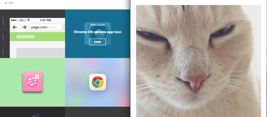
Regarding the Espied theme, it’s extremely similar. I only suggested it because it maintains the grid format a bit longer when the window is shrunk as shown in this example:
Does that make sense?
-
Yep. That makes sense.
My only question was how to get a grid on Espied. When I switched over to it no matter what the screen size it was in list format. So just wondering where the setting is to change it to that or if I have to have a feature image and or images must be in gallery or image format maybe?
Thanks again!! :)
-
Hey Emily,
My apologies! In order to setup the look of the Espied theme, you will need to setup a portfolio as explained here:
http://theme.wordpress.com/themes/espied/
You can read more under the heading “Portfolio Page Template”. Unfortunately, there isn’t a way to setup the grid format without the portfolio page template.
-
-
- The topic ‘does ubud have dynamic scaling?’ is closed to new replies.
 WordPress.com Forums