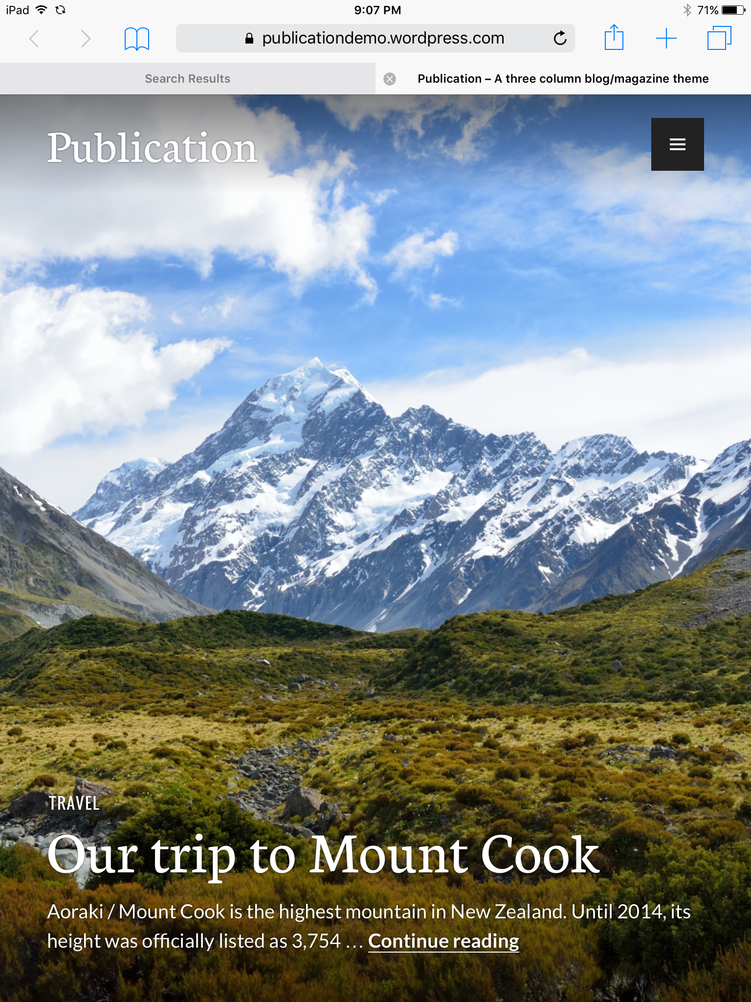
Featured image in Publication theme on mobile
-
When you view any site using the Publication theme (including the demo site – http://publicationdemo.wordpress.com) on a vertically-oriented tablet device, there is a large gray bar that appears on the right hand side of the screen (under the menu toggle) that causes the featured image to be truncated and pushed left, making the headline illegible. Orienting the tablet device (I’m using an iPad Mini) horizontally resolves the issue. If this can’t be fixed, I’m going to have to select another template for my site. Any help appreciated. Thank you!
The blog I need help with is: (visible only to logged in users)
-
Hi there, I’m not seeing this on the demo site, or on your site, with my iPad Air on iOS 9.2.1 and Safari. I checked both portrait and landscape and opened and closed the menu and switched back and forth.
Screenshot: https://cldup.com/fEODX1hq1d.PNG
What tablet and what OS/version/browser are you seeing this on?
-
OK, that’s good to know. I’m on an iPad Mini 2 on iOS 7.1.2 and Safari.
Screenshot: https://gc2016worship.files.wordpress.com/2016/03/screenshot.png
That’s what I see on initial load. Rotating to landscape causes the gray bar to disappear. But switching back to vertical causes the bar to appear again.
-
Hmmm, that’s strange. I can’t get 7.1 to load in my simulator at the moment, or I could see if I could fix it. I’m hammering on it at the moment and if I get things working and figured out, I’ll post back here.
-
I appreciate the help. sarahblackstock is working on it in another forum as well (I posted this a couple of places because my first post went unnoticed for 2 weeks) … and she was able to replicate on several devices. She’s reported it to the theme developer.
-
- The topic ‘Featured image in Publication theme on mobile’ is closed to new replies.
 WordPress.com Forums