Formatting Feedback: Underlining and Justification in the Drop-Down Menu
-
Hi,
I gave some feedback for the block editor in https://wordpress.com/forums/topic/feedback-thread-for-the-block-editor/page/11/ (more specifically, https://wordpress.com/forums/topic/feedback-thread-for-the-block-editor/page/11/#post-3509212). @supernovia responded to my feedback about the ‘underline’ formatting option in https://wordpress.com/forums/topic/feedback-thread-for-the-block-editor/page/11/#post-3509357, asking me to create a new thread. @supernovia had told me that the reason why the underline option was moved to the drop-down menu was because it had caused confusion, because it made text look like a link. However, as I posted in reply:
the reason why I was looking for the underline option was to make my links more noticeable, because my theme doesn’t make links a different format by default and the bold option doesn’t make it incredibly noticeable from the rest of the text.
(My theme is Stow, the link to the website is https://writingwebsite.poetry.blog/.)
The reason why I’d prefer if the underline option was moved to the main formatting menu is because I would like to use it for links, but it took me quite a while to discover the option even existed because it was hidden under the drop-down menu.
I’d also prefer it if justify was moved to the alignment menu. I’ve occasionally seen people ask (both within the Feedback Thread for the Block Editor and in individual posts) about the ‘missing’ justification option. Although I understand formatting might end up looking a little strange on a phone, this isn’t the case for me, and I’d prefer it if this option was made obvious. Could someone please explain to me why justified text looks strange on a phone? Is the text really spaced out, for example? (I’d like to use the justify on my posts but I don’t want to do it if it will make it hard for people to read if they’re using a phone to read it.)Thank you.
The blog I need help with is: (visible only to logged in users)
-
Thank you! I’ll do some testing on Stow and file an enhancement re: underlining links in content.
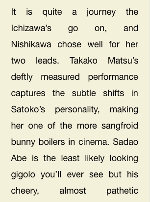
To check what I mean re: justification, go ahead and view your site in a browser window, then resize the window so it’s narrow like a tablet or a phone. You’ll likely see some weird spacing in the text that makes it harder to read, like this:

So it looks okay on wider windows where there’s room to move that spacing around, but on narrow screens, the spacing can get a bit unwieldy.
-
I’ll do some testing on Stow and file an enhancement re: underlining links in content.
Thank you so much!
You’ll likely see some weird spacing in the text that makes it harder to read,
Ah yes, I see that. That’s a problem with justification generally I think (it happens to me sometimes in Word even when I’m using a computer). Thanks for the screenshot :)
-
Thanks for understanding! So we tend to tuck away Full Justification for those who are positive they want to use it. If your site has CSS support though, and if you like having justified on wide screens but left-aligned on small, there are ways to achieve that automatically. :)
Still working through the other “quick” issues then I’ll come back to the one re: Stow. Noting on that, too, with CSS we can auto-underline everything content-link for you regardless of the theme design.
-
I’ve added a feature request here:
https://github.com/Automattic/themes/issues/2128Hoping this helps!
-
- The topic ‘Formatting Feedback: Underlining and Justification in the Drop-Down Menu’ is closed to new replies.