Formatting issues
-
I am currently running Penscratch theme at http://www.guidinghandpdx.com. I am really liking the overall theme of the site but I would like to be able to modify a couple of things about the formatting.
1) I’d like to take out the dividers above and below my menu.
2) The formatting of the site, although it is a responsive theme, seems to a run a bit large for all of the screens I have viewed it on. How can I shrink the overall size of the formatting so that it the main page and standalone, non-scrolling pages can be viewed at a glance and uninterrupted?
Thanks for your help.
The blog I need help with is: (visible only to logged in users)
-
Hi there!
1) I’d like to take out the dividers above and below my menu.
Sure! You can do this if you edit CSS. Please go to Appearance > Customize > CSS in your Dashboard. Then, try adding this:
.main-navigation {
	border-top: 0;
}

.site-header {
	border-bottom: 0;
}
2) The formatting of the site, although it is a responsive theme, seems to a run a bit large for all of the screens I have viewed it on. How can I shrink the overall size of the formatting so that it the main page and standalone, non-scrolling pages can be viewed at a glance and uninterrupted?
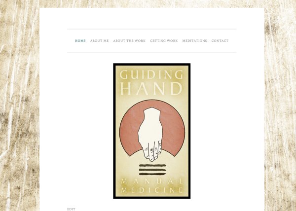
For some reason I’m not finding that it’s a bit large. Is it possible that you are zoomed in? Try pressing command – and see if that helps. For example this is what I am seeing:
Let me know if you have any questions with this!
- The topic ‘Formatting issues’ is closed to new replies.
 WordPress.com Forums