Hamonic theme front page image not displaying correctly on tablets & mobiles?
-
I’m having trouble getting my site to look right on mobile devices using the Harmonic theme.
I have a 2400×1400 front page title section image. It looks great on a desktop browser. However, on a tablet a narrow strip of the theme’s background color appears between the bottom of the image and the bottom footer.
On a smartphone, it looks even worse; a wide band appears between the bottom of the image and the bottom footer. I’ve tried various different sized crops of the image, and these bands always appear in tablet and smartphone view.
Any thoughts?
The site is http://scribblertom.com.
The blog I need help with is: (visible only to logged in users)
-
I noticed a couple of things on your site:
1) Harmonic requires background images for its front-page sections to function correctly, and it looks like your background image for the Title section is broken right now:
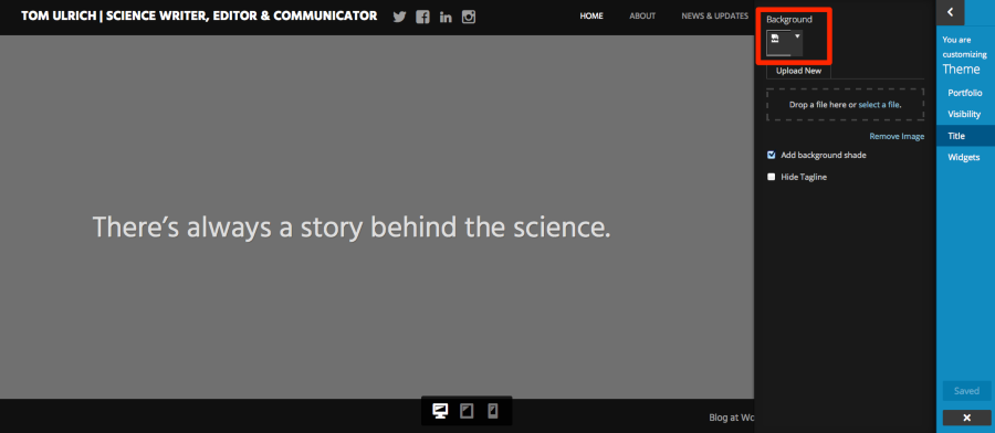
I’d suggest you try reuploading the image.
2) You’ve set the Widgets section to be visible under Theme > Visibility, but you haven’t yet added any widgets. That could be what’s accounting for the empty strip. Try either hiding that section or adding some widgets to the Front Page widgets area and see how it goes.
Let me know how it goes and we’ll take it from there.
-
Thank you Kathryn. I followed your suggestions (don’t know what happened to the title image, by the way; it was there and working fine this morning), but that band is still appearing on mobile and tablet view.
Next steps?
-
-
-
-
The developers have not looked at this issue yet, but it’s in the queue. Thanks for checking in!
-
Harmonic’s developer had a look at this and unfortunately there isn’t an easy workaround to prevent the background colour from showing at the bottom on small screens when using the front page template with the configuration you have.
If the gap really bothers you, you could change the site background colour to a tan colour that more closely matches the image, like #cac3b0. That will apply across the entire site, however.
With custom CSS, we could try other workarounds as well, such as changing the colour of the background only on the homepage.
Let me know if you have any questions about this.
-
Thanks Kathryn. Is there something I can do with the image that would fix the issue, like cropping it to a different size?
-
-
I should have been more clear, Kathryn…if I crop the image I’m using to a different size, would that help? Is there a recommended width & height for front page template pictures in this theme?
-
Cropping the image in a different way will not achieve the effect you’re after and there is no specific recommended dimension, as the theme scales the image automatically. A bit of the page background will always show at the bottom of smaller devices when you have the front page set up in the way you’ve chosen. You could try adding more content to your page there within the editor, but changing the dimensions or cropping the image won’t have any effect in reducing that space you’re talking about.
-
I’m not quite sure, Kathryn, what you mean by “set up in the way I’ve chosen.” All I had done was to upload the image that’s on the page’s title section.
If I were to make another section visible on my home page (for instance, the news section or page section), would that make the gap go away?
-
Having a single front-page section displaying means that your background colour will be more obvious in certain browsers and devices, showing in a strip down at the bottom. I’ve discussed this extensively with the developer who designed and coded Harmonic, and done many tests myself, and unfortunately there is no way to achieve what you’re after, especially without custom CSS. You’re very welcome to experiment with adding additional sections to the front page to get an effect you’re happier with.
-
Kathryn, I tried adding a second front-page section (a page section) and even then the strip of background still came through at the bottom.
Here’s the thing: I simply want the front page of my site to look & behave like the front page of the Harmonic demo site. As far as can tell, no gap shows up on at the demo when viewed on a mobile device. How do I go about doing that (e.g., image sizing, section inclusion)?
-
The Harmonic demo displays all front page sections except the portfolio. This is what it looks like in the Customizer: https://cloudup.com/cZzDToIWZeU
-
So is that what I would need to do in order to make that gap go away? Add more sections to the front page?
Frankly, that’s silly, and poor design. Why give users the ability to add or remove sections from the front page if it’s going screw it up?
-
If you set the theme to display the Front Page widgets area and add at least one widget there – could be something as simple as a line of text in a text widget – I think you’d remove the appearance of the gap at smaller screen sizes. You could either keep the default white section background colour, or you could upload a background image for the section. I tested this and I’m not seeing a white gap at small screen sizes.
Frankly, that’s silly, and poor design. Why give users the ability to add or remove sections from the front page if it’s going screw it up?
I do understand your frustration. One of our staff members has actually proposed a change in the theme’s construction in order to make the front page even more flexible than it is now, but it needs further testing before it can be made live to ensure it works as intended and doesn’t have any negative side effects for existing sites running Harmonic. We’ll definitely keep you posted here if it goes ahead.
-
-
Hi Tom, the gap in Harmonic that you reported should now be gone. Thanks for your patience!
- The topic ‘Hamonic theme front page image not displaying correctly on tablets & mobiles?’ is closed to new replies.
 WordPress.com Forums