Header image off center on different monitors
-
Hello!
I’m updating my site with a new theme (Bouquet). I created a new header image in Illustrator with the recommended dimensions (1100 x 180). However, after uploading the image into WordPress, it looks fine on my laptop but on a desktop monitor it’s shoved off to the right. I’ve tried both .png and .jpg and have fiddled with cropping, to no avail. I have not touched the CSS stylesheet as I have no clue what I’m doing there. I’ve done several updates over the years and haven’t ever had this problem. Help would be appreciated!
The blog I need help with is http://www.courtneyjhall.com.
The blog I need help with is: (visible only to logged in users)
-
What’s important is uploading an image of the exact size required for a header image on that theme.
The header image is 1100 by 180 (width, height).
https://wordpress.com/themes/bouquet/ -
but on a desktop monitor it’s shoved off to the right
Can you check to make sure the zoom setting in the browser you are using set to 100%?
Can you let me know the dimensions you’re using for your browser window on your desktop monitor or maybe even provide a screenshot showing the problem?
http://en.support.wordpress.com/make-a-screenshot/I did some testing myself by adding a custom header to the Bouquet theme on my test blog, and I found that the image gets cropped naturally for smaller screen sizes such as mobile devices and that appears to be by design. I’m not sure how that would affect your desktop view until I know the answers the questions I posted above.
-
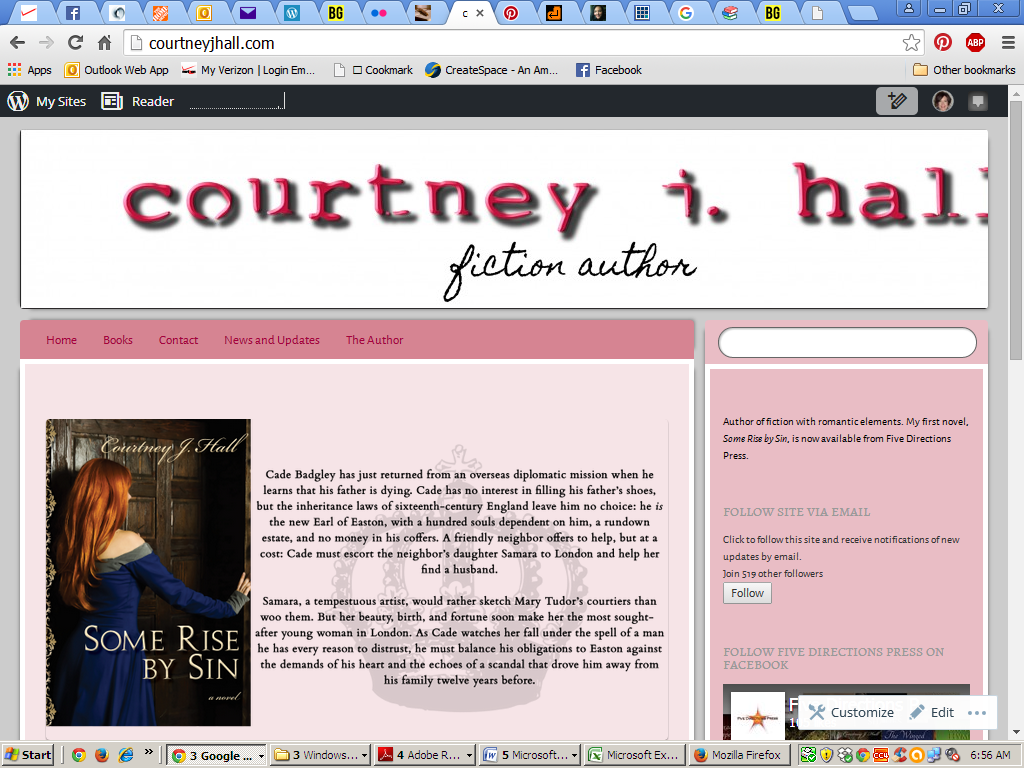
Thanks for the quick responses. As far as I can see, the header is exactly 1100 by 180. Zoom is 100% on both my desktop browser (Chrome) and laptop browser (Firefox). I have checked the site Firefox on my desktop too; same thing happens.
Below are screenshots – one from my desktop (the one that’s cut off) and one from my laptop.
Thank you!
-
Thank you for the screenshots!
For this one: http://i292.photobucket.com/albums/mm3/ckelley116/Screenshot%202015-10-06%2006.56.05.png
It looks to me like the resolution is 1024 x 768.
I reviewed the Bouquet theme, and I found that the header image in that theme is designed to show at full size (1100 x 180) even if the window is smaller (like it is in the case of your screenshot that is 1024 wide). This is how it was setup by design. Because of that, this theme works best with a header image that can still look okay when it is cut off (i.e. a landscape or a picture of flowers, for example, but many other types of images will work too). Your image has text rendered inside the image, and that type of image does not work well with how the Bouquet theme is setup. Each theme is unique and each theme’s original author decides how things like the custom header will work.
Sorry I don’t have a better answer for you!
Some ideas for how to work around how this theme is designed:
* use a different header, one that works well with how Bouque is designed to crop header images
* try another theme
* use custom css to try to make a customization that changes how the Bouquet theme worksIf the CSS route interests you, post a request for help at https://en.forums.wordpress.com/forum/css-customization and include a link to your screenshot so they can see how the current image is getting cut off. Adjusting header images to be responsive is possible, but it can be tricky. Someone in the CSS forum will know more if you decide you really want to keep Bouquet.
-
Thank you so much! What you’re saying makes total sense, and I really appreciate you taking the time to go through all of that for me. I’m not comfy fiddling with CSS even with help, so it looks like I’m going shopping for another theme.
Thanks again – you’ve been really helpful!
- The topic ‘Header image off center on different monitors’ is closed to new replies.
 WordPress.com Forums