Help with Navigation – The Expound Theme
-
Hi all,
I would love to get some help with the navigation of my site.
I centered the header and the navigation with the following CSS code:
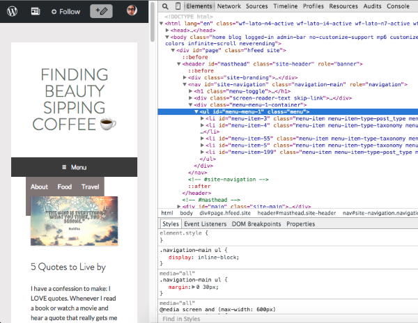
.site-title {
	text-align: center;
}

.navigation-main {
	text-align: center;
	height: 40px;
}

.navigation-main ul ul a {
	text-align: left;
}

.navigation-main ul {
	display: inline-block;
}
The way it looks in the browser is fine now, but it is not working well in the mobile version any more.
Can anyone help me?
Thank you in advance! :)
The blog I need help with is https://findingbeautysippingcoffee.wordpress.com/
The blog I need help with is: (visible only to logged in users)
-
Hi there,
Please use this css:@media screen and (max-width: 600px) .navigation-main ul { display: none !important; }Let me know if you need another help.
-
Hey nizamilputra,
thank you for your help. Unfortunately it is still not working, the mobile version looks like this: https://findingbeautysippingcoffee.files.wordpress.com/2015/08/screenshot1.png
Could anyone help me? :)
Thank you and best regards, Hanna
-
Hi there,
I don’t see the code above is pasted in custom css. Have you already paste that code?
- The topic ‘Help with Navigation – The Expound Theme’ is closed to new replies.
 WordPress.com Forums