Hover state color change, justify header for mobile, menu nav
-
Hi there,
I just purchased the premium plan and am trying to make some CSS changes.
-Editing Hover color to match the orange on my page
-Justifying the header image that I uploading when on the mobile responsive view (it currently keeps tucking to the left instead of spanning the width) and centering it for tablet. The sizing of the file at full size would be good for tablet.
-Fixing the “Previous and Next Project” arrows at the bottom of my project pages. As of now, these buttons are in place to toggle to the next project or back to the previous, but it does not go in order of projects shown from left to right and instead goes right to left.Someone was just assisting me with these things on chat and said that the free plan wasnt able to do these customizations so i upgraded. Kinda in a time crunch trying to get this site up.
Thanks in advance for your help
The blog I need help with is: (visible only to logged in users)
-
Hi Danielle, I’ll answer your questions in batches. Let’s start with the first one:
-Editing Hover color to match the orange on my page
Could you be a bit more specific about which element’s hover colour you’d like to change? For example, do you want to make the thick black border around each portfolio project orange? Or change the menu link hover colour? Or something else? Each element will require a different bit of CSS, so it would be good to know what you have in mind.
-
-Justifying the header image that I uploading when on the mobile responsive view (it currently keeps tucking to the left instead of spanning the width) and centering it for tablet. The sizing of the file at full size would be good for tablet.
The logo can’t really be enlarged with CSS alone without making it look fuzzy. The logo in Blask is set by the theme to a size that allows it to fill the left column on desktop, and that size doesn’t change on mobile. Adding CSS to try to override that just makes the logo blurry, so I don’t recommend it.
You can change the positioning to center it below the first mobile breakpoint, though – try adding this to your custom CSS:
@media screen and (max-width: 767px) { .site-header { position: relative; } .site-header .site-logo { display: block; margin: 0px auto; width: 220px; } } -
-Fixing the “Previous and Next Project” arrows at the bottom of my project pages. As of now, these buttons are in place to toggle to the next project or back to the previous, but it does not go in order of projects shown from left to right and instead goes right to left.
I’m not quite sure what you mean here. If we take this project for example:
https://daniellehadley.com/portfolio/willport-trust/
How do the links at the bottom differ from what you’re expecting to see, and if you could explain why that would be super helpful to. Thanks!
-
Hi Kathryn,
Thanks so much for getting back to me.
1. I’d like to change the hover state of the menu link hover color on the left to be orange. I think the hover states on the projects are fine for now.
2. I’ll give that code a go, do I just copy and paste this code into the “CSS” text field in the Customization panel? Do i need to put these in any particular order?
3. To explain, at the bottom of the Willport Trust Project page, you’ll see arrows at the bottom. The arrow at the left points to Oferta, and the arrow on the right points to Hilovely. This assumes the order of my projects begins with Oferta > Willport > Hilovely from right to left instead of left to right, which is the incorrect order when you’re viewing my homepage of all my tiled projects. The order should be Hilovely on the left arrow, then Oferta on the right arrow (so it mirrors the order on my homepage, which goes Hilovely, Willport, Oferta…etc).
Hope this helps. Looking forward to your reply!
Danielle :)
-
1. I’d like to change the hover state of the menu link hover color on the left to be orange. I think the hover states on the projects are fine for now.
Great. This CSS should do the trick:
.nav-menu a:hover {
  color: #f7ad62;
}
2. I’ll give that code a go, do I just copy and paste this code into the “CSS” text field in the Customization panel? Do i need to put these in any particular order?
Not yet in your case. :) But it’s good to keep in mind that there’s something in CSS called “inheritance” which means styles defining the same element further down in a stylesheet override the ones above. For example, if you say menu links should be blue and then further down in the stylesheet you say menu links should be red, the red will prevail because it’s further down.
I’ll look at #3 separately.
-
2. I’ll give that code a go, do I just copy and paste this code into the “CSS” text field in the Customization panel?
Yes! Just pop it in there and save. There’s a piece of custom CSS already in there (not sure from where) but it doesn’t seem to be doing anything so you can probably just remove it:
@media screen and (min-width: 769px) { .site-header .site-logo { float: left; } } -
Thanks for explaining about the arrows.
Single-project pagination arrows work like this:
< Previous/Older Project ...... Next/Newer Project >
[Oferta]........... [Hi Lovely]
The project order works by date, so:
“Willport Trust” was published on August 20.
The “previous” project is the project that’s one older by date, which in this case is “Oferta,” published on August 15.
The “next” project is the one that’s one newer/later by date, in this case “Hi Lovely,” published on August 23.
Here’s a screenshot to help visualize:
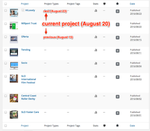
Does this help understand why the arrows work this way? This is standard for WordPress posts and custom post types (like portfolio projects) – previous (older post) is on the left and next (newer post) is on the right.
All this said, if you prefer to swap the position of the links, you can add certainly add some custom CSS to that. Give this a try and let me know how it goes!
.single-jetpack-portfolio .post-navigation .nav-next a::before { content: "←"; margin-right: 2px; } .single-jetpack-portfolio .post-navigation .nav-previous a::after { content: "→"; margin-left: 2px; } .single-jetpack-portfolio .post-navigation .nav-previous { float: right; text-align: right; } .single-jetpack-portfolio .post-navigation .nav-next { float: left; text-align: left; } .single-jetpack-portfolio .post-navigation .nav-next a::after, .single-jetpack-portfolio .post-navigation .nav-previous a::before { display: none } -
This all worked great! Thanks so much for your help.
One last thing: For mobile, can you help me get my social media icon buttons to be centered as well?
Thank you again for all of your help!
Danielle
-
Glad everything worked as you’d like!
To centre the social menu, you’ll need to add some more CSS inside the media query I gave you earlier. So you can modify this custom CSS you already have:
@media screen and (max-width: 767px) {
  .site-header {
    position: relative;
  }
  .site-header .site-logo {
    display: block;
    margin: 0px auto;
    width: 220px;
  }
}
to become:
@media screen and (max-width: 767px) {
  .site-header {
    position: relative;
  }
  .site-header .site-logo {
    display: block;
    margin: 0px auto;
    width: 220px;
  }
 /* Centre social links */
   .social-links {
        text-align: center;
    }
    .social-links ul {
        margin: 0 auto;
    }
    .social-links ul li {
        display: inline-block;
        float: none;
    }
}
Let me know how it goes.
-
-
- The topic ‘Hover state color change, justify header for mobile, menu nav’ is closed to new replies.
 WordPress.com Forums