how can i customize my site for my mobile
-
Hi,
I already checked in the box in appearance -> mobile so my page adapts to the default mobile theme it comes with.
Yet, is all distorted when I go to my page in my mobile phone.
¿How can I customize my site so when looked at in a mobile it fits perfectly?Thank you,
The blog I need help with is: (visible only to logged in users)
-
Hi again!
Your theme, Harmonic, is already mobile-ready, so you don’t actually have to enable that option in appearance>mobile unless you prefer the default mobile theme. In your current situation, I’d actually recommend removing the mobile theme, so we can just adjust your coming soon page with css.
Implement this css code as we did before:
@media screen and (max-width: 480px){
	body.custom-background{
	background-image: url('http://tailorandtea.files.wordpress.com/2014/11/tt_proyect__digital_ac_r03-ch.png?w=400') ;
	background-position: center;
	}
}
It’ll look like this:
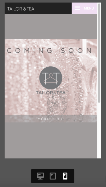
Perhaps not perfect, but your background image text won’t interfere with the other elements on your page at smaller screen sizes.
As you design your full site, I’d advise against including text or images as part of your background images, but instead insert them into the body of your pages so that the responsive design of your theme can handle it more appropriately.
Best,
-Alex G.
-
Hi!
Thank you for your help. Definitely looks better. I will try to break down my background image so it comes down more tight.
Thank you for the help!! -
- The topic ‘how can i customize my site for my mobile’ is closed to new replies.
 WordPress.com Forums