How can I fix my header issues (browser resizing) in "Hemingway Rewritten"?
-
Perfect! That looks great. Are you happy with how it looks? I tested it out on my iPhone as well and it looks great there too.
-
Thanks, Jeremy.
I’m generally pretty thrilled wih how everything looks now.
But if I could change one thing, it would be my custom header on the home page. I think the huge headers work on other pages since those pages are copy heavy. But not the front page.
Is there not any way to resize that area? If not, do you have any suggestions on how to make the focus more in the square images and less on my logo?
-
Hey Erika,
So, if I understand correctly, you’re looking to have the header logo be a bit smaller rather than stretching out across the page. Is that correct? If so, the only plan of attack I’m aware of would be to manually create a header image with a white background and place your logo in the middle. You’ll want to make the header image larger in size so that it doesn’t have to expand to fill the screen. That way, you can control how large the logo is in the middle. Does that make sense? For example, you could create a custom header that is 2560 x 832 with the logo in the middle. That way, you control how the logo image looks rather than letting the theme auto-expand it.
-
Hi, Jeremy.
Thanks for the suggestion. I gave that a go and the logo was smaller but the white space was still just as large.
So I spent yesterday exploring another them and I found Illustratr to be a good one. I’d love your thoughts:
http://erikakaophotography.com/
After all that! Well, hopefully our thread will help others with the Hemingway Rewritten theme.
-
Oy!
Now I see a “NOTHING FOUND” at the bottom of every page.
Any clue?
http://erikakaophotography.com/
Thank you.
-
-
Hey Erika!
Wow! I really like the look of the Illustrar theme on your site. I think it does a really great job of displaying your content. One note, the URL for your “People” page has a “2” in it:
http://erikakaophotography.com/people-2/
If you want, you can change that from the Edit Page screen here:
https://erikakaophoto.wordpress.com/wp-admin/post.php?post=80&action=edit
Just click “Edit” at the top of the page underneath the page title. Remove the “2” and click “Ok”. The URL should be updated when you update the page.
That’s my only suggestion! Otherwise, it looks wonderful.
-
Hey, Jeremy.
Thanks for the nice words! I’m pretty thrilled with it as well and I’ve gotten great feedback so far.
Thanks for the tip on “-2.” I’ve fixed it.
One more question, since you’ve been so helpful. ;) When I look at the site from my iPhone, the third box from each row on the home page is not aligned with the rest.
I’ve tried to remove the paragraph formatting but it makes it even worse.
Any suggestions?
Thanks in advance.
-
Hey Erika,
To be honest, I’m not exactly sure why the third image is always getting pushed over. One solution would be to build a table. If you did that, your images would look like this on mobile devices:
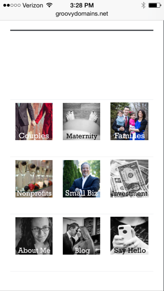
What are your thoughts on that layout?
Alternatively, you may want to ask in the CSS forum here:
https://en.forums.wordpress.com/forum/css-customization
We have some CSS wizards that patrol that forum. They may be able to give you a better solution!
-
Hi, Jeremy.
The layout you proposed is exactly how I’d like it to look “mobilly.”
I’ll take a stab at it and share the results soon.
Thanks.
-
Hi, Jeremy.
Thanks! That worked. Now when I view it on my phone, the images are exactly in that format.
However, there are now these gray lines between the rows and below the table. Any idea how to get rid of those?
Thanks.
-
Also, is it at all possible to remove the thick black line from under the headers on the pages that have visible headers?
-
Hey Erika!
Can you give this a try to remove the lines in the table and the black line underneath the header?
header.entry-header::after {
	display: none;
}

div.entry-content table {
	border: none;
}

div.entry-content table td {
	border: none;
}
Just place that in Appearance -> Customize -> CSS. Let me know if that works!
-
That did it, Jeremy.
I can’t thank you enough for all of your help. I’m so, so happy. Can I write to someone to say how helpful you have been? Or did I just do that?
-
Hey Erika!
I’m happy to help, and I appreciate your wanting to recommend my work. You’ll receive a rating email in a few hours that will ask you to rate our conversation, but other than that, I’m just glad we were able to get your site looking great!
-
- The topic ‘How can I fix my header issues (browser resizing) in "Hemingway Rewritten"?’ is closed to new replies.
 WordPress.com Forums