How can I fix my logo on my blog so it doesn't force the site below the fold.
-
The logo image in my theme forces the site content down below the fold. The logo defaults to a position well below the head of the page with a massive white space above it.Is there an optimum height that I should make the logo in my theme before I upload it?
I have tried to contact the Basis Theme makers for help but although I’ve searched there is just no way I can see to contact “The Theme Foundry” from within my dashboard, and visiting their website offers no means of contacting them whatsoever.
The Basis documentation offers no size recommendation for the custom logos.
All the best, ShaunThe blog I need help with is: (visible only to logged in users)
-
Hi Shaun,
Can you give this bit of CSS a try and let me know if it accomplishes what you’re looking for?
#basis-header-nav {
	margin-bottom: -70px;
}
Just paste that under Appearance -> Customize -> CSS.
Let me know how that turns out!
-
Hi Jeremy,
Magic! That fixed the problem right away thank you.
Supplementary questions regarding the appearance / display of the mobile theme. I see under Appearance -> Customize ->Theme I have loaded Regular and Retina logos. When I view the site on my iPhone 5 the logos are stripped out and replaced with the site title set in bold Helvetica.
This does not match the display of the mobile theme on my desktop MacPro in Safari, where both the logo and the theme’s webfont “league gothic” both display correctly.
I appreciate that such questions open up a can of worms regarding browser, IOS. But I wondered if there is a CSS code fix to the theme that “makes” the logo and League Gothic font load in the mobile and tablet themes.
Have also noted that the slideshows which contain ++size images ( http://velocetteracing.wordpress.com/the-racing-velocettes/eldee-2-racing-slideshow/ ), which display beautifully on my desktop machine, are not visible, will not load on the mobile theme. Is there a workaround for these slideshows to display in the mobile theme?
Finally I just wanted to add how delighted I’ve been with the whole WP, Basis Theme design and publishing “environment”, it really is all quite wonderfully well worked out and while a little challenging, it’s ultimately worthwhile.
All the best,
ShaunPS. I am keen on receiving critical review of how I’ve managed items like internal site cross-links graphically. Keen to learn whether their titles conform to HTML5/CSS3 standards with regards to usability for folk who are sight impaired for example.
-
Please see my answers below!
I appreciate that such questions open up a can of worms regarding browser, IOS. But I wondered if there is a CSS code fix to the theme that “makes” the logo and League Gothic font load in the mobile and tablet themes.
This should be fixed now. Under Appearance -> Mobile in your Dashboard, the default WordPress.com mobile theme was set. However, this isn’t necessary as your theme is mobile responsive. As a result, I disabled the mobile theme, and it looks to be displaying correctly on mobile browsers now. Can you give it a look and let me know if it’s working on your side?
Have also noted that the slideshows which contain ++size images ( http://velocetteracing.wordpress.com/the-racing-velocettes/eldee-2-racing-slideshow/ ), which display beautifully on my desktop machine, are not visible, will not load on the mobile theme. Is there a workaround for these slideshows to display in the mobile theme?
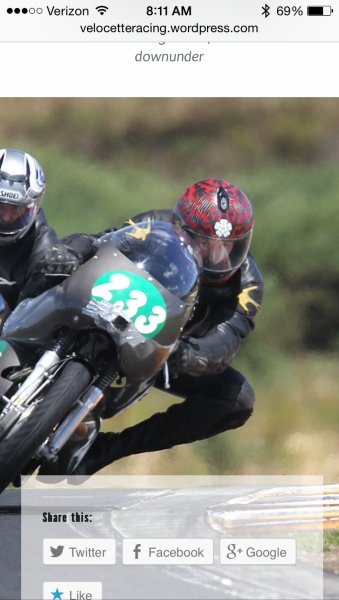
Can you give this a try now? Here’s how that page is currently displaying on my mobile browser (for reference, iPhone 5 on Safari):
Finally I just wanted to add how delighted I’ve been with the whole WP, Basis Theme design and publishing “environment”, it really is all quite wonderfully well worked out and while a little challenging, it’s ultimately worthwhile.
That’s great to hear Shaun! Yes, it can be a bit challenging to get down pat in the beginning, but I’m happy to explain any features you may have questions about!
PS. I am keen on receiving critical review of how I’ve managed items like internal site cross-links graphically. Keen to learn whether their titles conform to HTML5/CSS3 standards with regards to usability for folk who are sight impaired for example.
http://velocetteracing.wordpress.com/the-racing-velocettes/One thing I noticed on that page is that all of the images are not linked to additional pages. That may be something that you’re in the process of addressing. Outside of that, it looks like you’ve properly set a title for each image. From my understanding, that’s definitely important for visually-impaired users!
Let me know if you have any additional questions!
-
Thanks for the prompt response Jeremy, (sorry for the delay in response). Your actions above appear to have remedied all the niggling issues I raised and I’m well pleased to see the site display so nicely on my iPhone/Safari now.
Thanks for bringing the image linking matter to my attention, I will address that.
Jumping topics, doing some experimentation with CSS the other day, with respect to finessing/nuancing the typography on the site with css markup. What I was able to achieve was the insertion of an “emspace” by entering this markup
> emsp; < , directly into the “visual” view of the headings on this page.
http://velocetteracing.wordpress.com/merchandise/I very much like the League font as its Grotesque aesthetic is correct, for the era of Classic Racing bikes. I noted in my research of old ads and books from back in the day that setting all caps with wide letterspacing or kerning was a common type styling. This aids readability and the aesthetics of headings set in all caps. As when set “straight” the close spacing of ALL CAPS letters / words is very black and “clumpy” visually. So I was really pleased the workaround I tried using css markup worked out.
Which leads me to my point, and I do have one :)
Aside from emspace, enspace and thinspace, what other typographic control and nuancing can be exercised on the site’s type? I see there are buttons for Italic and Bold, but, for example can “blockquote” be marked up in the type?
-
There are tons of other options outside of the ones you mention. They just don’t appear in the menu toolbar in the sections shown here:
To utilize other elements, you’ll want to switch to the Text Editor by clicking “Text” at the top of the text box. For example, if you wanted to use a blockquote, you could just wrap your text in the following tags:
<blockquote>This is a blockquote</blockquote>You can see a larger reference for styling posts and pages here:
http://en.support.wordpress.com/editors/styling-individual-posts-and-pages/
Is that what you’re looking for?
-
Thanks Jeremy, most helpful, that’s exactly what I’m looking for.
Jumping topics now I have stumbled upon another new bug that has emerged since fixing the logo problem above. When I view any page of the blog in Firefox (3.6.12) on my Mac (OS10.5.8), the logo at the head of the page is anchored top left, but it does not scale down to fit inside the logo area or “mask”, instead it appears at a size roughly 2x too large with only 25% of the top left of the logo visible and the rest cropped off.
Thanks for your consideration.
-
I tested your blog out in Firefox 29.0.1 on Mavericks on my Mac. Here’s how your blog appears on my side:
Can you make sure you’re running the latest version of Firefox that your operating system will allow? You can check this by clicking Firefox -> About Firefox. The pop-up message should let you know whether your browser version is up to date.
If you’re still having trouble, can you upload a screenshot to your Media Library so I can take a look?
-
Phew! Thanks for that, I’m glad it is displaying properly in your ffox version :)
I can confirm that the version I’m running of ffox is the latest my OS will allow. Yes, still having trouble. (NB. It was displaying fine in ffox before the round of code changes above.)
http://velocetteracing.files.wordpress.com/2014/05/ffox-vrnz-ssht.png
Trust this helps. -
That’s interesting. I went way back in Firefox versions (to version 20.0) on OS X Snow Leopard, and I didn’t experience the same issue. Can you let me know the Firefox version you’re using so I can try to recreate (I can’t find version 3.6.12)?
-
Sshot of the FFox version info from the version I’m using.
http://velocetteracing.files.wordpress.com/2014/05/ffox-version.png
Have refreshed the page and cleared the cache, quit ffox and re-launched these steps have not corrected the problem.
I have some developer tools I use in ffox, this sshot below shows the css applied to the “home” “a.custom-logo” element.
If the problem will be fixed by loading up a new “a.custom-logo” element at a precise pixel dimension I can do that easily.

-
Btw these tools do allow me to edit the css for any page loaded in ffox, so I was just thinking that I could experiment locally before applying global changes. (If that makes any sense, web coding is not my area of expertise.)
-
Hi!
My apologies – I was able to test your site in Firefox 3.6.12, and I confirmed the issue you’re having. This is likely just a result of how your site renders in the older browser (since the browser was released in October of 2010). Can you confirm what OS X you’re using (Mavericks, Snow Leopard, etc)? This issue looks like it’s cleared up in every version of Firefox since.
Experimenting with CSS locally is a great idea. I was testing some things on my side, but I couldn’t get the exact right combination to work.
-
Hi Jeremy,
Mac OSX Leopard (10.5.8)
As mentioned it appeared “correctly” before we made the edits to the CSS at the head of the thread. This is not conclusive proof that is the cause, other factors may be at play, but no other variable has changed as far as I am aware.
I appreciate your perseverance, I know that reverse compatibility has to have reasonable bounds so if this bug isn’t resolved I’m prepared to accept that.
-
That’s definitely odd. The CSS changes shouldn’t cause the issue we’re seeing in Firefox. However, with that being said, I removed the Custom CSS, and it didn’t seem to have an effect on the site layout. Can you try removing the CSS and see if the problem clears up on Firefox?
- The topic ‘How can I fix my logo on my blog so it doesn't force the site below the fold.’ is closed to new replies.
 WordPress.com Forums