How do I change settings so my blog title and description spread across the page
-
I am creating my first blog and have solved a lot of things with the tutorials and searching the previously asked questions, but I can’t fix this one. For some reason the title of my blog and it’s description are not stretching out across the whole page – instead, it’s weirdly truncated and then word-wrapped. My blog, http://www.momlifehacker.com is in the Zoren theme, if that matters. Could anyone help me figure out how to change this so my blog does not look I can’t even title it properly? Thank you so much in advance!
The blog I need help with is: (visible only to logged in users)
-
There is only one relevant tutorial for WordPress.COM bloggers and it is at http://learn.wordpress.com. The one you find online are for WordPress.ORG installs. Read about the differences here http://en.support.wordpress.com/com-vs-org/
-
I do see your issue with the site title. There is no setting for you to change. I’ll tag this thread for a Themes Staff follow-up. Please subscribe to the thread so you are notified when they respond and please be patient while waiting.
-
-
You’re welcome and not to worry as Staff will “fix” this.
NOTE: The Site title (blog name) and/or the optional Tagline can be changed on the top of this page at any time. > Settings > General …
“save changes”. That is exactly where search engine spiders look for the site title and removing it from there can cause issues with getting your content indexed. -
Hi there, as you can see in the demo, Zoren is designed to display the site title and tagline in a small rectangular block at the upper left of the screen. To change the appearance of elements in that box, you would need to add some custom CSS, which you can do with the Custom Design upgrade. (The upgrade would also give you the ability to tweak colours and fonts.)
If you’d like to preview how it could look with some CSS tweaks, head to Appearance > Customize > Custom Design, and click Try Now. In the CSS box, you would then add this code:
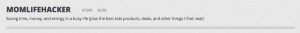
@media only screen and (min-width : 1224px) {
	.site-description {
		width: 1200px;
	}
}

.site-title {
	font-size: 30px;
}
This would make your title a bit smaller, and stretch the tagline across the page on desktop and laptop screens, and would look something like this:
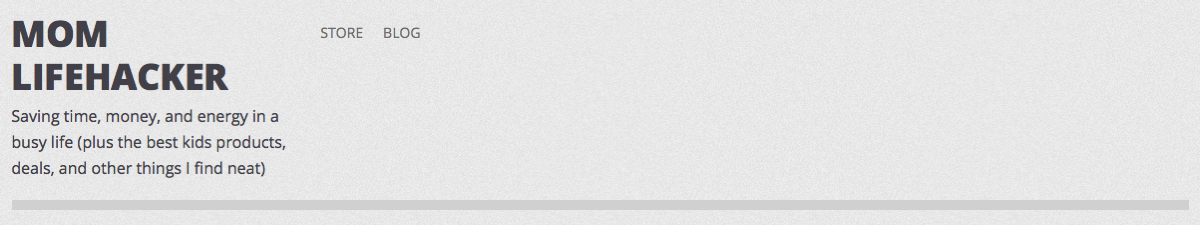
If you didn’t want to go for Custom Design right now, would consider splitting your title into two words, like “Mom Lifehacker”? If you did that, it should break after the first word, which will look less awkward. That would look like this:
Just let me know if you need further help.
-
Thank you so much for the help! I went through and previewed a bunch of other themes that had a different top layout, but I realized I liked Zoren the best so I purchased Custom Design and pasted in the code that you sent and that fixed it. I don’t know CSS at all so I really appreciate it (I’ve only ever blogged on weebly before so I am learning!) Thanks again for helping me!
-
I’m glad that worked out for you! It looks very good. :-)
If you need any help tweaking more CSS in the future, feel free to post in the CSS Customizations forum.
-
Hi there, I’m having the same issue that momlifehacker did with Zoren header, but that snippet of CSS didn’t fix it for me (I do have the custom design upgrade).
Here’s the blog I’m working on…http://karensawa.wordpress.com
Any suggestions for how to fix this?
Thank you.
-
Hi Karen,
Can you try removing the following bit of code?
.wf-active .site-description {
	position: relative;
	min-width: 400px;
}
Then, place this in its place?
@media only screen and (min-width : 1224px) {
	.site-description {
		width: 1200px;
	}
}

.site-title a {
	font-size: 30px;
}
The difference in the site description code ensures that your theme looks great on mobile devices as well. Note, you can adjust the Site Title font-size to your liking.
Let me know if that works for you!
- The topic ‘How do I change settings so my blog title and description spread across the page’ is closed to new replies.
 WordPress.com Forums