how to fix my site for smartphone
-
I am happy with the look of my site on screen computers with different explorers, BUT the site doesn’t look the same on smartphone/iphone.
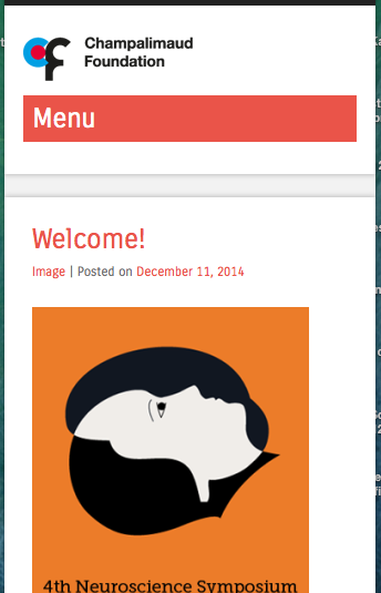
The main menu is vertical instead of horizontal, it says ‘Menu’ with a red background where it shouldn’t, the menu’s elements have transparent background instead of white, and shows text labels next to home, facebook and twitter where it shouldn’t.I am customising the css and I am not sure how to fix this…
Thanks for helpThe blog I need help with is: (visible only to logged in users)
-
The main menu is vertical instead of horizontal
Only these themes are responsive layout themes http://theme.wordpress.com/themes/features/responsive-layout/
A responsive layout theme adapts to different screen sizes so that your website will work (and be optimized for) iPhones, iPads, Android and other mobile devices. When responsive width themes are viewed on mobiles sidebars appear below the posts in order to provide as much space as possible for reading.
The mobile theme is a completely different theme. When we use a responsive theme we disable the mobile theme Go to > Appearance > Mobile and disable the mobile theme
-
Hi,
I sm using superhero, which is a responsive theme, I also added many thing to the css.
I tried to disable the mobile team as you suggested, but it didn’t change anything.The website is for a big scientific conference, so its important to have a reasonable website in the mobile devices. I don’t want to change the theme, cause the organisers really like the look as it now. I am just asking to keep the same look for the mobile devices.
I hope it’s possible
thanks -
I tagged this thread for Themes Staff assistance. Please subscribe to it so you are notified when they respond. To subscribe:
1. Look in the sidebar of this thread and find the subscribe to topics link.
2. Or look below the comment box for this: _ Notify me of followup posts via e-mail -
It looks like some of your CSS customizations are overriding the theme’s responsive qualities. If I temporarily remove your custom CSS, the site appears correctly at small screen sizes.
To troubleshoot, I suggest you remove your custom CSS and add it back bit by bit. In this way, you’ll figure out which piece(s) are responsible for the problem.
I’d suggest focussing to start on how you’ve tried to resize the site width:
#main.site-main {
	width: 1200px;
}

#primary.content-area {
	width: 900px;
}

div#primary.content-area.full-width-page {
	width: 1200px;
}
Declaring new widths like this in your custom CSS overrides the theme’s built-in responsive styles that make the theme adapt to different screen sizes automatically. I’d suggest either removing them, or wrapping them in a media query so they only apply to large screen sizes.
-
thank you very much for your respond !
I’ve tried the media query to apply different sizes to different screens but finally I decided not to change the original css for the screen and to keep it as much responsive and usable as possible.
BUT I really want and need to keep my css of the navigation bar, with the social logo’s and the home logo, and with the background colour white, at least for computer screens. For other mobile devices it can stay as the original css. I tried to use media query to use my css only for computer screens but it didn’t work.
Could you please help me with that? -
I took a look at the custom CSS for https://cnpsymposium2015.wordpress.com/ and I found that you have a media query that starts with:
@media screen and (max-width: 1500px)That will apply to browsers that are 1500px and smaller. If you wanted that to apply to browsers that are 1500px and larger, then change “max-width” to “min-width”
-
thank you very much! I used your suggestion and it works for the width in different screens. Noe I am trying to to do the same to fix the look of the navigation bar for mobile devices.
-
Hi, on my iPhone, what I see when I visit your site is the touch menu, which is designed for touch devices such as tablets and phones. It appears to me just like the one on the Superhero demo site.
This is basically what I see on my mobile: https://cldup.com/OnmqpKyrwj.png
-
-
Thank you thesacredpath for your answer.
Is it possible to replace the red bar of the menu with a smaller bar/icon, or to replace the red colour to white?
Also, my viewer complained that the size of the slides photos (in iPhone)
is too small in compare to the photo of the posts. How can I fix that?thanks
shira -
This will change the red background color to white and the text to black. You can edit the text color as desired.
.site-navigation h1.menu-toggle {
    background-color: #fff;
    color: #000;
}
On the post slider visibility on phones, add the following. I’ve set it to screen widths of 599px or less, which is where the small menu for phones and tablets activates. See what you and your visitors think.
@media screen and (max-width: 599px) { #featured-content.flexslider { margin-top: 50px; } } -
Thanks again thesacredpath for your answers.
I think that now the sizes are much better on smartphones, I am still waiting for my viewer feedback.
I would also like to improve the menu bar for tablets, and couldn’t manage to do so by myself. I’ve tried to put all the issues in the same line so the images will be higher and the icons are also missing.Could you please help also with the menu bar in smartphone, I managed to insert 3 icons to the menu but couldn’t remove nor hide the text.
Thanks for your help
shira -
I see you have used the large, negative text indent on your social icons, and that is as good a solution as any. I’ve also set the text to a transparent color by using RGB with an alpha transparency like this:
color: rgba(0, 0, 0, 0)
The first three are the color (black in this case) and the 4th 0 is the opacity/transparency. 0 is fully transparent, and 1 is fully opaque.It looks good! Nice job!
-
Thank you so much, thesacredpath!!
I appreciate your help and feedback!!I’ve notice though, that the bold character I use in some of the pages (for example: https://cnpsymposium2015.wordpress.com/information/) doesn’t appear as bold/strong in Chrome explorer but do appears bold in Safari.
How to fix that?Thanks
sh.lo -
I checked https://cnpsymposium2015.wordpress.com/information/ just now and it looks like you might have edited that page since you posted here. This is what I see: https://cloudup.com/cPT3p7HjRrb
I don’t see a difference in the screenshot myself, but I do know that different browsers render fonts in different ways and it’s possible not every font will look exactly the same in every browser. If the difference is stark with regard to bold text not showing up bold, it might be because each browser is displaying the font in a slightly different way and you might not be able to make them both look exactly the same.
Just in case you’re still seeing it and want to continue troubleshooting, I would recommend a cache clearing step as a first troubleshooting step (just to make sure that’s been checked).
- The topic ‘how to fix my site for smartphone’ is closed to new replies.
 WordPress.com Forums