Image location change
-
If you have additional authors or contributors added to your site that create posts, their name will show up instead of yours. If you are taking their content and adding it into a post and then publishing it, it will show your name, since you are the one that published it. What you could do would be to hide the existing byline with the following custom CSS,
.byline, .entry-meta ul > li::before {
	display: none;
}
and the manually add a byline at the top of the post content.
-
Thank you for the code Scared.
Any help with the logo sticky on the sticky menu?
The social media buttons being in a square on the iPad screen?
I think the post titles are evening out with the picture image sizes but I am not sure?
I still don’t know how to get around the featured image size and it still being able to fit right on the page without it messing up the alignment like rosecrans is doing currently.
Also anyway to change that button saying older posts to more posts on the other pages on my site?
-
With the sticky logo, about the best we can do is to move it out of the div you have it in and into the main “stuck” navigation div. Remove this
.main-navigation-sticky-wrapper .stuck .site-primary-menu {
	background-image:url('https://fteswl.files.wordpress.com/2017/05/small-logo-e1494004235426.png');
	background-repeat:no-repeat
}
and add this.
.main-navigation.stuck {
	background: url('https://fteswl.files.wordpress.com/2017/05/small-logo-e1494004235426.png') no-repeat scroll left top #fff;
}
On the social widgets, you have two widgets with two social media icons in them which means they will align one over the other by default. You can add the following to the bottom of your custom CSS and see what you think. At some screen sizes, the spacing is off some, but I think with the way you have done things, this is the best we can do.
@media screen and (max-width: 992px) {
  #wpcom_social_media_icons_widget-4, #wpcom_social_media_icons_widget-5 {
	  max-width: 40%;
	  display: inline-block;
  }
}
@media screen and (max-width: 480px) {
	#wpcom_social_media_icons_widget-4, #wpcom_social_media_icons_widget-5 {
		max-width: 50%;
	}
}
I still don’t know how to get around the featured image size and it still being able to fit right on the page without it messing up the alignment like rosecrans is doing currently.
Not sure I understand. Are you talking about the featured images in the slider at the top? I’m not seeing any alignment issues on the slider. Can you be a bit more specific?
Also anyway to change that button saying older posts to more posts on the other pages on my site?
Add this and see what you think.
#infinite-handle span button { visibility: hidden; } #infinite-handle span button:after { content: "More Posts"; visibility: visible; position: relative; right: 40px; } -
Scared thank you very much! Is there a way to move my menu bar a little over to the right to give the sticky logo just a little breathing room.
No the social media icons come down in a straight line on the ipad screen regardless of how you place the screen horizontal or vertical. I just want it fit nice and compact in square shape not straight down.
I notice on the pc everything from the images to the title posts on the front page is uniformed which is exactly how I wanted it. However looking on the mobile/tablet the images come out in different sizes so it doesn’t appear to stay uniform same with the title posts. Not all of them start on the same line.
I also notice that I have two more featured post sliders. Do I have to manually take the older featured posts tags off so I can keep it at 4 or does it do it automatically and just bump the older posts off?
Last but not least when I am speaking about the featured image size I mean the ratio is 1110×555 approx. My regular image posts that aren’t featured are cropped into the 400×400 box. When you see the featured posts down below they usually have different dimensions and look way different than all my other post images. Again I want everything to be uniform under the slider but I also want the featured images that go to the slider to be scaled properly. If that makes sense?
-
Move the sticky menu to the right just a bit on the mobile view.
But move the sticky menu way more to the left to get closer to the logo on the pc view if possible.
-
Move the sticky menu to the right just a bit on the mobile view. But move the sticky menu way more to the left to get closer to the logo on the pc view if possible.
This will keep the menu away from the logo on tablet sized screens:
@media screen and (max-width: 1060px) {
    div.site-primary-menu {
        width: 98%;
    }
}
No the social media icons come down in a straight line on the ipad screen regardless of how you place the screen horizontal or vertical. I just want it fit nice and compact in square shape not straight down.
Change the 50% to 30% in the code that thesacredpath provided (as shown below), and let us know if that doesn’t fix it:
@media screen and (max-width: 480px) {
	#wpcom_social_media_icons_widget-4, #wpcom_social_media_icons_widget-5 {
		max-width: 30%;
	}
}
I notice on the pc everything from the images to the title posts on the front page is uniformed which is exactly how I wanted it. However looking on the mobile/tablet the images come out in different sizes so it doesn’t appear to stay uniform same with the title posts. Not all of them start on the same line.
I have some CSS to help clean this up, however the reason it happens is because the featured images don’t have a consistent shape or size.
The following CSS is based on your current images, and it should generally work well unless you upload a really wide and short image. However, I recommend that you try to use a consistent size where possible, because all images will be sized the same way when you do that.@media screen and (max-width: 1199px) { .display-posts-listing .listing-item a.image { max-height: 117px; } } @media screen and (max-width: 767px) { .display-posts-listing .listing-item a.image { max-height: 95px; } }In this case, it is a result of the images being different sizes.
I also notice that I have two more featured post sliders. Do I have to manually take the older featured posts tags off so I can keep it at 4 or does it do it automatically and just bump the older posts off?
Arcane supports twelve posts or pages in its featured content area, so you will need to remove older ones if you only want four to display at a time.
Last but not least when I am speaking about the featured image size I mean the ratio is 1110×555 approx. My regular image posts that aren’t featured are cropped into the 400×400 box. When you see the featured posts down below they usually have different dimensions and look way different than all my other post images. Again I want everything to be uniform under the slider but I also want the featured images that go to the slider to be scaled properly. If that makes sense?
I believe the items under the slider should be corrected based upon the above CSS. Let us know how things look once you’ve applied all of the above CSS.
-
Thank you Dcole!
Everything is looking good. I just want the social media icons to be in a square. I am not sure if they need to be in one social media text widget as opposed to split up to the two they are in but it’s still showing vertical down the iPad.
To be clear the featured images on the sliders will be good? Without me having to resize the images to the 1110×555 approx size?
Everything is really shaping up thank you very much for all the help everyone has been giving me.
-
I just want the social media icons to be in a square. I am not sure if they need to be in one social media text widget as opposed to split up
Yep, sorry I forgot to mention that. Put them all in the same widget and you should see them in a square on the iPad.
To be clear the featured images on the sliders will be good? Without me having to resize the images to the 1110×555 approx size?
I’d still recommend making them that size if you can. If I understand correctly, you’re referring to something earlier in the thread:
I was also told “The better option for that would be to utilize a specific image size and stick to that size in choosing your Featured Images.” I think 405 x 270 would be a good size for all the images to be on the front page. The thing is I know the slider is 1110 x 555 so I’m a bit confused with how to work around this. If there is a way.
The reason that you would not want to use a small image in the slider is that the slider will stretch that image, and it won’t look very good. It isn’t a problem for the theme to automatically make the smaller versions from the 1110×555, but making a small image larger doesn’t work well.
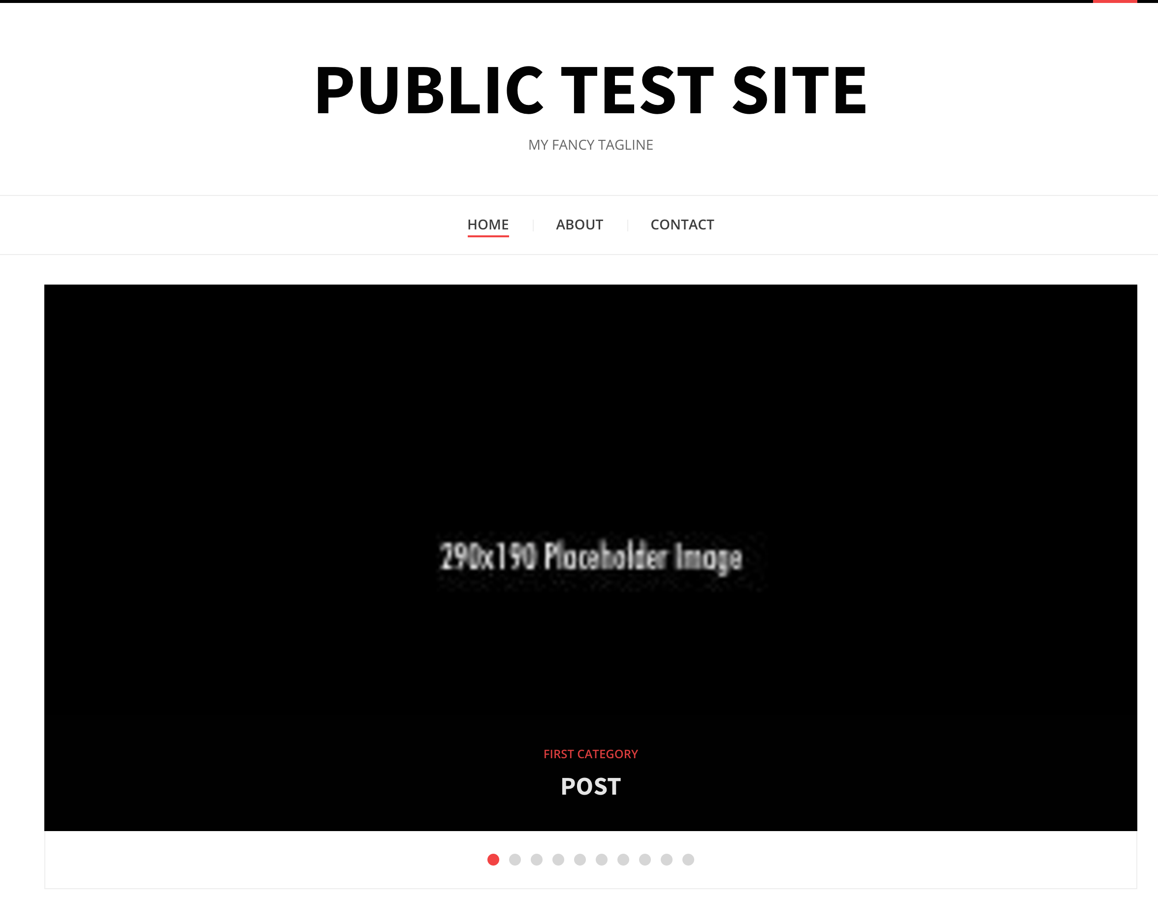
For example, here is a 290×190 image:

Here is what it looks like in the slider:
Let me know if that doesn’t address what you’re asking about with the slider images.
Everything is really shaping up thank you very much for all the help everyone has been giving me.
Awesome! I’m glad we’ve been able to help so far.
-
Thank you Dcole.
I will put them all in one widget box.
When looking at the site mobile the vertical wise the images are severely cut is there a way to show more of the image if not the whole thing?
Let me try to clarify. As far as the image box I have them at 425 x 425 now instead of at the 405 x 270. Scared said the width and height should be the same. When I crop an image to 1110 x 555 to make it featured it looks different compared to the other image posts that aren’t featured. I don’t like that so what I am asking is should I crop all images to 1110 x 555 even if they aren’t featured posts to all make them uniformed? It’s hard finding images to fit the 1110 x 555 the first place so I have to usually make a smaller picture bigger.
-
-
They still come down vertical on the iPad when it’s in the horizontal position.
For the social icons, remove these styles:
@media screen and (max-width: 992px) {
	#wpcom_social_media_icons_widget-4, #wpcom_social_media_icons_widget-5 {
		max-width: 40%;
		display: inline-block;
	}
}

@media screen and (max-width: 480px) {
	#wpcom_social_media_icons_widget-4, #wpcom_social_media_icons_widget-5 {
		max-width: 30%;
	}
}

.sidebar .widget_wpcom_social_media_icons_widget li {
    margin-right: 45px;
}
Then add these:
.widget_wpcom_social_media_icons_widget li {
     float: left;
     margin-right: 10px;
 }
 .widget_wpcom_social_media_icons_widget li:nth-of-type(2n+1) {
     clear: left;
 }
That should work across all screen/device sizes and orientations. If you add more, this will still limit the rows to holding two icons at a time.
When looking at the site mobile the vertical wise the images are severely cut is there a way to show more of the image if not the whole thing?
This should take care of the view on mobile phones:
@media screen and (max-width: 599px) {
     .display-posts-listing .listing-item a.image {
         max-height: none;
     }
 }
When I crop an image to 1110 x 555 to make it featured it looks different compared to the other image posts that aren’t featured.
Could you point me to an example of this so I can get a better understanding?
-
First of thank you Dcole for your help!
Right now the featured posts and the regular image posts on the pc look great I do not have an example it looks like the slider is cropping the images well enough.
The social media icons code is working well also I just couldn’t find the last bit of code where it has the 45px to delete. I can’t find that code to delete it.
The code that you had me insert for the mobile works well but I noticed when the mobile is vertical some pictures are bigger and some pictures are smaller. Like the wale shine and logic everybody is bigger than the beserek image. Is there a way to make all the images a uniform sized too? It only happens when the mobile is vertical.
-
The social media icons code is working well also I just couldn’t find the last bit of code where it has the 45px to delete. I can’t find that code to delete it.
No worries. I’ve just removed it for you. It may be easier for you to find bits of code if you copy all of your CSS into a text editor like Microsoft Notepad or TextEdit on a Mac. Then you can use the Find feature to search for things. I say this because there is a lot of CSS in your customizer now, and sometimes it can be easier if you can view it in a larger space.
The code that you had me insert for the mobile works well but I noticed when the mobile is vertical some pictures are bigger and some pictures are smaller.
Sure, so you can set a specific size in pixels in place of the none:
@media screen and (max-width: 599px) {
    .display-posts-listing .listing-item a.image {
        max-height: 200px;
    }
    .display-posts-listing .listing-item img {
        min-width: 355px;
    }
}
I added a bit of extra code there to make sure the images are all a minimum of 355px in width, because some of them (like Berserk) aren’t already that wide. This should make them all the same size.
Let me know if this helps.
-
-
-
Hmm, ok. If you use the full bit of code from my last reply, that should make things work. Right now, only the max width part is being used.
Let me know if that doesn’t change things.
-
Didn’t notice it was a full code. I thought it was just that 355 part. I did that and now everything looks uniform. Thank you.
The biggest thing now is to have an expert just comb thru any conflicting css with the current display. Code that’s either duplicate or unwanting so it’s easier to navigate.
-
Glad I could help!
As far as reviewing all of the CSS, so long as the site is working as it should, you’re good to go.
More than one person has helped you with the CSS, but ultimately the site looks the way you want now. Because you do not have access to change the underlying PHP of the theme, CSS is naturally overriding prior rules in order to make the site look different than it otherwise would.
If you’d like to hire someone to look through your CSS, you can check out https://jobs.wordpress.net or https://jetpack.pro.
-
Thank you Dcole and Scared for your help.
On the mobile is there a way to move my menu bar that’s in the middle to the left side and have the sticky logo in the middle? Remove the desktop banner from the mobile. I just want my drop menu to the left and the sticky logo in the middle.
-
Remove the desktop banner from the mobile.
Can you tell me what you are referring to as the desktop banner?
For the menu toggle, the following will move it to the left.
.toggle-menu-wrapper {
    text-align: left;
}
- The topic ‘Image location change’ is closed to new replies.
 WordPress.com Forums