Images on the front page of the Designfolio theme
-
I am having difficulties with images on the designfolio front screen when it shows a latest blog with a featured image. on a high resolution screen it cuts off the bottom of the picture but shows the full width which I don’t want. Can this be changed or edited in some way?
The blog I need help with is: (visible only to logged in users)
-
Hi there,
I believe you’re referring to the larger featured image that appears at the top of the home page. If so, you could definitely change the height of that element. In order to do so, you would need to purchase the Custom Design upgrade shown here:
http://en.support.wordpress.com/custom-design/
Then, you could use the following CSS code:
.flexslider .slides > li {
	height: 650px;
}
It would produce something like this:
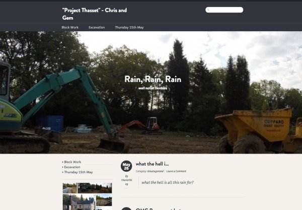
The height would be adjustable to achieve the look you want. Would that work for what you’re looking for?
-
I thought the image would scale depending on the device it was being viewed (PC, Ipad, Iphone) from but instead it just crops it which makes the image look terrible. should it scale??
-
Hi!
First, it looks like there is an issue with the slider content on mobile devices (it overlaps the other blog content). That appears to be a theme bug. I have alerted our theme developers, and I’ll let you know as soon as a fix is in place!
You’re correct in that the responsiveness of the theme does adjust the image a bit so it can display properly on mobile devices rather than distorting the image dimensions. Are you looking for the images to maintain their original size ratios (so appear as the entire picture)?
- The topic ‘Images on the front page of the Designfolio theme’ is closed to new replies.
 WordPress.com Forums