Increase post content size and other issues in CSS
-
Hi VCP (very clever people) Staff & volunteers.
I have just upgraded to the brand new Gallery theme. Im a little worried about it as it seems pretty sluggish on loading. Also Its meant to be a responsive theme, but on my iPad I have a problem displaying the header properly – the sides are cut off, although strangely the iPhone seems to work as it should.
Can anyone help me with a few issues im having & some CSS codes to fix?
1) the iPad header display issue.
2) I would like to increase the post content, from the default of 640 pixels to at least 860 (the post content just looks so tiny on the screen)
3) Its important to me that my site display category descriptions. I had the CSS code for this in my previous theme of Triton Lite, but this coding doesnt show up correctly on the Gallery theme. (I can send screen shots of my previous theme if you’re not sure what I mean by this)
4) I would like to neaten up the widgets at the bottom of the home page. I would prefer these to be smaller in neat rows of 3 widgets.
5) I would like to add Pinterest & other options such as eBay to the social media links in the menu.
6) I would like to reduce the size of the footer, or at least make it useful to add footer widgets.
Many thanks, if anyone can help.
The blog I need help with is: (visible only to logged in users)
-
Hi there!
1. For the iPad header issue, add the following custom CSS, which appears to take care of the issue and keeps the entire header visible at all screen/device sizes.
#header {
    background-repeat: no-repeat;
    background-size: contain !important;
}
2. The following takes the static and single post pages from the 700px max width to 920px max width, which will give you 860px clear for images. In the “Content Width” field at Appearance > Customize > CSS, add 160px to the default content width.
.single #container, .page #container, .error404 #container {
    max-width: 920px;
}
3. On the category descriptions, can you upload the screenshots to your media library and then post links to those so we can take a look at them. That will be very helpful.
4. Let’s try and @media rule and limit the 3 row widget width to 980px, which is the point where the post display goes drops from 3 columns to two. You can add the following and then narrow down your browser window to see how it works. One thing I noticed is that you have a blank text widget in your widget area, which is causing some spacing issues. It is right below the “My Web Links” widget. Remove that widget and the Profile widget will then align with the others to the left of it.
@media screen and (min-width: 980px) {
.widget-zone > ul > li {
max-width: 33%;
}
}
5. Right now there isn’t a way to add additional services via Publicize, but you can add social icons to the menu. I’m going to be away for a little bit, but will return to this thread this evening and give you some CSS and instructions for getting started on that, if you want to do it.
6. See what you think of the footer widget area now that we have made it three columns in #4 above. The widgets and widget content can be restyled and changed to make them appear smaller than they are now. The space above the follow widget is due to the fact that the theme will align the widgets in rows, so the tallest widget in the first row determines where the second row of widgets will be placed below.
-
Hi and thank you so much for your support.
The post content size now looks so much better, as do the widgets – although there doesn’t appear to be any way to resize some of them e.g. gravatar (theres no option for it.)
The iPad header issue is also much better, it shows all its content but still doesn’t look as it should. I don’t understand why when its a responsive theme.
Re the category descriptions, I have a feeling it was you that helped me with it before on the last theme Triton Lite. Heres a screenshot showing what i mean. Categories
With point 5, i know how to add links to sites and services on the menu is that what you meant? It was the little black icons that come as theme options that i was hoping to add to.
Is there a way to reduce the size of the footer? The bit that says ‘blog at wordpress’, it seems overly large. Is there a way to add a widget into it?
One last thing, I was told that if you have a premium theme that you can get premium support. I posted all this on the gallery theme support pages and have had no response at all. Are the theme makers aware they have a responsibility with this?
Im so grateful that you helped me out here, thanks once again. :)
-
Here is what I see on my iPad: https://i.cloudup.com/9mEisadjQH.jpg .
On the iPhone, the image gets very small and the header area is pretty tall compared to the header image.
iPhone portrait orientation: https://i.cloudup.com/FjVWBlwEGs.jpg
I’ll work on the iPhone view along with the social icons after firing this off.
I see by looking at your Creative Photography category page that you have the descriptions showing now.
On #5, there isn’t a way to add to the existing social icons built into the theme itself. What you would have to do is abandon those and then put the social icons into the menu as menu items (we can use the available icons so they will look just like the ones used now). Sorry I didn’t get back to you with some sample code for that. I’ll do that just as quick as I reply to your other questions.
Footer: You can reduce the height of the greenish area with the following. Just adjust the 40px value (top/bottom margin) as desired.
#footer {
margin: 40px 0'
}
Yes, premium themes come with support directly from the theme designer. If you click on Themes to the left on the main forum page, and then click on Premium themes, there will be another link that takes you to the Premium Theme Support forum. There is a listing of the separate Theme forums on the left.
Or, given that is sort of a lengthy trip, you can click here: http://premium-themes.forums.wordpress.com :)
-
Hi, thanks for returning to this. Ive been in touch with the premium theme support and they say they are unable to help me with CSS codes for individual customisation. So I guess I’m in the right place here then.
Re social media icons, the theme makers say they’re in the middle of creating a different solution instead of using publicize. However I was intrigued by your suggestion. I have actually created my own set. Are you saying an image can be used as a menu item? If so could I use my own then?
How strange! On my iPhone 5s the header looks fine, its the iPad which has too much padding.
I copied the code for the footer but it doesn’t appear to have changed.
Since the descriptions have now been added by the theme makers. I would like to alter the format a little if possible. These were my requests to the premium support which they are unable to help me with:
The spacing between the widgets and the comments section within posts is too large. Can this be reduced?
Within a post my custom made ‘social media’ text widget just won’t display correctly – no matter how I seem to arrange them. Both the spacing and widget are fine on the home page.
I would like to widen the category description to the page width. I also would prefer that these allow me to have a space or bullet points etc. Also can the light green border outline be replaced with a more complementary colour to my site. e.g. turquoise?
Thanks once again, you’re a star! ⭐︎
-
The spacing between the widgets and the comments section within posts is too large. Can this be reduced?
The extra spacing appears to be coming from the Facebook Like Box widget you’ve added in the third widget column.
Go to Appearance > Widgets in your dashboard, find “Sidebar on Single Posts” on the right, and you should see the “Facebook Like Box” there. If you click the arrow to the right of that widget, there are options to adjust the width and the height. Try changing those until you find the dimensions that work best for you.
-
Within a post my custom made ‘social media’ text widget just won’t display correctly – no matter how I seem to arrange them.
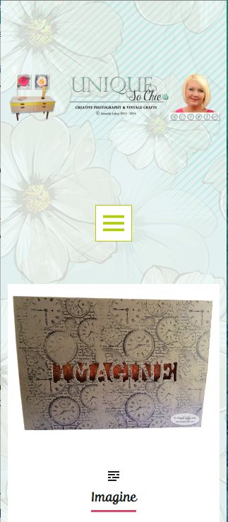
Are you talking about the ones in the widget titled “MY WEB LINKS” at the bottom of posts like http://uniquesochic.com/2014/02/12/imagine/ ?
Apologies in advance if I missed this from earlier, but could you describe what you mean when you say they won’t display correctly? Right now, they look good to me, but I’m not sure how you were trying to get them to look.
-
I would like to widen the category description to the page width.
Give this a try:
.archive-header {
	max-width: 1320px;
}
I tested it on http://uniquesochic.com/category/creative-photography/
-
I also would prefer that these allow me to have a space or bullet points etc.
My apologies but that’s not something that is available. I noticed extra line returns work so you could approximate a bulleted list by adding something like this to the category description:
nbsp;
bull; one
bull; two
bull; three
Edit: wow, I couldn’t get the formatting for that last example to work at all, try adding an ampersand character to the front of each line and then add it to a category description.
-
Also can the light green border outline be replaced with a more complementary colour to my site. e.g. turquoise?
.custom-background .archive-header:before, .custom-background .archive-header:after { background-color: turquoise; } -
Thank you, ill look more at these tonight. However for the category descriptions I just copied in the codes for the green border outline and also the width and these had no effect.
You asked: Are you talking about the ones in the widget titled “MY WEB LINKS” at the bottom of posts like http://uniquesochic.com/2014/02/12/imagine/ ?
Apologies in advance if I missed this from earlier, but could you describe what you mean when you say they won’t display correctly? Right now, they look good to me, but I’m not sure how you were trying to get them to look.
Yes that is the widget I mean, within a post the icons are vertical. (not what i intended) On the home page they display correctly .
-
However for the category descriptions I just copied in the codes for the green border outline and also the width and these had no effect.
I don’t see them added in your custom CSS right now. Are you sure you saved properly?
-
Yes that is the widget I mean, within a post the icons are vertical. (not what i intended) On the home page they display correctly .
Okay, I checked http://uniquesochic.com/2014/02/12/imagine/ again and I see that there are two social media icons per row now instead of one. It looks like you may have adjusted a whole slew of things at once and that might have gotten you turned around with regard to how big you want those widget containers to be. Because of how you’ve setup your social media icons as links in a text widget, they will adjust to fit whatever space is given and in a previous answer to your question about cleaning up the widget space, thesacredpath suggested this CSS:
@media screen and (min-width: 980px){
	.widget-zone > ul > li {
		max-width: 33%;
	}
}
That basically makes the widget containers smaller and so the icons are lining up with fewer per row because the container space for them is smaller.
Try this just in the preview screen to visualize where those containers are:
.widget-zone > ul > li {
	border: 2px dotted red;
}
Then try removing the whole 33% rule (shown above) to see how the container sizes change.
-
-
I re-tested them and they work for me. :)
If you’d like me to have a look at why they might not be working for you, add them back to your site and reply back here. I’d be happy to take a look.
-
Hi there designsimply. Thank you for your help. :) Im not sure why some codes didn’t work the first time but some are now! Heres an update of my queries.
Issue with the green border – now solved.
Issue with the description width – now solvedIssue with reduction of footer space (where it says blog at wordpress) – not resolved.
Issue with the widgets, I followed your suggestions and removed the code for it – after trying various figures to no avail. I still want to neaten this area up. How can I make the widget section have 3 container spaces instead of 2? – not resolved.
Thanks once again.
-
Let’s take each issue one at a time.
Issue with reduction of footer space (where it says blog at wordpress) – not resolved.
Here’s what you said earlier:
6) I would like to reduce the size of the footer, or at least make it useful to add footer widgets.
And this:
Is there a way to reduce the size of the footer? The bit that says ‘blog at wordpress’, it seems overly large. Is there a way to add a widget into it?
I also see that you had some help in the way of a suggestion to adjust the margins for #footer, but I also noticed there was a typo in it. Instead of a single quote for at the end of the margin line, it should have been a semi-colon. Also, it should have been “padding,” not “margin.” Here is a corrected snippet:
#footer {
	padding: 20px 0;
}
Do you see how the syntax was wrong before?
I think it might look nice to remove the background color and border from the footer area all together and also get rid of all the extra padding. Here’s an alternate solution you can try out, instead of using the snippet above, to see what you think:
#footer { background: none; border: none; padding: 0; } -
Thank you very much designsimply.
Ah so that was why it had no effect. Yes I quite agree with your last suggestion so have gone with that one. :)
Just the widget issue left now then.
Thanks once again.
-
Issue with the widgets, I followed your suggestions and removed the code for it – after trying various figures to no avail. I still want to neaten this area up. How can I make the widget section have 3 container spaces instead of 2? – not resolved.
Looks like we gave some tips before to neaten the footer area up before, but they didn’t work out for you. First, I noticed the widget layout is slightly different on the home page compared to posts, and that looks like it’d by design to me.
Let’s focus on the widgets in posts. Here is an example post so we’re clear on exactly what we are both looking at:
http://uniquesochic.com/2014/02/18/monotone-sculptures-iphoneography-black-white/#sidebar-singleIt looks to me like the widgets on posts are setup to display in a grid and they actually look pretty neat and tidy to me already. I can tell there’s something you want to change about it… but I’m not sure exactly what you mean when you say you want to neaten the area up. You did mentioned having 3 container spaces instead of 2, so let’s try that.
There are probably several different routes you could take to do the same thing here. Based on the widgets I see on single posts right now, removing the margins and adjusting the widget widths and making it so there are essentially 3 columns instead of 2 may help. However!, for this to work, you also will need to adjust the contents of some of your widgets. The reason is that this next idea is based on what are called “floats” in CSS. What we’re going to do is get rid of the margins for each widget and float them all to the left. In browsers, that means they’ll stack into a grid and each one will fall to the next line — but it will stack kind of funny if something from the first column gets in the way of something else wrapping.
Add this CSS in the live preview to see what I mean:
@media screen and (min-width: 760px) {
	.single .widget-zone > ul > li {
		margin: 0;
		max-width: 33%;
	}
	.single .widget-zone > ul > li:nth-child(odd) {
		clear: none;
	}
}
Because of this, the order of the widgets and how much space each one takes up matters a lot.
So, what I would recommend is editing the text in the copyright notice widget to make it about two lines shorter than it is right now. If you don’t want to modify the wording, we could also try adjusting the font size using CSS, but I think you should try adjusting the wording first.
Try editing the copyright notice text first and then try previewing the CSS example above. You may need to keep adjusting the widget text until you get the right configuration. Another trick I use in CSS is to add temporary red borders around things so I can visualize where they are when I’m working in the live preview. Try adding this just in the preview to see what I mean:
.widget-zone > ul > li { border: 1px dashed red; } -
Hi there designsimply. Thank you so much for all your advice and help. Its really strange, im struggling to understand how the widgets on this theme work! I changed some widgets around today and added some new ones. It actually looks really cool and also quite neat – in 3 columns!! No idea why, but thank goodness for that – I daren’t mess with it any more LOL :D
- The topic ‘Increase post content size and other issues in CSS’ is closed to new replies.
 WordPress.com Forums