is it possible to move side nav (#site-navigation) to the top of the browser window
-
Is it possible to move the side nav (#site-navigation) to the top of the browser window on the desktop (so it can match my mobile version).
This is for my client’s site:
https://mygoodmeasure.wordpress.com/I am happy with the navigation on the home page – its just the navigation for the rest of the site.
Thanks
The blog I need help with is: (visible only to logged in users)
-
Hello,
Saw your other thread as well, figured we can handle both at once. :)
How can I move home menu up so it almost joins the heading block I’ve created above it.
This is for my client’s website:
https://mygoodmeasure.wordpress.com/div.menu-home-menu-container{ margin-top: -10px; }Is it possible to move the side nav (#site-navigation) to the top of the browser window on the desktop (so it can match my mobile version).
@media screen and (min-width: 791px) {
	#secondary{
		position: absolute;
		top:0;
		right: 10%;
	}
}
This wouldn’t be a great solution if you plan to add other widgets, but as it is this absolute positioning works pretty well.
Let me know if you have any other questions.
-Alex G.
-
Hiya,
The home menu moved up a treat thanks!
The #site-navigation css works until you click for more detail on either a blog article or in the portfolio page, where the nav drops down to a weird spot..
On these pages also, the author and date isn’t in the best place on the desktop version (in the dark blue bar I’ve created) However, on the moblie version, they’re sat underneath the blue bar aligned left – looks much better. Can I force the desktop version to do the same?
Also, I think I’ve asked for your help on this before but as I only work part time, think your response got lost in amongst numerous emails! I’d like my #site-navigation titles to go white when they’re in the down state. Currently they are bold which I might lose if I can make them white instead.
Thanks again
-
The #site-navigation css works until you click for more detail on either a blog article or in the portfolio page, where the nav drops down to a weird spot..
On these pages also, the author and date isn’t in the best place on the desktop version (in the dark blue bar I’ve created) However, on the moblie version, they’re sat underneath the blue bar aligned left – looks much better. Can I force the desktop version to do the same?That author and date is exactly the problem.
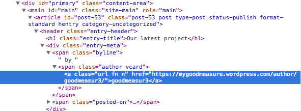
Looks like single-post pages handle the #secondary column differently from the rest of the site, in order to handle that .entry-meta information.
In order to move that section out of the way to raise the #secondary column, we’d have to do a lot of changes to the #primary column as well — and honestly, I don’t know how to do it without assuredly breaking the display of many future blog posts.
But if you can figure out a way, the section that’s in the way is here in the dev tools:
Also, I think I’ve asked for your help on this before but as I only work part time, think your response got lost in amongst numerous emails! I’d like my #site-navigation titles to go white when they’re in the down state. Currently they are bold which I might lose if I can make them white instead.
By ‘down stat’e I’m not sure if you’re referring to when the links are being hovered, active, or if it’s on the selected page (i.e. how ‘about’ appears on the about page. how ‘contact’ appears on the contact page.)
We were last discussing it here though:
https://en.forums.wordpress.com/topic/reposition-the-navigation-to-be-horizotal-not-as-sidebar
Making an element bold is determined by the font-weight property, not its color. So making it white will not change it being bold.
-
Hi again,
I’ve moved the sidenav back where it was – as me trying to find a solution as we had it, just wasn’t going to happen!!
Instead, what I’d like to do is differentiate the H1 on my home page from my H1’s elsewhere on the site. I’d like to extend the blue bar block behind the text (as it was) on the Home page, but keep it to 100% on the other pages. Is that possible? If so, that would resolve things (as by shortening the blue bar on the other pages would mean the author/date wouldn’t be overlapped etc)
Thanks
-
Ok, have gone back to the original emails and tried everything you’ve suggested. Its not working as I want. Bear with me!
I’d like…
– The active and hover state of the text links in both the home nav and the #site-navigation nav to be white (as well as not bold). I realise my home page currently wouldn’t have nav title as active, but that might change going forward.
– The hover state of the background blocks to go lighter on the home nav as it does currently on #site-navigation.
Can you provide the css for this – as I just can’t do it!!
Thanks
-
Hi again,
Instead, what I’d like to do is differentiate the H1 on my home page from my H1’s elsewhere on the site. I’d like to extend the blue bar block behind the text (as it was) on the Home page, but keep it to 100% on the other pages. Is that possible? If so, that would resolve things (as by shortening the blue bar on the other pages would mean the author/date wouldn’t be overlapped etc)
It sounds like you want this bar to extend all the way across:
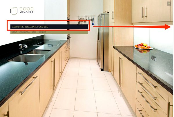
… but only do this on the home page. Previously you wanted the same out of the menu bar, so I’ll do both and then you can just decrease the width of your menu beneath the h1 however you’d like.
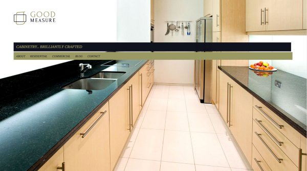
To do this we’ll need to expand not only that #main h1 element on the home page, but all of it’s parent divs widths as well. Because it’s maximum width is not just contained on its own, but also the divs called #primary, #content, and #page… which are going to affect things like your logo and menu too.
So start with this:
/*Expand the home page title, and all its parent divs, areas only on the home page*/

.home #page , .home #content , body.page.home #primary , .home #main{
	width: 100%;
}
That gets you here:
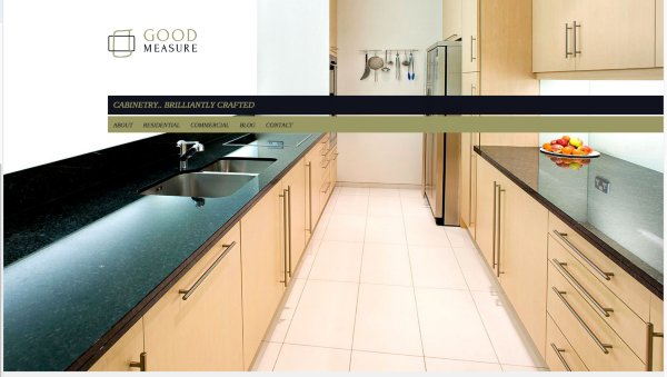
Next, add some left margin to reposition them all back…
/*Add left margin to reposition*/

.home #page{
	margin-left: 15.8%;
}
And the bars now extend all the way over, but the logo, menu, and title appear where they were.
– The active and hover state of the text links in both the home nav and the #site-navigation nav to be white (as well as not bold). I realise my home page currently wouldn’t have nav title as active, but that might change going forward.
Here’s the hover rule:
/*Make navigation links white and not bold on hover*/

#site-navigation a:hover , #secondary .menu li.current_page_item>a:hover ,
#menu-home-menu a:hover{
	color: #fff !important;
	font-weight: normal;
}
But it sounds like by “active” you’re actually referred to the selected item.
“Active” means what happens to the link once it’s been clicked, but the new page hasn’t loaded yet. Your theme has a class for “current page item” that’s currently making your current page item bold. This is different from being ‘active.’
Do you want your active items to be white, or your current page items to be white?
– The hover state of the background blocks to go lighter on the home nav as it does currently on #site-navigation.
This is the rule being used for the other pages’ navigation, but their
aelements have more padding, so the background changing has a fuller effect. I’d recommend you similarly had more padding to your home menu./*Background hover rule*/ #menu-home-menu li a:hover{ background-color: rgba(255,255,255,.2); }-Alex G.
-
All worked beautifully thanks!
To answer your question, its the current page item that I’d like to be just white please (and not bold, dark blue)!
Finally on this, how do I reduce the space between each nav title on the home menu? I’d like to make all the titles fit on a mobile screen. Don’t mind how it is on a desktop – so if its only code for a mobile thats ok.
Thanks as always
-
Try this out for the side navigation:
#secondary .menu li.current_page_item>a , #site-navigation li.current_page_item a{
	color: #fff !important;
}
Here’s an attempt for the home menu, though I don’t really have a way to test it out:
.menu-home-menu li.current_page_item>a , menu-home-menu li.current_page_item a{ color: #fff !important; } -
The #site-navigation works fine now thanks.
I added the other one too – and added my home page into the menu to test it. However, my home link isn’t showing up in the menu so can’t see if its worked or not either! Its definitely been added the home menu and not #site-navigation..
Any ideas on reducing the gap between the home page menu titles too?
-
Looks like it’s the same distance on all screen sizes, so pixels should be fine here:
div.menu-home-menu-container{ margin-top: -11px; } -
No I meant between each title on the actual navigation!
So for example – between the titles About and Residential, between Corporate and Blog and between Blog and Contact. I’d like them to sit closer together.
Sorry If I wasn’t clearer. You’ve been so helpful!
-
I’d recommend going into your Menu settings and adding a CSS class to all the items except “About”, then select that replace that class you create with code like this:
#menu-home-menu li.customcssclasshere{ margin-left: -5px; } -
How do I go into menu settings? I wouldn’t know how to add a css class to each title anyway, that being said! Can you be a bit more specific?
Thanks
-
You can find the Menu settings here:
https://mygoodmeasure.wordpress.com/wp-admin/nav-menus.php
Instructions for adding CSS classes to menu items are here:
https://en.support.wordpress.com/advanced-menu-settings/#css-classes
-
Hi,
I can see how to show the CSS classes to the menu items now but otherwise unsure how to alter things.
I have tried adding to each menu item’s class what you’ve put e.g.
#menu-home-menu li.customcssclasshere{
margin-left: -5px;
}and changed customcssclasshere to corporate, residential etc
The just tried adding margin-left: -5px; by itself in each class.
Nothing works of course as I guessing!
-
Hi, just to let you know, I’ve resolved this with someone via the Live chat. You’re off the hook!!
Thanks for being patient anyway!
- The topic ‘is it possible to move side nav (#site-navigation) to the top of the browser window’ is closed to new replies.
 WordPress.com Forums