Logo Alignment on Goran Theme
-
Hello, I want my logo to be on the same line as the site title and menu. Currently when I upload the logo (regardless of size), the site title is moved to a line below it. Thanks.
The blog I need help with is: (visible only to logged in users)
-
Hi there, to do this would require the WordPress.com Premium Plan upgrade, which has the Custom Design feature allowing custom CSS. The following would be the code required.
You can try out and preview custom CSS before you buy as explained here.
.site-title { background: transparent url("https://ivanandlydia.files.wordpress.com/2015/09/logo3.png?w=74") no-repeat scroll left top /contain; } .site-title a { padding-left: 90px; } .site-branding { max-width: 400px; width: 100%; } .site-logo { display: none; } -
Thanks, it looks good on the webpage view. Is there a way to prevent the title from going to the next line in the ipad or phone view?
Still trying it out in the preview mode. -
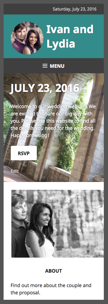
I’m not sure what you mean. On mobile, this is what I see:
Blueish greenish background with Ivan and Lydia title
Then a smaller greyish background with the Menu
Then the background image with the horseshoe pillar things and the title July 23, 2016, with the paragraph underneath.It looks good to me, what is the desired look?
-
Hi, see if this does what you are wanting. Add this below any other custom CSS you have.
@media screen and (max-width: 1019px) { .site-branding { max-width: 100%; } .site-title { text-align: left; padding-left: 120px; } .site-title a { padding-left: 0; } } -
Thanks! Now it looks perfect on the webpage and tablet screens. The phone screen, however, shows the title and logo on top of each other. Ideally the logo would reduce in size so the title can fit on the same line without being overlaid. Is there a way to do that?
-
Hi, I can’t check your site on a phone since you do not have the upgrade, but when I go into your customizer and put in the code and then use the mobile preview button, this is what I see: https://cldup.com/EqAgO-Efcv.png . Is that not what you are seeing?
-
When I do the same thing, my preview has the logo taking up more than half the blue space. The three words take up three lines and half of the words fall on the logo. However, do you think it might just be a preview issue? It may look ok when I have it saved.
-
I must be going crazy. I don’t see that logo (the round picture of Ivan and Lydia) on mobile or desktop. I just see the title “Ivan and Lydia”
-
Yes, because I am still in preview mode, I haven’t bought the premium yet which allows the custom CSS.
-
-
@ivanandlydia, given I’m seeing things correctly in your customizer preview in my browser, I would say it is a preview issue with your browser. I checked in Chrome on my Mac, and it works for me there also.
If you decide to purchase the Premium plan, and there are alignment issues after you do, we can fix those.
- The topic ‘Logo Alignment on Goran Theme’ is closed to new replies.
