Menu alignment and table display
-
Hi everyone.
Recently I’ve added another page to my site’s main menu and the buttons I had to the right aren’t aligning properly when shown on a 9.7 tablet (ideally they would be aligned to the far right, horizontally with the text menu items). I have some CSS customizations that might be causing it, but I’m unsure on how to fix it.
Additionally, my main page has a table that has also received some CSS love, but when viewing it on same screen size devices (iPhone 5 and iPhone SE, specifically), one seems to read the CSS, while the other ignores it, making for a terrible design and reading experience.
As usual, your expertise is very much appreciated.
Cheers!
The blog I need help with is: (visible only to logged in users)
-
Recently I’ve added another page to my site’s main menu and the buttons I had to the right aren’t aligning properly when shown on a 9.7 tablet (ideally they would be aligned to the far right, horizontally with the text menu items). I have some CSS customizations that might be causing it, but I’m unsure on how to fix it.
I’m not sure exactly what you’re seeing, but you may want to experiment with reducing the amount of space between each menu item – something like:
#site-navigation li {
  margin-right: 15px;
}
Make sure to put this above all other menu-related custom CSS in your editor.
Additionally, my main page has a table that has also received some CSS love, but when viewing it on same screen size devices (iPhone 5 and iPhone SE, specifically), one seems to read the CSS, while the other ignores it, making for a terrible design and reading experience.
Where exactly are you seeing the problem?
– device
– iOS
– browserDoes this device/browser ignore other custom CSS or just the CSS related to the table? Does the problematic device match the media-query sizes you’ve used for the table CSS?
Could you please upload a screenshot showing the issue to help in troubleshooting?
Here’s a guide on how to make a screenshot:
http://en.support.wordpress.com/make-a-screenshot/You can upload the screenshot – in a graphic format like JPG, PNG, or PDF – in your Media Library so I can see it.
-
Hi Kathryn,
Thanks for your input!
You can check the first issue I’m having on this screenshot: https://brlingo.files.wordpress.com/2017/01/ipad.png
I’ve tried to experiment with your suggestion (reducing the amount of space between each menu item): even though that solves the layout issue on tablets, it creates a problem on smaller devices (when one has to touch the menu button to expand it, exposing unaligned entries underneath it). If they could remain in place on smaller devices, it would be optimal.
And here you can check what happens in the second issue:
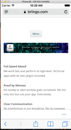
iPhone 5: https://brlingo.files.wordpress.com/2017/01/ip5.png
iPhone SE: https://brlingo.files.wordpress.com/2017/01/ipse.pngBoth devices use the latest iOS version and Safari for browsing. I believe the SE is completely ignoring the CSS, as other customized components seem to be ignored as well. Any reason behind this?
Thanks again for your valuable input!
-
And here you can check what happens in the second issue:
iPhone 5: https://brlingo.files.wordpress.com/2017/01/ip5.png
iPhone SE: https://brlingo.files.wordpress.com/2017/01/ipse.pngBoth devices use the latest iOS version and Safari for browsing. I believe the SE is completely ignoring the CSS, as other customized components seem to be ignored as well. Any reason behind this?
Thanks for the screenshots, let’s look at the iPhone SE issue first. I tested your site on iPhone SE running iOS 10.0 with Safari, and it looks OK there:
Could you please let me know exactly what iOS is running on the SE? I know you said the “latest” but just to be sure, please go under Settings > General > About and let me know exactly what it says next to Version.
Could you also check on a different browser on the SE, like Firefox of Chrome?
-
I’ve tried to experiment with your suggestion (reducing the amount of space between each menu item): even though that solves the layout issue on tablets, it creates a problem on smaller devices (when one has to touch the menu button to expand it, exposing unaligned entries underneath it). If they could remain in place on smaller devices, it would be optimal.
Ah yes, let’s wrap the menu spacing changes in a couple of media queries:
@media screen and (min-width: 600px) {
  #site-navigation li {
    margin-right: 10px;
  }
}
@media screen and (min-width: 960px) {
  #site-navigation li {
    margin-right: 30px;
  }
}
What this does is apply the smaller menu-item margin in two steps, so the smaller screen has a bit less maring, preventing the social icons from going onto two lines. Let me know how it goes.
-
Hi Kathryn,
Thanks for the screenshots, let’s look at the iPhone SE issue first. I tested your site on iPhone SE running iOS 10.0 with Safari, and it looks OK there:
Could you please let me know exactly what iOS is running on the SE? I know you said the “latest” but just to be sure, please go under Settings > General > About and let me know exactly what it says next to Version.
Could you also check on a different browser on the SE, like Firefox of Chrome?
The iOS version was 10.2.1 – right after installing and checking the site on Firefox, Safari seems to have gotten jealous and displayed it properly. Go figure. Thanks for taking the time to check this oddity and for suggesting the use of a different browser.
Ah yes, let’s wrap the menu spacing changes in a couple of media queries:
[…]
What this does is apply the smaller menu-item margin in two steps, so the smaller screen has a bit less maring, preventing the social icons from going onto two lines. Let me know how it goes.
And so it does; this is exactly what I was looking for. Your Happiness Engineer title is surely appropriate.
Thanks again for taking the time to walk me through this. Much obliged!
-
Glad to hear you’re all set! I’ll mark this thread as resolved but feel free to start a new one if you need help with anything else.
- The topic ‘Menu alignment and table display’ is closed to new replies.
 WordPress.com Forums