Menu CSS
-
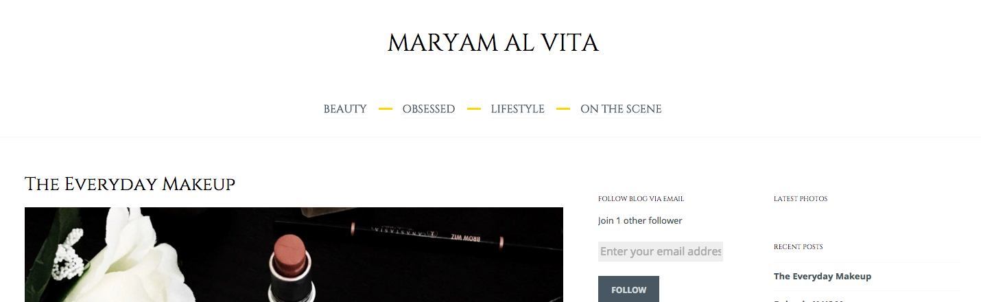
Hello! I am using the ceruano theme with a premium plan. Currently my menu is at the top left corner. Is there a CSS to change this and to have me menu under my heading centred. I would also like to have a gold dash in between them and no arrow beside them. Thanks in advance
The blog I need help with is: (visible only to logged in users)
-
Hi there,
This will swap the position of the header and the menu, center the menu and reduce the padding between the header and the menu so it looks a little better:
#site-navigation div.menu-menu-1-container {
  display: table;
  margin: 0 auto;
  float: none;
}

#masthead {
  display: -webkit-box;
  display: -webkit-flex;
  display: -ms-flexbox;
  display: flex;
  -webkit-box-orient: vertical;
  -webkit-box-direction: normal;
  -webkit-flex-direction: column;
      -ms-flex-direction: column;
          flex-direction: column;
}

.site-branding {
  -webkit-box-ordinal-group: 2;
  -webkit-order: 1;
      -ms-flex-order: 1;
          order: 1;
  padding-bottom: 1.6em;
}

#site-navigation {
  -webkit-box-ordinal-group: 3;
  -webkit-order: 2;
      -ms-flex-order: 2;
          order: 2;
}
And this will hide the arrows after each menu item:
.main-navigation ul li.menu-item-has-children > a:after,
.main-navigation ul li.page_item_has_children > a:after {
  display: none;
}
The golden dash, do you want it between the menu and the header or between each menu item?
-
Thank you!! Is there a CSS so that the menu is under the main title instead of above? I would like a gold dash between the menu e.g. beauty / obsessed / lifestyle
Can I match the menu font to the title font and take it down a size?
-
You’re welcome. :)
I’ve adapted the code a bit so that your site looks like this:
https://cldup.com/o750P9yBQo.pngJust replace the previous code with this:
#site-navigation div.menu-menu-1-container {
  display: table;
  margin: 0 auto;
  float: none;
}

#masthead {
  display: -webkit-box;
  display: -webkit-flex;
  display: -ms-flexbox;
  display: flex;
  -webkit-box-orient: vertical;
  -webkit-box-direction: normal;
  -webkit-flex-direction: column;
  -ms-flex-direction: column;
  flex-direction: column;
}

.site-branding {
  -webkit-box-ordinal-group: 2;
  -webkit-order: 1;
  -ms-flex-order: 1;
  order: 1;
  padding-bottom: 1.6em;
}

#site-navigation {
  -webkit-box-ordinal-group: 3;
  -webkit-order: 2;
  -ms-flex-order: 2;
  order: 2;
}

.main-navigation li {
  margin-right: 3em;
}

.menu-item a::before {
  content: "";
  display: block;
  width: 20px;
  height: 3px;
  background: #ffd700;
  position: absolute;
  top: 10px;
  right: -37px;
}

.sub-menu .menu-item a::before,
.main-navigation .menu li:last-of-type a::before {
  display: none;
}

.main-navigation ul li.menu-item-has-children > a:after,
.main-navigation ul li.page_item_has_children > a:after {
  display: none;
}

.main-navigation ul {
	font-family: "Cinzel",serif;
	font-weight: 400;
}
This should work, but I’ve checked your site with the previous code and it looks like the some of the flex box lines gets filtered out by WordPress.com. If that’s the case there is no easy way to change the position of the header and the menu.
Let me know if this works! :)
-
Hi
Thanks again. When I put it into the CSS the menu appears under the header however as soon as I press save & publish it goes back to the top. Is there anything else I can try to change this?
Also sorry this is a minor detail but I meant slash instead of dash(/). The colour also appears more yellow. Is there a specific colour code to get more of a dark golden?
Thanks :)
-
-
Replace the #masthead rule with this and see if this doesn’t take care of it.
#masthead { display: -webkit-flex; display: -ms-flexbox; display: flex !important; -webkit-box-orient: vertical; -webkit-box-direction: normal; -webkit-flex-direction: column; -ms-flex-direction: column; flex-direction: column; } -
@michaelvandenberg, complex but effective solution. Thanks for all your help in the forums. It is appreciated.
-
thanks!! :)
how can i add a black bar behind the menu, change the menu to a white colour and remove the yellow dash?
Is there a css to have a scroll of posts underneath the menu? (i.e. http://www.harpersbazaar.co.uk) and also have my posts displayed like this – to remove the side bar and allow the image to be on the right hand side instead of under the title?
-
To remove the yellow dashes and give the top navigation a black background with white text, add the following.
.menu-item a::before {
	background: none;
}
@media screen and (min-width: 600px) {
	#site-navigation {
		background: #000;
	}
	#site-navigation a {
		color: #fff;
		border-color: #fff;
	}
}
This is designed to only change the navigation for the full navigation, not the touch device navigation that becomes active below 600px.
-
Hello
Thanks for the assistance so far.
– Is it possible to use my blog picture (which appears in the tab) to replace the A in ‘Al’ in my heading?
– is it possible to have a row of posts (like here:http://zanita.com)
– can i remove the 2 side bars on the left and have squares of posts (like a posted note- like the ones near the bottom of http://zanita.com)It is definitely a process of trial and error untill i reach the final finish! :)
-
maryamalvita – could you please start a new thread in the CSS forum for your additional questions? Thanks!
https://en.forums.wordpress.com/forum/css-customization#postform
- The topic ‘Menu CSS’ is closed to new replies.
 WordPress.com Forums