Menu dissapears in landscape on mobile phone in Responsive theme
-
Hello,
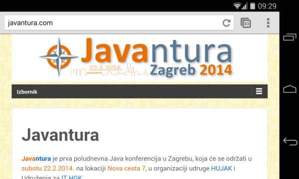
I’m using Responsive theme (http://theme.wordpress.com/themes/responsive/) on my sites http://javantura.com and http://javacro.org hosted on wordpress.com.
The problem is that MENU DISAPPEARS when it is viewed on a mobile phone in landscape mode, while in portrait it is ok.I have found this problem also with Responsive theme demo on wordpress.com (http://responsivedemo.wordpress.com).
To be sure, I have tested it on Samsung Galaxy S4 (1080×1920), Galaxy S4 mini (540×960), and Galaxy Note 2 (720×1280), with native Android browser and Chrome browser, and it is always same problem.It is important to notice that the same Responsive theme in wordpress.org demo on wp-themes.com or in Cyberchimps demo (http://demos.cyberchimps.com/responsivepro/) doesn’t have this problem.
To show you what I mean here are screenshots I have uploaded to my site.Portrait mode without menu problem:
http://javantura.files.wordpress.com/2014/01/wordpress-com-responsive-demo-portrait.png
http://javantura.files.wordpress.com/2014/01/javantura-com-responsive-demo-portrait.png
http://javantura.files.wordpress.com/2014/01/javacro-org-responsive-demo-portrait.png
http://javantura.files.wordpress.com/2014/01/cyberchimps-responsive-demo-portrait.png
http://javantura.files.wordpress.com/2014/01/wp-themes-responsive-demo-portrait.pngLandscape mode WITH MENU PROBLEM:
http://javantura.files.wordpress.com/2014/01/javantura-com-responsive-demo-landscape-problem.png
http://javantura.files.wordpress.com/2014/01/javacro-org-responsive-demo-landscape-problem.png
http://javantura.files.wordpress.com/2014/01/wordpress-com-responsive-demo-landscape-problem.pngLandscape mode without menu problem:
http://javantura.files.wordpress.com/2014/01/cyberchimps-responsive-demo-landscape-no-problem.png
http://javantura.files.wordpress.com/2014/01/wp-themes-com-responsive-demo-landscape-no-problem.pngCan someone please see what is the problem and if it is possible fix Responsive theme menu installed on wordpress.com?
If it cannot be fixed I will have to give up on Responsive theme.
Please help, thank you.Regards,
BrankoThe blog I need help with is: (visible only to logged in users)
-
Hi,
Which version of Android and of the Chrome browser is on your device? I can test with a Nexus 4, which shows the menu as expected:
Thanks!
-
Hi,
thank you for reply and testing it. :)
My Galaxy S4 is on Android 4.3 with stock browser and Chrome 31.0.1650.59 and Galaxy S4 Mini is on Android 4.2.2. with stock browser and Chrome 32.0.1700.99,
I have also tested it today with Galaxy S2 on Android 4.1.2 with stock browser and Chrome 30.0.1599.92, and on old HTC Wildfire S on Android 2.3.5. and it looks OK, like on your Nexus 4.
But in the meantime I have also discovered a problem on Nexus 7 1st generation (1280×800) on Android 4.4.2 with Chrome 32.0 1700.99 and also on Nexus 7 2nd generation (1920×1200) on Android 4.4.2 with Chrome 32.0 1700.99. While in portrait mode it is OK, in landscape I get a full menu similar to desktop browser (nice), but with fourth item in two rows (probably it cannot fit, I will try to size text down) and with opened Follow tab (?!) which cannot be closed down in any way and which is after that always visible even in portrait.
Nexus 7 portrait: http://javantura.files.wordpress.com/2014/01/nexus-7-portrait.png
Nexus 7 landscape with PROBLEM: http://javantura.files.wordpress.com/2014/01/nexus-7-landscape-with-problem.png
Once again original Cyberchimps demo looks OK on Nexus 7, but Responsive theme demo on wordpress.com doesn’t http://javantura.files.wordpress.com/2014/01/wordpress-com-demo-on-nexus-7-landscape-with-problem.pngIf it depends on Android version I don’t understand why this doesn’t show on Responsive theme demo in wordpress.org (wp-themes.com) or in original Cyberchimps demo, but only on wordpress.com blogs?
Also, I don’t understand this problem with Follow tab and is it somehow connected with menu problem, layers, divs or something similar?
IMHO Responsive theme implemented on wordpress.com is having some real menu problems …
Can anyone else confirm problems on default demo (http://responsivedemo.wordpress.com)?
Thank you. -
One other finding for Nexus 7 – when I remove some menu items from primary menu and make primary menus shorter (e.g. 75% of full width), “Follow” tab is working correctly. :)
So, it is all the same problem with menu dissapearing and acting strange in landscape. -
I have also asked for help on Cybershimps forum, but they can’t help because it is up to how responsive theme is installed on wordpress.com :(
-
-
-
Hi,
I can’t replicate your original issue with the menu not appearing at all with any browser/device combination. The menu at the smaller sizes is generated using Javascript. If there’s some type of connection issue that is preventing your device from downloading the script being used to generate it, or if your device is set to not use Javascript, or if a corrupted copy of the script is saved in your device’s cache, those reasons could explain why it isn’t rendering for you.
I can duplicate the Follow tab issue, so I’m asking our theme folks to take a look at it.
Thanks!
-
Thank you for everything you’ve done so far.
Here’s also a thread on Cyberchimps forum regarding this problem, but so far there’s no solution http://cyberchimps.com/forum-topic/menu-dissapears-in-landscape-on-mobile-phone-on-wordpress-com-responsive-theme/#post-147071
Do you maybe have any Samsung device with Android 4.3+ around?
As I mentioned, I’ve seen this problem on Galaxy S4 (Android 4.3, stock browser and Chrome 31.0), Galaxy S4 Mini (4.2.2., stock browser and Chrome 32.0, as well as friend’s Galaxy Note II.One other thing is that when I’m changing orientation from portrait to landscape it seems like there is a menu for a fraction of the second and then it disappears, and the whole div with content moves up for a size of menu. It looks like that div which holds menu is hidden and lower content div is somehow pulled up.
It happens even if I remove the header image completely.
So far I have 3 sites on Responsive theme on WordPress.com, and it’s kind of a problem. :(
-
I have found the reason why it affects only certain phones. :)
It is noticeable that horizontal resolution up to 635 shows the menu, and from 636-650 up doesn’t, while from 651 up it shows full menu as on desktop.
There is an online simulator that shows the problem:
Good in portrait: http://quirktools.com/screenfly/#u=http%3A//javantura.com&w=360&h=640&a=38
Bad in landscape: http://quirktools.com/screenfly/#u=http%3A//javantura.com&w=640&h=360&a=38
Good on resolution smaller than 636: http://quirktools.com/screenfly/#u=http%3A//javantura.com&w=635&h=360
Good with full menu on resolution wider than 650: http://quirktools.com/screenfly/#u=http%3A//javantura.com&w=651&h=360
It this last example there is also unwanted header resize in full resolution.Maybe this will help?
-
It is also noticed on the default Responsive theme demo:
http://quirktools.com/screenfly/#u=http%3A//responsivedemo.wordpress.com/&w=635&h=360
http://quirktools.com/screenfly/#u=http%3A//responsivedemo.wordpress.com/&w=636&h=360
http://quirktools.com/screenfly/#u=http%3A//responsivedemo.wordpress.com/&w=650&h=360 -
That would explain why I couldn’t duplicate it! I’ve passed this on to the theme folks as well. I can’t duplicate it with a browser window (which I’d expect to reflect the same), but with the Screenfly links, that should give them enough to go on.
Thanks for the detailed research on this.
-
CyberChimps team suggests that you also make sure you’ve updated to the current version of Responsive theme.
-
-
Howdy,
I wanted to post a brief note that the issue of the menu not loading between 636 and 650 has been patched and released. The other issues you mentioned are still being looked at.
Cheers!
-
Thank you very much! :)
I can confirm that even on my device menu looks great :)
We will be using WordPress.com and Responsive them for our two conferences and some other sites.
-
Hello,
I am checking in to see if you are still having menu display issues on the Nexus 7?
Let us know if you have any questions.
-
Hi,
the problem I still see is with “+Follow” button and Follow dialog. It can be reproduces on javantura.com site in landscape like this: http://javantura.files.wordpress.com/2014/01/nexus-7-landscape-with-problem.png
I will describe it in detail: “+Follow” (e.g. “+Prati” in Croatian) button is not visible at all in portrait mode and I don’t think it is correct behavior, but it’s not a big problem. The real problem can be seen when I change it to landscape mode and I suddenly see not only +Follow button but the whole Follow dialog expanded for entering email address with “Sign me up” button. If I press “+Follow” button it doesn’t collapse the dialog, but it expands up the dialog a little bit more, and after I press it again it just collapses for a few pixels down. It continues to work that way and the dialog never collapses. If I now change it back to portrait mode, than the “+Follow” button with expanded Follow dialog is also always visible, and has the same behavior as in landscape mode, so it never collapses. The whole behavior is that toggling the +Follow button only collapses the lower part of the dialog where it stands “Powered by WordPress.com”.
The only way it works correctly is to shorten primary menu to less than 75% of its full width e.g. to add fewer items to primary menu. I have tested it on Nexus 7 1st generation (1280×800) on Android 4.4.2 with Chrome 32.0 1700.99 and also on Nexus 7 2nd generation (1920×1200) on Android 4.4.2 with Chrome 32.0 1700.99. Unfortunately, it cannot be reproduced on online simulator?! :(
Can you reproduce it somehow, on any device with 1024×600+ resolution in browser?
One other problem on javantura.com is that Facebook widget cannot be less than 300px in width. If i put e.g. 250px it automatically puts 300px and resizes the widget back.
Can it be somehow fixed?Thanks in advance,
Branko
- The topic ‘Menu dissapears in landscape on mobile phone in Responsive theme’ is closed to new replies.
 WordPress.com Forums