Motif theme – frontpage content no longer responsive
-
Hi everybody!
I’ve changed the position of the front page content area on my blog: orangemediatique.fr.
Now, it looks good on large screens but it’s no longer responsive.
Is there a way to keep it like this on large screens AND responsive for smaller devices?
Cheers,
MarineThe blog I need help with is: (visible only to logged in users)
-
Hi Marine, I’ve looked at your site and it is responsive to me, clear down to smartphone size. Did you get this solved?
-
Hi!
No, I haven’t changed anything.
Until now, I was using the tool provided by WP to check my design on other kind of screens.
Because of that, I thought that the content area was not visible on smartphones BUT it seems ok on my iPhone. I’ve just checked! However, I’ve discovered a new problem: the background image (the slices of orange) is not visible. Do you think there is something I can do?On iPad mini, the content area appears only partially (it goes out of the screen). Is there a way to avoid that?
Mille mercis!
Marine -
You have the mobile theme that is designed for use with fixed width themes. Go to Appearance > Mobile and deactivate the mobile theme. You may have to clear the browser cache on your phone to see the change.
-
Hi!
Thanks a lot for your answer.
I’ve deactivated the mobile theme.
On iPad mini, it doesn’t change anything. The content area is still truncated.
On iPhone, the background image is back but I’ve lost the content area. Is it possible to have both of them?Cheers,
Marine -
I’m seeing everything fine on my iPad Air in both portrait and landscape orientation (768px and 1024px) although the space above your site title image could be less. On my iPhone, I’m noticing a huge about of space at the top of your site (above the header image you have. The following will reduce the space on both iPads and iPhones. It also resizes the text area overlaid on the image at 900px so that it doesn’t flow off of the side of the page.
@media screen and (max-width: 900px) { .front-page-content-area .with-featured-image .hentry { width: 650px; } } @media screen and (max-width: 768px) { .site-image { height: 100px; } } @media screen and (max-width: 480px) { .site-image { height: 50px; } } @media screen and (max-width 336px) { .site-image { height: 25px; } } -
Thanks! Thanks! Thanks!
The first piece of code works beautifully!
I’ve tried the 3 others but it doesn’t seem to change anything. I probably did something the wrong way… -
Hi, I tried the code again and it all works for me. Put all that code at the very bottom of your existing Custom CSS so that there isn’t a possibility of something below it overriding one of our settings.
-
-
Ah, I just noticed that you have the Mobile theme active at Appearance > Mobile. Since the theme you are using is responsive to all screen sizes and devices, deactivate the mobile theme.
-
If I deactivate the mobile theme, the content area of the front page disappears on iPhones (at least, on mine!)…
-
-
I see that too!
And here is what I see when I active the mobile theme:
http://orangemediatique.files.wordpress.com/2014/05/captureiphonewithmobiletheme.pngDo you think I can have a mix of these two options (the background image + the content area)?
-
Hi!
Can you explain more by what you mean when you say “background image + content area”? Currently, I’m seeing the same layout as Richard when the mobile theme is disabled:

This displays everything that is on the front page of your site when it’s viewed from a traditional monitor.
-
Hi Jeremy!
Sorry the late answer.
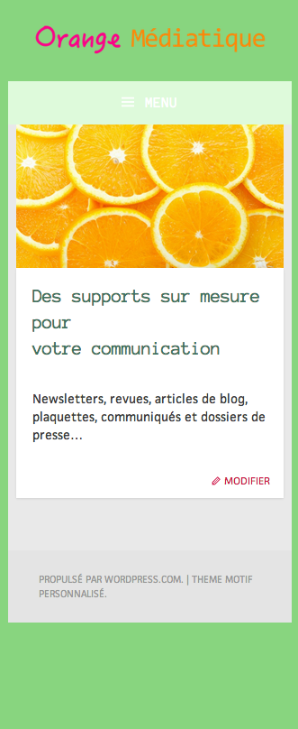
What I call “background image” is the image with the orange slices and “content area”, the text box that says “Des supports sur mesure pour votre communication…” (which is missing on iPhones when the mobile theme is deactivated).
Does that help? -
Hi!
Ah, I apologize for the misunderstanding. So, it looks like this is a result of a snippet of custom CSS you’re using. The content should be displayed beneath the image like this:
However, part of the CSS code is pushing the image out. Can you try switching the following CSS?
.front-page-content-area .with-featured-image .hentry {
	margin-top: -350px;
	margin-left: 50px;
	width: 800px;
}
This should do the trick:
@media screen and (min-width: 900px) {
	.front-page-content-area .with-featured-image .hentry {
	margin-top: -350px;
	margin-left: 50px;
	width: 800px;
}
Give that a try and let me know if that works!
-
Hi,
A million thanks for the tip!
I’ve tried this:
@media screen and (max-width: 640px) {
	.front-page-content-area .with-featured-image .hentry {
		margin-top: -20px;
		margin-left: 5px;
		width: 300px;
	}
}
It seems to work!
https://orangemediatique.files.wordpress.com/2014/06/captureiphone2.pngI’ve also added this:
@media screen and (min-width: 640px) and (max-width: 1000px) {
	.front-page-content-area .with-featured-image .hentry {
		margin-top: -300px;
		margin-left: 60px;
		width: 600px;
	}
}
in order to have a nice display on iPads and… it’s working!
However, doing these modifications, I’ve noticed something strange: on old iPhones and old iPads, the header image (that shows “Orange Médiatique…”) doesn’t appear.
You can see it on that other screenshot:
https://orangemediatique.files.wordpress.com/2014/06/captureiphone3.pngIs there something I can do to change this?
-
It looks like this issue is caused by the following snippet:
.site-image {
	background: url('http://orangemediatique.files.wordpress.com/2014/05/logoorangemc3a9diatiquelongvert.png') no-repeat scroll center bottom / cover rgba(0,0,0,0);
	height: 150px;
	background-size: 100% auto;
}

.site-image img {
	display: none;
}
I’m still trying to figure out the best solution going forward. I’ll let you know when I do!
-
Great, merci!
I tried to find a solution myself but I am too new with CSS… Maybe one day I’ll be a jedi too!
- The topic ‘Motif theme – frontpage content no longer responsive’ is closed to new replies.
 WordPress.com Forums