Move Latest Posts Higher Up On the Page
-
I have a sticky “Welcome Message” post that shows on my front page. Underneath I have it so that it shows my latest post. The problem is that there is a huge gab between the welcome message and my latest post. Is there any code I can add to move the post higher up on the page, or remove some of the gap? Thank you!
The blog I need help with is: (visible only to logged in users)
-
Hi.
You have rigth now a 10% vertical padding at your “TAYLOR’S SPOOKY STORIES” message. You need to modify this value by using the next CSS code.
media="all"
.site-header-image {
   padding-bottom: 6%;
}
You can try with different values to adjust this gap to your needs.
I hope this helps you. Enjoy blogging
-
Thank you for your reply. Actually, the issue is not with the header. I don’t wish to move my header at all. I want to remove the space between my welcome message and the post entitled “Mr. Thomas and the Mysterious Black Cat”. There is a little border in between, and there is almost no space above the second post, but a lot of space below the first Welcome post. I want to reduce that space a bit so it looks more even
-
Ok. I see.
If you delete the border you will save a lot of space.
.hentry {
    border-bottom: 0px none rgb(238, 238, 238);
}
Take a look and check if it is enough. :)
-
-
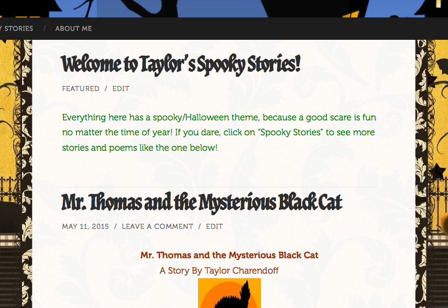
Hi, I’m not seeing a large gap between Welcome… and Mr. Thomas… Here is what I’m seeing: https://cldup.com/xOJ4NXVl4w.png
If that is the gap you are talking about, add this at the end of your custom CSS and see what you think.
.sticky .entry-content { margin-bottom: 0; } -
Thank you that solved it! Your other suggestion for my other question worked as well! Could you potentially help with another issue? On my laptop, the background I have fits my screen fine, but on my larger computer with a bigger screen the background doesn’t completely fill the screen. Do you know why this is or how I can fix it so that it adjusts with screen size? I’m also not sure that it looks right on tablets… so far it looks okay with the mobile setting, it just doesn’t have any of my custom css but I don’t mind that for mobile viewing. I just want to make sure that when people are on their desktops or laptops, no matter what it will look right.
-
Try adding this to your custom CSS, which makes the background adjust to the width of the monitor/screen/window.
body.custom-background {
    background-size: cover;
}
- The topic ‘Move Latest Posts Higher Up On the Page’ is closed to new replies.
 WordPress.com Forums