move site title above header image in Libre theme
-
Hello …
I would like to move my site title from where it currently is (below header image) to directly above the header image, left-justified. I have a premium account so I can add custom CSS but I don’t know how to find (or enter) the code that will do this.
Can someone help me? My blog address is http://www.gypsyhausfrau.com
Thank you!
The blog I need help with is: (visible only to logged in users)
-
Hi there, go to Appearance > Customize > CSS, delete all the informational text in that window, and paste in the following custom CSS and see what you think. Make sure and view your site on a tablet and phone if possible to make sure that everything works correctly, especially the menu on phones.
.site-title { position: absolute; top: 0; } .site-header { position: static; } .custom-header { padding-top: 100px; margin-top: 20px; } .site { margin-top: 50px; } .menu-toggle { margin-top: 20px } -
Hi! Thank you for your swift response! I think I may have found a workaround with a static front page and removing the header image entirely, which also solves a few other problems.
While I have you here, is there a way to move the share buttons (currently at the bottom of my front page) to the top, right underneath my site title?
I would be so grateful … I think I almost have everything where and how I want it.
Thank you!
-
What we can easily do is to move the sharing icons to the top of the front page content area. By doing it this way, we don’t run into problems with things going awry on smaller screens/windows. This targets your home page only.
.home .hentry { position: relative; padding-top: 90px; } .home .hentry div.sharedaddy { position: absolute; top: 0; width: 100%; } -
That almost works, but the position is awkward … any way to move the share buttons either directly above or directly below the site title on the front page? Right now they show up right in the middle of the page. Can we left-justify them to line up with the site title?
I returned to the recent posts format for the front page in response to some feedback from readers. I would love to add a sidebar (for the Recent Posts, a custom menu, and Categories widgets) right on the front page.
Is that possible?
-
… any way to move the share buttons either directly above or directly below the site title on the front page?
I’m reluctant to use position:absolute; to take the sharing buttons on the home page outside of the .hentry div due to the way the design of the theme header area flows on smaller screens. On phones, the sharing buttons would crowd and interfere with the menu making it difficult to select.
Here is all the code I used above, and one additional bit of code I added at the bottom to reduce the bottom margin on the .site-header dive to move the sharing buttons up closer.
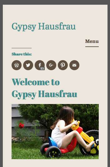
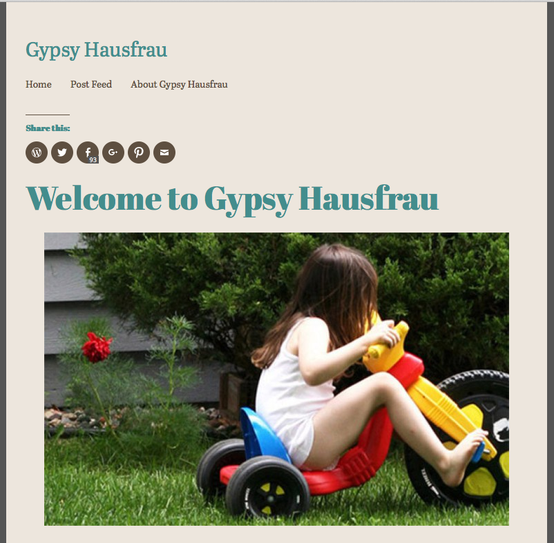
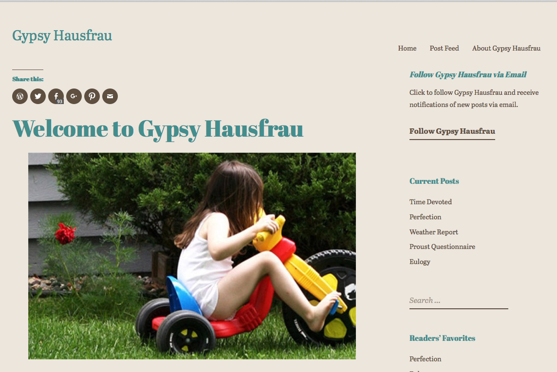
.site-title {
    position: absolute;
    top: 0;
}
.site-header {
    position: static;
}
.custom-header {
    padding-top: 100px;
    margin-top: 20px;
}
.site {
    margin-top: 50px;
}
.menu-toggle {
  margin-top: 20px
}
.home .hentry {
    position: relative;
    padding-top: 90px;
}
.home .hentry div.sharedaddy {
    position: absolute;
    top: 0;
    width: 100%;
}
.home .site-header {
	margin-bottom: 2.0em;
}
Here are three screenshots of what the above looks like to me. You can adjust the 3.0em value as desired. It was 5.35em originally.
Phone: https://cldup.com/0MXfXUdz_W.png
Tablet: https://cldup.com/woGl_v89fM.png
Desktop/laptop: https://cldup.com/xWEqpP__t4.pngSee what you think about the above and let me know.
-
-
-
Shoot … I spoke too soon … the menu for laptop/desktops and smaller tablets works, but the menu on phones won’t open ( I tried three different ones) and the menu on my Android tablet, which is on the larger side, shows up too close to the site title.
Any way to fix that?
-
Ah, we can fix that. I should have checked that. Find the .menu-toggle rule in your custom CSS and add the following to it
z-index: 1;
so that it looks like this..menu-toggle { margin-top:20px; z-index: 1; } -
Yes! It works ;-)
While we’re at it, is there a way to make the menu more prominent by changing font color and size?
-
Given your site’s design, maybe try using a larger font size for the menu:
.main-navigation a {
font-size: 1.25rem;
}
If you want to change the color too, maybe try this instead:
.main-navigation a {
font-size: 1.25rem;
color: #438D8D;
}
Of course, you can adjust the above font size and color as you desire. You can use hex codes for color — this will give you some reference:
http://www.w3schools.com/HTML/html_colornames.asp
Since you seem very interested in customizing your blog, and really making it your own, I encourage you to have a look at our guide on CSS. There’s lots of awesome resources in there! :)
-
Hi, we can do that. Add the following and adjust the color and font size as desired. This will affect both the desktop menu and the touch menu for phones.
.main-navigation a { color: #cc0000; font-size: 120%; } -
I AM interested in customizing my blog, but I confess that CSS completely intimidates me … I’m a writer! Code is scary ;-)
I love how the menu looks now, but my site title shrinks to almost nothing when I scroll down. Is that because I made the menu bigger? How do I fix THAT?
Maybe I should just invite you to Thanksgiving dinner ;-)
Does it help that I am deeply grateful? -
No, that is how the theme is designed. If you wish to have the site title maintain the original size, you can add the following CSS to override the change in font size.
.singular .site-title {
    font-size: 1.8125rem;
}
- The topic ‘move site title above header image in Libre theme’ is closed to new replies.
 WordPress.com Forums