Problems with mobile theme
-
The disable mobile theme option isn’t working for my blog & I no longer have the option to switch between mobile and full view at the bottom of the page when viewing on a mobile. How can I fix this?
The blog I need help with is: (visible only to logged in users)
-
Hi there,
Currently, with the mobile theme disabled, here’s what I’m seeing when I visit your site:
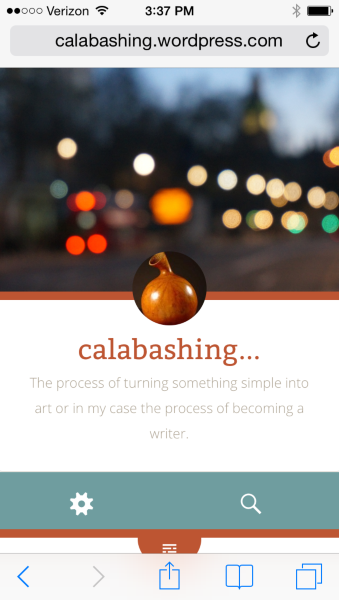
This is to be expected as the Fictive theme adapts to the size of your browser. Therefore, it doesn’t offer a “View Full Site” option as the theme is mobile responsive. It’s just adjusting to the size of your browser.
On the other hand, when I enable the mobile theme under your mobile settings here:
https://calabashing.wordpress.com/wp-admin/themes.php?page=mobile-options&settings-updated=true
This is what I see:
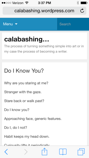
At the bottom of that version, I do see a “View Full Site” option.
Can you let me know if that’s what you’re experiencing as well?
-
Thanks for your reply.
Yes I see the same things you do, also when I enable the mobile theme.
The view full site option gives me the adapted version I was trying to change in the first place, which sounds like all I’m going to get with this theme?
At least I understand what’s happening now!
Thanks for your help:)
-
Ah – I understand. Yes, when you switch to the full version, you’ll see the responsive design of the theme, which will automatically adjust to be a bit smaller on your phone. That’s a function of the theme referred to as “responsive design”. Since it’s a function of the theme, the responsive nature can’t be toggled off.
Let me know if you need anything else!
- The topic ‘Problems with mobile theme’ is closed to new replies.
 WordPress.com Forums