reposition the navigation to be horizotal not as sidebar
-
With the above site, is it possible to reposition the navigation so its at the top as a horizontal navigation, not as a sidebar on the right? At least for a mobile screen? Ideally above the logo, aligned left, rather than to the right of the logo..
If so, I’d need the css to reposition the home screen nav as well as the nav for the rest of the site. And so it works on a mobile of course (better than it does now)
The blog I need help with is: (visible only to logged in users)
-
Hi @laurapalmerwp,
It’s certainly possible to reposition the navigation using CSS, but I think it would be far easier to start with a theme that already has this type of navigation you’re looking for in place already. Moving the navigation can create an assortment of issues with various screen sizes. What do you think about Sela as a theme?
https://selademo.wordpress.com/
It offers the menu across the top of the page. On mobile devices, the menu is hidden behind a menu icon as shown here:
Would that work?
If you’re set on the Capoverso theme and moving the menu with CSS, you will need to consult with an outside designer. We’re only able to provide small tweaks to themes rather than more involved design overhauls.
-
Hmm.. this is going to be tricky as my client is set on this theme.
Is there not a simpler workaround? For example – on the mobile version, could I replace the current navigation with a link/or button which says Menu that, when clicked, takes people down to the footer, where the navigation could live instead. Or is that even more complicated?!
-
I’m afraid that’s going to be even more complicated (we still need to move the menu into the footer). I would suggest going with a different them if your client could budge!
-
Ok final suggestions just to try your patience!
First one – I doubt we can do either but wanted to check. Could we keep the sidebar menu where it is but make it a show/hide menu? So, it just says Menu until clicked and then all the menu titles would be revealed underneath.
I know that only works in certain browsers but I know it works on the iPhone and iPad – so actually, it doesn’t matter if it doesn’t work anywhere else (and the full menu is shown instead).
Failing that, I’ll have to restyle it to work better. However, currently I can’t restyle it at all! Could you send me the the CSS for it? What I’d like to do is, change the font to match my headings font and reduce the line height. I’d also like to put one block of colour behind the menu if that’s possible too. That way, it won’t look like it’s misaligned on the mobile
Thanks for helping as per usual!
Laura
-
Hello! :)
Could we keep the sidebar menu where it is but make it a show/hide menu? So, it just says Menu until clicked and then all the menu titles would be revealed underneath.
Capoverso has no flyout menus available like this. We can hide the menu entirely with one property of CSS, but the theme provides us no buttons to push to unhide it. Interactivity like this requires Javascript (or another interactive language) and can’t be added unless the theme already has it.
Menus can be toggled in themes like Fiore or Largo.
What I’d like to do is, change the font to match my headings font and reduce the line height. I’d also like to put one block of colour behind the menu if that’s possible too. That way, it won’t look like it’s misaligned on the mobile
Here’s some CSS to help with those issues
/*Change menu font to match my headings font*/

#site-navigation, #site-navigation a{
     font-family: "Times New Roman", Times, serif;
     font-style: italic;
     color: #9a9867 !important;
}

/*Reduce line height within menu*/

#site-navigation li{
     	margin-bottom: -3%;
}

/*Add background color to the menu*/

#site-navigation{
	     background: #fff;
}
I’m sure you’ll want to play around with different sizes for the “-3%” number and choose another background color than white (#fff). You can find hex values for colors using tools like ColorHexa.
-
Hi Alex,
Thanks for helping out on this one. I have added that code and can see things looking a bit better (client wants to keep to this template so we have to work with it!) I’d like to improve on what I have done – but need a bit more help..
You’ll see on the desktop, the padding for the side menus background colour is fine. On the mobile, its too much at the bottom i.e. the margin between under ‘Contact’ to the perimeter of the gold box is too large. Also, the line height on the mobile doesn’t reduce like it does on the desktop and that’s where I’d like it to be less!
How can I alter the down and hover states on this menu?
Is it possible to bring the position of the website logo down from the top of the page at all? I realise that would push all the other content down – but am hoping that I can then align the baseline of the logo with the baseline of the background box of the sidebar menu on the mobile..
Also, on my home page, I have now also added the background colour to the nav menu there to make it match the rest of the site – but there are gaps between each menu title. Is there anyway I can change it to be one long block behind the menu titles? Lastly, I can’t seem to make these menu titles plain in style.. they’re bold currently..
Thanks again!
-
Hi again! :)
On the mobile, its too much at the bottom i.e. the margin between under ‘Contact’ to the perimeter of the gold box is too large. Also, the line height on the mobile doesn’t reduce like it does on the desktop and that’s where I’d like it to be less!
Here’s code for that, but be careful with eliminating space between links on mobile views. It makes it harder for the reader to click the link they’re going for. Less space = more confusion.
/*Adjust background height on mobile/tablet*/
/*Adjust line height in the same media query*/

@media screen and (max-width: 790px){
	#site-navigation{
		height: 107.359px;
	}
	#site-navigation li{
     	margin-bottom: -6%;
}
}
How can I alter the down and hover states on this menu?
Use the CSS selector:
#site-navigation a:hover{
    /* insert properties */
}
Is it possible to bring the position of the website logo down from the top of the page at all? I realise that would push all the other content down – but am hoping that I can then align the baseline of the logo with the baseline of the background box of the sidebar menu on the mobile..
There’s currently 80 px of bottom margin on the logo. This reduces it to 40px:
.site-branding{
	margin-bottom: 40px;
}
Use that same selector, but within an @media query to adjust its placement on mobile.
Is there anyway I can change it to be one long block behind the menu titles? Lastly, I can’t seem to make these menu titles plain in style.. they’re bold currently..
One long block:
div.menu-home-menu-container{
	background: #9a9867;
}
Normal instead of bold:
.menu-home-menu-container li>a{ font-weight: normal; } -
Hi Alex,
Thanks for all that.
Moving the logo down worked on my iphone without needing to add a media query.. How would I add it if I do need to add it for other mobile platforms? Like I’ve attempted below….
@media screen and (max-width: 790px){
.site-branding{
margin-bottom: 40px;
}How do I get the hover states that I currently have on #site-navigation – onto the Home menu? As in, the blocks behind each nav title go lighter on #site-navigation – so want to make the home menu the same. I will want to make the blocks behind the titles go darker (now I’ve changed the colours I’m using) so will need the css for both #site-navigation and the home menu.
Not sure I have worked out how to alter the states of the text used in the menu titles on the Home menu… The down state ought to be bold, like on #site-navigation
Also, Is there anyway I can make the block behind my home menu extend to the right hand edge of the page?
Thanks again.
-
Moving the logo down worked on my iphone without needing to add a media query.. How would I add it if I do need to add it for other mobile platforms? Like I’ve attempted below….
@media screen and (max-width: 790px){
.site-branding{
margin-bottom: 40px;
}This CSS will affect only devices with screen sizes less than 790px, and would cover phones and most tablets. Deciding what breakpoints (i.e. 790px vs. 760px, an arbitrary number I chose for this example) you want to use really just depends on how your site is behaving at various screen widths.
How do I get the hover states that I currently have on #site-navigation – onto the Home menu?
You can add CSS properties to hover states using this CSS selector:
:hoverhttp://www.w3schools.com/cssref/sel_hover.asp
So this will allow you to change your home menu…
.menu-home-menu-container a:hover{
/* properties here*/
}
Not sure I have worked out how to alter the states of the text used in the menu titles on the Home menu… The down state ought to be bold, like on #site-navigation
Try using the
:activeCSS selectorhttp://www.w3schools.com/cssref/sel_active.asp
Is there anyway I can make the block behind my home menu extend to the right hand edge of the page?
/*Extend home menu color to right edge of page*/ div.menu-home-menu-container{ width: 200%; } -
why doe adding the code (below) for positioning the logo on mobiles affect extending the block behind the home menu? That code you gave me for that worked until I added the mobile code in! Code I added was…..
@media screen and (max-width: 790px){ .site-branding{ margin-bottom: 40px; }
Also, I tried adding a hover state to the buttons with:
menu-home-menu-container a:hover {
background-color: yellow;
}But there’s no change…
Hopefully it’ll all work soon and I’ll stop hassling you all!!
-
why doe adding the code (below) for positioning the logo on mobiles affect extending the block behind the home menu? That code you gave me for that worked until I added the mobile code in! Code I added was…..
@media screen and (max-width: 790px){ .site-branding{ margin-bottom: 40px; }I added this code, exactly as you’ve shown and I’m not seeing any effect on the background color’s width:
Also, I tried adding a hover state to the buttons with:
menu-home-menu-container a:hover {
background-color: yellow;
}
But there’s no change…You’re missing a ‘.’ character in the class selector. Try this out:
.menu-home-menu-container a:hover{ font-weight: bold; } -
I’ve added the home menu media query code again – and its worked this time..?!
With the hover css….
.menu-home-menu-container a:hover{
font-weight: bold;
}works – but…
.menu-home-menu-container a:hover{
background-color: yellow;
}…doesn’t work.
Which ‘.’ am I missing?!
An on that, I’m not sure what the hover state for #site-navigation is actually – as can’t find it with the inspector tools (or just don’t recognise it)
Thanks Alex
-
Which ‘.’ am I missing?!
You had been missing a . before your class selector (Screenshot)
With the hover css….
.menu-home-menu-container a:hover{
font-weight: bold;
}
works – but…
.menu-home-menu-container a:hover{
background-color: yellow;
}
…doesn’t work.Take a look at what Inspect Element shows with that code:
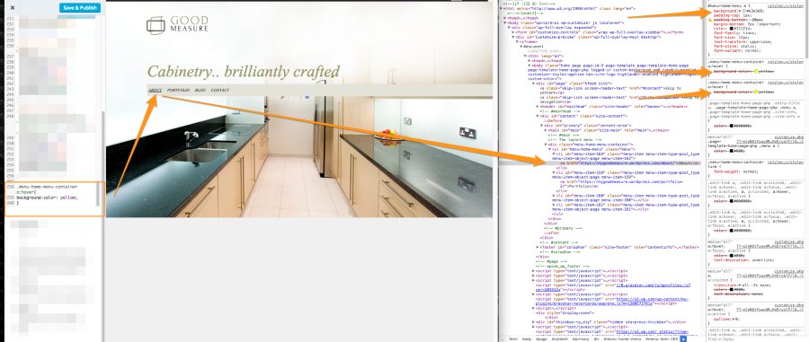
The rule for #menu-home-menu a is still affect it, so the hover state is being disregarded. Change the CSS to this:
#menu-home-menu a:hover{
background-color: yellow;
}
And now it’s working.
An on that, I’m not sure what the hover state for #site-navigation is actually – as can’t find it with the inspector tools (or just don’t recognise it)
Try opening up the page, then in the Inspector highlight one of the elements. (Example.)
Then in your page, hover over that element and watch the style change in the inspector.
(Example)
It appears the :hover rule currently is this:

- The topic ‘reposition the navigation to be horizotal not as sidebar’ is closed to new replies.
 WordPress.com Forums