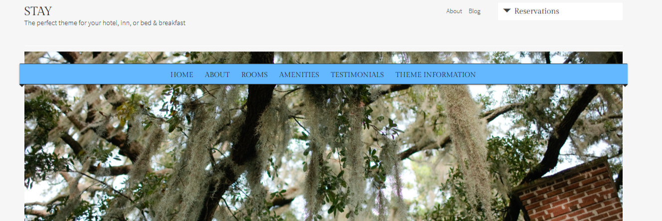
Ribbon effect for main menu in Stay theme
-
Hi there…is it possible to produce a very simple ribbon effect on the main menu in the Stay theme with CSS (similar in look to what is on the Organization theme sample)? I have used border-radius code on my navigation-main selector to get a rounded effect, and increased the menu width to get it to extend beyond the featured image at each edge, but am at a loss as to how to get a shadow effect to make it look like it is wrapping around.
My site is currently private.
Any help is much appreciated.
Thanks
The blog I need help with is: (visible only to logged in users)
-
If you want to make a shadow, you can use this generator to make the code for you :
http://css3gen.com/box-shadow/
Hope this helps !
-
@Francis–that’s a handy and timesaving website with which I was previously unfamiliar. Thanks!
@jlanglois2014 do let us know if you are able to make this work with a box-shadow. I investigated how they did the effect with the Orgainzation theme as well as found an article about css ribbons in general (http://css3.wikidot.com/blog:wrap-around-ribbons-with-css) but wasn’t able to find anything that didn’t require access to the HTML as well as the CSS.
-
@Lizthefair, yeah, it’s pretty nice !
@jlanglois2014 / @Lizthefair, I’ll try something tonight when I’ll be home, seems that the link @liz posted needs proper HTML markup but I’ll try to ‘piggyback’ the menu code with the ribbon one.
-
It’s roughly made, but I think you can tune it up a little bit by playing in the code. Looks like this : http://snag.gy/IOEVg.jpg
Code is here :
/* CSS Preparation */ #site-navigation .menu-toggle{ display:block; width:100%; position:relative; top:30px; height:30px; font-size:0; } #site-navigation { position: relative; top: 20px; } #primary-nav-container { z-index: 40; position: relative; } #main{ position:relative; z-index:5; top:-60px; } .featured img{ position:relative; z-index:0; } /* Ribbon */ #site-navigation .menu-toggle { z-index: 30; display: block; height: 30px; line-height: 1.3; width: 1192px; margin: 0px; padding: 5px 10px; position: relative; left: -6px; top: 35px; text-shadow: 0px 1px 1px #111; border-top: 1px solid #363636; border-bottom: 1px solid #202020; background: none repeat scroll 0% 0% #63B8FF; border-radius: 2px 2px 0px 0px; box-shadow: 0px 1px 2px rgba(0, 0, 0, 0.3); } #site-navigation .menu-toggle::before{ content: ''; display: block; width: 0; height: 0; position: absolute; bottom: -11px; z-index: -10; border: 5px solid; border-color: #242424 transparent transparent transparent; left:0; } #site-navigation .menu-toggle::after{ content: ''; display: block; width: 0; height: 0; position: absolute; bottom: -11px; z-index: -10; border: 5px solid; border-color: #242424 transparent transparent transparent; right:0; } -
-
Thanks. I did try the box-shadow code and fiddled around with it to get an effect close to what I want, but it is not ideal. If you can find another solution I will be very happy to try it out!
-
-
Yes, it worked really well! I will work with it to get what I want in terms of placement, colour, etc. but this is exactly what I was looking for. Per my other question, I will need to make sure this shows up properly on mobile so media query is important.
Thanks so much!
-
Enclose the code in :
@media screen and (min-width:800px){
   CODE
}
And change the width in ‘#site-navigation .menu-toggle’ for inherit and add max-width:1192px;
This will make the menu fall back to it’s original look when it’s seen on a tablet or a phone.
-
Oaky, thanks. I added the media screen and changed the max-width but not sure how to add in inherit?
-
- The topic ‘Ribbon effect for main menu in Stay theme’ is closed to new replies.
 WordPress.com Forums