Sela Theme Modifications
-
Hello there,
I am struggling with a few modifications that I would like to make on the Sela theme.
I am already using a child theme and was able to change the link colours using the Edit CSS option. However, when I check my website on mobile, the navigation bar is still showing the original nav-bar color that came with the theme. Also, I would like to change the color of the Search button (mobile) and the search box border color (desktop and mobile). Which properties should I look for and modify? I would also like to change the colors of the dots in the nav-bar but can’t find a way to do so….
Is there a way to change the footer color and add text to it (like; copyright etc etc.)?
Would really appreaciate your help :) this is the website I am talking about http://www.btque.nl
The blog I need help with is: (visible only to logged in users)
-
Hi.
I am having the exact same issues with Sela as in the original post but I am a WordPress.com user with the Custom Upgrade.
1. I need to change the link colors in Sela and cannot make it work.
2. I would like to change the color of the Title and simply cannot make it change no matter what. It appears to also be a link. I would like to change it’s color and how it responds when hovered and visited without changing any other links on the site. I was able to change the color of the description but again – not the title.
3. I would like to make the main menu area wider and increase the font size for the items in it. I would like to make it so when they are hovered over, they change to the orange color (same as the site description). I would also like to change the color of the dots that separate the menu items to orange.
4. I would also like to change the footer area color to match the main navigation menu color – the blue.
5. I want to add the social media icons in the footer as displayed in the sample Sela theme but cannot make it work. I tried the social media icon widget but the icons are not the same as the ones in the sample. Once we can get them to even appear in the footer, then I would like to have them the orange color with white text to match my site description and when hovered over – i would like them to be white with white with orange text.
6. I would like to change the transparency of the white box on the front page to be more transparent – not a huge amount but a bit more. Also, is there a way to add a picture to the box or make a picture THE box?
7. Finally, could you explain how to get the testimonials onto the front page. Originally, i thought it was through a widget but that doesn’t seem to be the case. I basically would like my site to closely resemble the sample Sela Theme but with a few modifications to color and text size as well as the transparency of the white box on the front page (or make it am image which i can change the transparency of).
THANKS SO MUCH in advance!
I appreciate it. I am under the wire here to get this site up and running and don’t have the excessive amount of time that I spent learning the CSS for my other sites. Apparently, the codes are not interchangeable at least as far as I can tell. Some of them were the same and I changed what I could but I need a lot more help!
The site I need help with is:
-
Hi Robin,
I don’t have the answers for all your questions but I do have for some. So here goes.2. The css code for editing the color of the site title is below. Change the hex #FFF to something of your choice.
.site-title a {
	color: #fff;
}
3. I think you already figured this out. Your site menu’s turn orange when I hovered.
4. The css code for editing the color of the Footer is below. Change the hex #FFF to something of your choice.
.site-footer {
	background-color: #fff;}
5. & 7.
The Sela theme’s introductory page here has all the detail on how to go about these options. Look for the Social links and testimonials section to learn how these works with the Sela theme.
https://wordpress.com/themes/sela/BTW, I thought I would let you know that, it is recommended NOT to hide the “Blog at WordPress.com” attribution. You are violating the TOS by hiding it. Do read point 11 from the TOS.
Hope it helps.
-
Thank you! I was in fact able to figure out a couple of those things soon after making the post. However, I still wasn’t sure how to change the color of the footer and where to find the answers to numbers 5 & 7. So I appreciate your help!
As for the attribution, it wasn’t meant to be hidden. I was told as long as it is readable, then it is find even if it is more transparent than it was originally. However, still – i planned on fixing it when I was finished with the footer color and everything else….once i knew more about my color scheme, etc. The site hasn’t “gone live” by being shared so no one knows it is there – so i wasn’t too worried about it at this moment. But thanks for your help and concern! ;-)
If anyone can answer questions 1 and 6 – I would really be grateful!!
Thanks!!
-
I have figured out the codes for numbers 5 and 7. They may not be done the correct way but they work and that is fine with me.
Could someone please help me with the following:
1. I would also like to have my nav bar frozen so it doesn’t scroll with the page, but I cannot find a CSS code that works.
2. The featured images on pages seems to continuously cut off the top of the image. I have tried cropping the images, enlarging the images, etc. Nothing is working. I don’t understand. The images that I am uploading are anywhere between 1500 x 800 to 6000 x 4000 and even with cropping and scaling, the top is being cut off.
3. I would like the comment box to not be available on any of the pages and I remember that there was a way to remove it but I can’t seem to find it. Help, please.
4. I would like to add an orange bar at the top of the front page only where I can put an election day reminder. Currently, there is no bar there so i didn’t know what code to use. I’ve become okay at editing existing code but adding it is definitely beyond my capabilities unless instructed.
5. Is there a way to change the layout of the contact form? What I mean by this is currently each line of the form is right under the previous one and I would like to have a few of them be on the same line – columns or what not. Is this possible?
Thanks for all your help!
-Robin
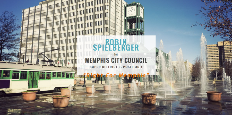
http://www.RightforMemphis.com
Arg. I’ve been dealing with this code for days now. I may go insane before I ever get to actually run my campaign. Id appreciate any help that you all could give.
-
HI Robin, when you tack new questions onto someone else’s thread about a different issue, there’s a good chance no one will notice them, particularly staff, who focus on unanswered threads. :) That’s why it’s taken a while for someone to spot them here. In future, try starting a new thread and you’ll likely get quicker help. I’ll take a look at your questions now and post replies in batches, but if you have any new questions, please start a new thread. Thanks!
-
1. I would also like to have my nav bar frozen so it doesn’t scroll with the page, but I cannot find a CSS code that works.
Looks like you got this done:
.site-header {
    max-width: 100%;
    min-width: 300px;
    position: fixed;
    top: 0;
    width: 1180px;
    z-index: 2000;
}
4. I would like to add an orange bar at the top of the front page only where I can put an election day reminder. Currently, there is no bar there so i didn’t know what code to use. I’ve become okay at editing existing code but adding it is definitely beyond my capabilities unless instructed.
Looks like you’re set here too:
.site-branding::before { background-color: #fa720a; border-bottom: 1px solid #e1e1e1; color: #fff; content: "–– Election on October 8, 2015 ––– Vote Early from September 18-29, 2015 ––"; font-size: 18px; font-weight: 500; line-height: 43px; max-width: 100%; opacity: 0.7; padding: 8px; text-align: center; width: 100%; } -
2. The featured images on pages seems to continuously cut off the top of the image. I have tried cropping the images, enlarging the images, etc. Nothing is working. I don’t understand. The images that I am uploading are anywhere between 1500 x 800 to 6000 x 4000 and even with cropping and scaling, the top is being cut off.
Do you still need help with this one? Featured images in Sela are displayed at 1180 wide by 435 high on static pages.
-
3. I would like the comment box to not be available on any of the pages and I remember that there was a way to remove it but I can’t seem to find it. Help, please.
Looks like you probably got this sorted out, but here’s some guidance just in case:
https://en.support.wordpress.com/enable-disable-comments-for-future-posts-pages/
https://en.support.wordpress.com/enable-and-disable-comments-for-published-posts-and-pages/
-
5. Is there a way to change the layout of the contact form? What I mean by this is currently each line of the form is right under the previous one and I would like to have a few of them be on the same line – columns or what not. Is this possible?
This might be able to be done with custom CSS. Please let us know which specific fields you want to be on the same line.
Is this the form in question?
-
Did I miss any of your other questions that you still need help with?
Now that you’ve made a lot of customizations, I’d suggest that you look at your site in different browsers and on different platforms and devices to make sure everything looks as intended. For example, the content of your homepage box is spilling out of the container in Firefox 37.0.2 on Mac 10.9.5, so you’ll want to make some adjustments there:
-
THANK YOU!
I do have some problems – and i made a new thread but i cant seem to find it.
Basically, on my iPad and smartphone the whole site is messed up. So, can you help me make it responsive again? Please and thank you! I am desperate.
I also would like the top bar to shrink when one scrolls and i cant figure out how.
Do you know what code i should take out and place the correct codes that you have given me in its place? I suppose i could just add your codes at the end but i’m sure that will mess up something or other. Lol.
On the Ipad, the text in the white box on the home page isn’t fitting. How do i fix this?
I am looking for the other post/thread i made addressing these issues but i don’t know where to find it…
Thanks!!
-
It also is squishing my name in the box on the home page. I have no clue what im doing with CSS but am trying my best. However, I cant spend 100 more hours messing with everything and it seems i am hurting the site in terms of responsiveness.
-
oh – and the bars at the top – the orange bar and the nav bar are spilling over the side on the iPad as well. I am at a loss here….
-
When you make certain types of changes to a responsive theme, you may end up removing some of its responsiveness if you don’t restrict certain things to particular screen sizes. And since you’ve already added a great deal of custom CSS, it is not a simple matter to now undo everything and redo it responsively.
You can learn more about using media queries that target certain screen sizes here:
http://en.support.wordpress.com/custom-design/custom-css-media-queries/
http://webdesignerwall.com/tutorials/responsive-design-with-css3-media-queriesMedia queries are a simple concept but powerful in practice, and can take some experimentation and testing to get right.
While we don’t offer design and development work as part of our support services, we can help get you on the right track. If you’re short on time, you might like to hire a web designer to help.
I’m going to close this thread so new any issues can be dealt with separately in their own threads.
You’ll find all your threads here:
-
Do you know what code i should take out and place the correct codes that you have given me in its place?
I did not supply any new code here – the code I showed you was your own, taken directly from your Customizer.
- The topic ‘Sela Theme Modifications’ is closed to new replies.
 WordPress.com Forums