Sela Theme – Modifications with CSS and now…Screen Viewing Trouble
-
Hi. I hope someone can help me because I am at my wits end here. I have spent almost 24hrs/day for the last 3 days trying to get this site formatted so that it can “go live” and I can worry about the 50 million other things that I need to do. Anyway, I thought I had finally had a breakthrough today and solved issues..but alas, tonight I looked at my page on my ipad and everything was just wrong…plain messed up…a hot mess. And I have no idea how to fix any of it. The only upside is that it is fairly obvious to see what I am was going just by looking at the page but I am not sure how to code it any other way or to fix what ive done.
So here goes.
1. I wanted the main navigation bar to be sticky and to shrink when you scrolled down the page.
2. I wanted to add a bar at the top of the page that was smaller than the main navigation bar (the orange bar on the site) with text aligned to the right side.
3. I wanted the text buttons on the main navigation bar to be centered vertically and for right now, horizontally. However, I am finishing my logo design and would really like it to be placed on the left side of the main navigation bar and the text buttons centered between it and the right side.
4. In the footer, I have added “Join the Conversation:” above the social icons but no matter what I do, it simply will not center align. The same goes for the text immediately below the social icons that reads “@2015…….” – I can’t get it to center align to save my life.
5. Now, when viewing it on an iPad – there is no main image on the front page nor any images on any of the pages – featured images.
6. When viewing it on an iPad, the main navigation bar and the orange bar above it are too far to the right and not aligned with everything else, causing the words to hang off the screen. I thought i set the max-width and the width percentage as 100% – which i read in the forums would prevent this problem. Maybe i just don’t understand.
7. When viewing it on my computer, it looks almost perfect, except:
– the text items above and below the social icons in the footer will not center align
– the main navigation bar does not shrink when scrolling even though it does remain sticky
– the orange bar above the main navigation is supposed to remain at the top and not be sticky when scrolling once you scroll past the bottom of the main navigation bar
*(Here is a website that works the way I want this one too – I was able to pay a professional to do this one because the candidate had money without having to raise it like I still have to do but cannot without a website – http://www.pierceforschools.org)*– I still need the code to change the color (using CSS style sheets and not for each individual post) for all links in the body of pages, posts, and widgets but not in the headers, footers, titles, etc.
– I need to add my logo to the left side of the navigation bar and then center the buttons between that and the right margin. Again – just like on the aforementioned site. I can’t find the code to just stick an image there. I tried using the .site-logo and was able to get an image in that general area but once i started trying to move the navigation bar beside it and the logo down using padding and margins – everything got all messed up and so i deleted it in hopes that you would be able to just supply me with a code to add in order to put the image there once I upload it as the Site Logo or maybe you can just link to it generically and I can substitute its actual URL once i finish the design and upload it to my media.
If you could help me make these changes by looking at my code and seeing what i’ve done and then give me the full CSS to replace what i’ve done and to make these edits correctly then I’d be forever grateful. I need for it to work on a computer, iPad, and smartphone and I can’t spend another 24 hours working on it only to have it worse than it was yesterday. If I keep making small individual edits, it is going to get worse because i don’t know why the featured images disappeared on the ipad – what part of the code changes caused that and what didn’t. Does that make sense? I am begging someone for help and help quickly!! I am about to cry….again….
Thanks in advance. I know it is a lot to ask. I tried to do it myself…i really did. Someone…anyone??
The blog I need help with is: (visible only to logged in users)
-
Just an update. I am still stressing over this but here’s what i have found.
1. On my Android Smartphone – except for the navigation bar and orange bar being non-existent and the featured image being there and the Front Page Post Content (the stuff in the small white box that is supposed to be in the middle of the featured front page image) being under the featured image and out of whack visually (format-wise) – the rest of the site looks really good. The footer is center aligned and the widgets looks great. I had expected much worse. But – without the navigation bar, It really is still a hot mess.
2. On the iPad – everything is still as described above. It’s just very messed up and looks completely unprofessional.
3. I found a blog about how to make a WordPress theme responsive (they used TwentyTen but said it would apply to any theme so I gave it a whirl). They explained the CSS code used to make it responsive for a smartphone and a tablet. I copied and pasted at the bottom of my CSS Style Sheet as they instructed. The computer looks the same, the iPad is still messed up, and the phone I had not checked beforehand. So either way, It doesn’t look like it worked. Which means I still need help!
Here is the code that I added to make it responsive:
`@media only screen and (min-width: 768px) and (max-width: 959px) {
#access .menu-header, div.menu, #colophon, #branding, #main, #wrapper, #site-title {
width:900px;}
#container {
width:100%;
}#branding img {
width:100%
}
#site-description{
float:left;
}
#access{
width:100%;
}
#content{
width:100%;
}
.hentry{
margin-left:-13px;
}
<blockquote>
#footer{
width:100%;
}
#site-generator {
float:left;
margin-top:5px;
}
#colophon {
width:100%;
}}
` -
I checked again to see if it just happened to take some time to load on the new code. In fact, it had. Still not perfect but now:
1. the featured image shows up on the iPad and has the post content box in the middle as it should be. However, the text inside the post content box is messed up and the box is no longer large enough to encompass it all.
2. The main navigation bar and the orange bar are still too large and hang over the content area – thus, causing them to be cut off on the right side. They both are sticky when scrolling but do not shrink nor are they the right size. Also, the “Contact” button which is supposed to be the last button on the navigation bar on the right side is somehow underneath the navigation bar where it isn’t supposed to be.
3. The text items located before and after the social icons in the page footer are still not center aligned as they are suppose to be.
So – at the bare minimum if we could fix the footer items, fix the navigation bar sizing issue, and the front page post content box sizing and formatting issue – I would be happy. The shrinking when scrolling and the orange bar not moving, would be an added bonus. Being able to add the logo/image to the left side of the navigation bar would be the cherry on top!
Thanks!! Hope to hear from someone soon!
-
I have messed with some of the code and got it to somewhat work if i changed the font size of the items in the navigation bar but would really rather have them larger. I need serious help here. If someone could respond and help me get this site responsive again and fix the items listed in the post above, Id really appreciate it. I have to direct people to this site starting tomorrow and it’s no where near ready to go.
Thanks!
-
Hi rars22, as I mentioned in the other thread, you have a couple of options at this stage. While we are happy to help with small and medium tweaks to a site here in the forums, we’re not able to design your site for you or undertake this sort of substantial customization on your behalf.
With the huge amount of customization you’ve already done without taking media queries into account, it also makes further customization extra-challenging at this point.
Your best bet, especially since you’re in a time crunch, is to look into hiring a web designer who can redo your CSS tweaks while retaining the site’s original responsive nature, or perhaps you could look at undoing some of the big changes you’ve made temporarily, until you can redo them responsively, using some of the resources I provided in the other thread.
-
Well, can somebody take a look and see how to make the footer text above the social media icons align center, please?
And I never asked anyone to design my site for me, by the way. I just needed some direction in how to fix the responsiveness. I put a ton of work into my site, myself.
Also, If anyone could just look and see if they could find a quick solution to the text spilling out on front page white box in the featured image when viewed on Firefox or Ipad, I would be more than appreciative.
Thanks!!
Thanks! -
I also did take media queries into account because i added the code back in to the CSS style sheet at the bottom after i realized that I messed something up – even though, I didn’t realize anything i did would’ve messed something up because i stayed away from fixed widths and widths given in pixels – I used percentages which I had read would keep everything the same when I did hours of research to figure out how to do this.
After putting the media query code back into the CSS Style Sheet, the only problem is the text spilling out of the box on the front page. I would think that is a relatively small problem but what do i know, apparently. I don’t know the solution and can’t seem to find it and don’t want to mess anything else up.
Finally, the footer problem existed before there was a responsiveness problem. I know how to align center text but it isn’t working.
-
Well, can somebody take a look and see how to make the footer text above the social media icons align center, please?
Try adding this:
margin: 0 auto;to your existing declaration for:
.social-links::before { } -
The box on the front page should expand to fit your content, without cutting anything off.
The reason that’s not working as intended now is that you’ve defined a hard height of 150px in your custom CSS, as part of this block of code:
.front-page-content-area .with-featured-image {
     background: #ffffff none repeat scroll 0% 0%;
     box-shadow: 0px 1px 2px rgba(0, 0, 0, 0.1);
     height: 150px;
     margin: 0px auto;
     max-height: 100%;
     max-width: 100%;
     opacity: 0.85;
     padding: 1.5em;
     position: relative;
     width: 350px;
}
I’d suggest either removing this line to allow the box to have a flexible height instead of a fixed one, or making the number higher to ensure better display on various devices. You could also add a media query to set alternative heights for smaller devices.
height: 150px; -
Hi! The alignment of the information above and below the social links, still doesn’t work. I tried adding the code you suggested above but it is still firmly aligned left. Any other thoughts?
-
Nevermind! Got it to work! Thanks!
Now, the only problem is fixing that front box. Do you know what media query I could add so that it doesn’t have a large amount of extra space underneath it on regular screens?
-
My final question in addition to the one above.
Do you know how I could fix the drop-down box from covering up the “Take Action” button in the main navigation bar?
I really appreciate all your help!!!
-
Now, the only problem is fixing that front box. Do you know what media query I could add so that it doesn’t have a large amount of extra space underneath it on regular screens?
Hmm – my browser window is quite large at the moment (1832px) but I’m not seeing a large amount of space below the white box – here’s a screenshot:
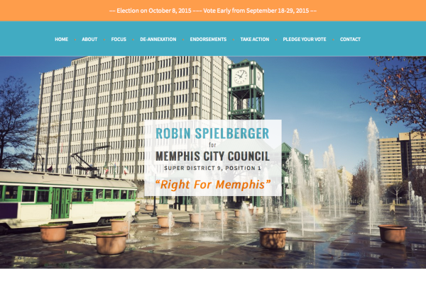
Could you let me know in what browser and version you’re seeing extra space there?
-
Something like this should restore the sub-menu to its correct position:
@media screen and (min-width: 768px) {
  .main-navigation ul ul {
  margin-top: 40px;
  }
}
I did notice that your mobile menu is no longer being displayed correctly on small screens. Something in all your custom CSS is causing that – to find the culprit, you can remove it temporarily and add it back in chunks. If you need further help with it, could you please start a new thread here in the CSS Customization forum so we can help you better? Thanks!
- The topic ‘Sela Theme – Modifications with CSS and now…Screen Viewing Trouble’ is closed to new replies.
 WordPress.com Forums