Some CSS edits to new blog
-
A few CSS questions…
1) Please see Site Title at top and excerpts/lines below each post. The color is a slight maroon hue. Can we make this black?
2) Is there a way to make the social icons on the right a little larger? And can we make it where that menu floats as you scroll down the page?
3) Next to each post, can we remove the line that reads “Categories: Latest”? I just want it to show date. Can we make it show author, too? The theme may not allow that for some reason, but thought I’d check.
4) At the bottom of the page, there is “Older Posts” text on the left side of page. Can we do something with this? I was hoping to have it hover more to the right, bold the text and have it rest on a black strip with white colored font? Something to just catch the eye better.
5) Is there a way to restrict images to a certain size to make them all uniform? Width looks like it’s set, but some are longer than others. I’m open to suggestions on this one.Thanks!
The blog I need help with is: (visible only to logged in users)
-
Hi there,
1) Please see Site Title at top and excerpts/lines below each post. The color is a slight maroon hue. Can we make this black?
Currently the color on the site title and body text is #1a1a1a, which is very nearly fully black. If you wish full black, go to Customize > CSS, delete all the informational text in that window, and paste in the following custom CSS.
body, .site-branding .site-title a {
  color: #000 !important;
}
If you wish the continue reading link to be black, the following will do that.
a.more-link {
  color: #000;
}
2) Is there a way to make the social icons on the right a little larger? And can we make it where that menu floats as you scroll down the page?
Add this and see what you think.
.widget.widget_wpcom_social_media_icons_widget li a::before {
  line-height: 45px;
  height: 45px;
  width: 45px;
}
.widget.widget_wpcom_social_media_icons_widget li a {
  height: 45px;
  width: 45px;
}
.widget.widget_wpcom_social_media_icons_widget .genericon {
  font-size: 28px;
}
3) Next to each post, can we remove the line that reads “Categories: Latest”? I just want it to show date. Can we make it show author, too? The theme may not allow that for some reason, but thought I’d check.
I see you have hidden the categories and tags at Customize > Content Options.
On sites with only one published author, the author name is hidden by default. On sites with more than one published author, the author name is displayed, but we can force the author to display with the following CSS. You will see that the author gravatar image is show as well, and the second rule in the below removes that avatar. If you wish to display your gravatar, simple do not use the second rule.
.byline {
  display: block;
}
.byline .avatar {
  display: none;
}
4) At the bottom of the page, there is “Older Posts” text on the left side of page. Can we do something with this? I was hoping to have it hover more to the right, bold the text and have it rest on a black strip with white colored font? Something to just catch the eye better.
I’m seeing “older posts” with a black background and white, bold text on the left. This will float that to the right.
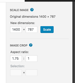
.site-main #infinite-handle span {
  float: right;
}
5) Is there a way to restrict images to a certain size to make them all uniform? Width looks like it’s set, but some are longer than others. I’m open to suggestions on this one.
The software will size and crop the images for the area available. What I would suggest is that you prepare the images in the same width to height proportions before uploading and inserting. It looks like a ratio of 1.75 to 1 would work best. Some image editing programs allow you to set a ratio for cropping of images, and the WordPress editor does as well, so you can also crop the image in the Media Library and set the aspect ratio for the crop. Screenshot
-
Thanks! Couldn’t find a way to set the aspect ratio at 1.75 to 1 in the WordPress editor, but I was able to manually resize to approximately the same height by dragging the image corners. Not too worried about it. Tried to find what you took a screenshot of, but nothing showed up in the editor that looked like it.
Few more questions…
1) Can you help me set the hover color on my social icons to the red hue that the icons in my footer show?
2) On my “Recent Posts” header can I remove the “: Grandstand News”, where it just reads “Recent Posts”?
-
You can ignore my second question. Instead, is there a way to hide the bullet points next to each item under “Recent Posts”?
-
Use the following to remove the bullets on the Recent Posts widget.
.widget_recent_entries ul {
	list-style: none;
}
On the social icons in your sidebar, add the following to change the hover color to red.
.widget.widget_wpcom_social_media_icons_widget li a:hover:before { color: #de2f10; } -
Thanks!
I’m using this code to remove “News Ticker” header text on my News Ticker page, but I noticed that it is also removing the entry header text on my blog post page. I’ve removed the CSS so that you can see how it appears without the code. Is there a way to target the page h1 text and not the post h1 text?
#page header.entry-header h1.entry-title { display: none; } -
Hi, what you want to do is to use the unique page id CSS class from the opening body HTML tag on the News Ticker page to specifically target just that page, like this.
.page-id-10441 .entry-title { display: none; } -
Thanks! Is there a way to make the default size for “heading 6” a tad smaller? A point or two lower in font size?
-
-
Also, any idea how I can remove the hover underline on the links that appear on my News Ticker page?
-
-
h6 font size on your main page:
@media screen and (min-width: 61.5625em) {
	.entry-content h6 {
		font-size: 1.1875rem;
	}
}
The underline is actually done with a box shadow. Add the following to remove that from your home page content area.
.home .entry-content a { box-shadow: none; } -
Thank you!! Last question on the font… I prefer no line, to a line pre-hovering (I hope that is said properly). But would it be possible to make the line appear when you hover over it? Like when you hover over links on http://www.huffingtonpost.com/? The previous way it was doing it was making the line disappear when you hover over it. I would prefer if the line appears when you hover over the links.
-
To add the line to links when you hover, add the following to your custom CSS.
.home .entry-content a:hover { box-shadow: 0 1px 0 0 currentColor; } -
Is there a way to make my Menu stand out more? Like a black background bar behind it with the Menu titles as white text? Maybe an < (arrow), or slight angled mark on the left end of the menu? Not sure if the bar alone would appear as poor design. Any ideas?
-
Also, is there an easy way to edit Widgets? The “Display WordPress Posts” widget in my sidebar is supposed to be used for other WordPress blogs. It’s the one that is titled “GRANDSTAND BLOG: GRANDSTAND NEWS.” I’m trying to use it for my blog, because I like that it provides the option to show a featured image. The regular “Recent Posts” widget, which is designed for listing your own blog’s posts does not provide this option. It appears that the “: GRANDSTAND NEWS” is auto filled in the title. I can’t remove that from the title. Am I able to change it to just “GRANDSTAND BLOG” with CSS? And can we make the headlines black instead of the red, and the red (#e83111) on the hover? Basically, I want the colors to swap.
-
This fist CSS gives a black background to the menu with white text. I’ve set this in a media query so it doesn’t affect the touch menu. You can give it a try, but it does look a bit weird with the black block to the right.
@media screen and (min-width: 910px) {
.site-header-menu ul {
	background-color: #000;
}
.site-header-menu a {
	color: #fff;
}
.site-header-menu a:first-of-type {
	padding-left: 20px;
}
.site-header-menu a:last-of-type {
	padding-right: 20px;
}
}
As another more balanced option, we might do an inclusive thing with the site title and the menu with the following. Again, I’m letting the design revert to the original below 910px in width when the touch device menu becomes active.
@media screen and (min-width: 910px) {
	.site-header-main {
		background: #000;
		padding-left: 20px;
		padding-right: 20px;
	}
	.site-header-main .site-title a, .site-header-main .site-header-menu a {
		color: #fff;
	}
}
On the widget title, the software creates the title you see as a single line of text, but we can hide that and add in just Grandstand Blog with a bit of CSS trickery. See what you think with this.
#jetpack_display_posts_widget-8 { position: relative; } #jetpack_display_posts_widget-8 .widget-title { visibility: hidden; font-size: .8rem; } #jetpack_display_posts_widget-8 .widget-title:before { visibility: visible; content: "Grandstand Blog"; position: absolute; font-size: 1rem; } -
Thank you!! This helped so much. Is there a way to center the Menu button (it may be the touch menu you were referring to) on the mobile page? Right now it floats to the left on my phone.
-
Hi, add the following to your custom CSS at the bottom. While working on this, I noticed that from 909px width down to 710px, the content was shifted to the left a bit as were the widgets, so I also addressed that.
@media screen and (max-width: 909px) { .site-branding { width: 100%; text-align: center; } .menu-toggle { margin-left: auto; margin-right: auto; } .entry-content { margin-right: 7.6923%; } .sidebar { padding-right: 7.6923%; } } -
- The topic ‘Some CSS edits to new blog’ is closed to new replies.
 WordPress.com Forums