Theme Natural: header is not shown correctly on mobile phones and other browser
-
On my PC it looks fine. But my friends send me screenshots, that on mobile devices and Safari for example, the header image isn’t shown correctly. It’s cutted and only shown partly.
How can I fix it?The blog I need help with is: (visible only to logged in users)
-
Natural
Overview https://wordpress.com/theme/naturalSetup https://wordpress.com/theme/natural/setup
Custom Header Image
Natural supports a Custom Header, shown at the top of each page of your site, behind the site title. The image will be cropped for small screens to fit the available space, which means not all of the header image will be visible on all screen sizes, so decorative background images may work best. Please start with an image that’s at least 1200 pixels wide by 480 pixels high.Support https://premium-themes.forums.wordpress.com/forum/natural
The mobile ready theme is a default theme and a completely different theme that you do not need to enable, if your theme is listed as a responsive layout theme here https://theme.wordpress.com/themes/features/responsive-layout/
See here please and scroll down to locate your theme by name https://wordpress.com/themes/premium/filter/responsive-layout
See also Mobile themes https://en.support.wordpress.com/themes/mobile-themes/ Note that we disable the Mobile theme when using a responsive layout theme.
Screenshots can be very helpful. You can use http://snag.gy/ or http://cloudup.com to share screenshots and link to them here. If you use the WordPress.com guide for screenshots http://en.support.wordpress.com/make-a-screenshot/ you can and upload it to your Media Library, and return to this thread to provide the file name so Staff can examine it.
Then type modlook into the sidebar tags on this thread for a Staff follow-up. How do I get a Moderator/Staff reply for my question? https://en.support.wordpress.com/getting-help-in-the-forums/#how-do-i-get-a-moderatorstaff-reply-for-my-question Also subscribe to this thread so you are notified when they respond and be patient while waiting. To subscribe look in the sidebar of this thread, find the subscribe to topics link and click it.
-
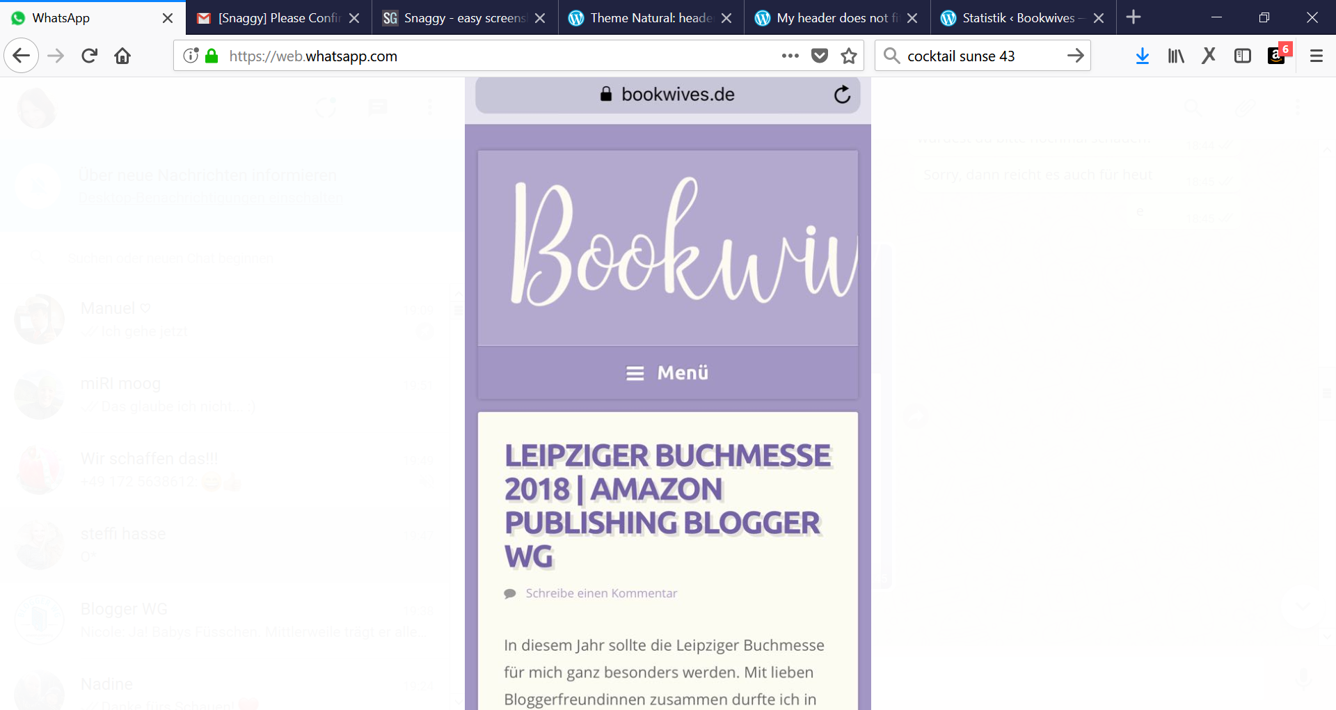
Thanks, but this doesn’t help me… Here some screenshots via snag.gy (for cloudup a code is needed to register):
https://snag.gy/EIZwfo.jpg
https://snag.gy/2cx1lN.jpg
https://snag.gy/GCBnbL.jpgAnd also the graphic designer used the format, which is recommended (1600×480 pixels) it looks in preview like this:
https://snag.gy/oXDtIv.jpg (which is the way it should be)but in real like this:

-
Do you understand that the software will crop the header image and that means the lettering in it will not be completely displayed?
-
But in which format do I have to add the header image, so that the lettering will be shown completeley?
-
-
Let’s ask Staff to assist you with sorting this out. I will type modlook into the sidebar tags on this thread for Staff help. How do I get a Moderator/Staff reply for my question? https://en.support.wordpress.com/getting-help-in-the-forums/#how-do-i-get-a-moderatorstaff-reply-for-my-question
-
-
-
Hi bookwives,
@timethief is correct when she mentions the header image will be cropped for the best fit on mobile devices. For this reason, header images aren’t designed to display text and we recommend uploading a site logo instead — which is scaled larger or smaller rather cropped.
However, I’m going to do some testing because the header image doesn’t appear to be scaling as I would expect.
-
I’ve done some further testing and the header image appears to be working as it should — but the cropping effect is magnified on your site because the image contains text. If you want to add the text as a logo, 493px by 1096px is the suggest size for logos on the Natural theme. You could try and see how you feel.
- The topic ‘Theme Natural: header is not shown correctly on mobile phones and other browser’ is closed to new replies.
 WordPress.com Forums