Triton Lite display problems
-
Hi,
I use the Triton Lite theme, with custom design upgrade. After adding a background image and tweaking the container size and colour to align the layout, there are a few layout issues I am unable to resolve and my CSS knowledge is practically zilch, so would really appreciate some help.
1. The header image is not centre aligned (all devices, browsers)
2. The background is not appearing on the midrow and footer widget areas (they stretch fully across the page)
3, To get around this, I tried to make the midrow container transparent, so the whole background appeared behind the widgets, which worked, but not on ipad or iphone (chrome and safari) where the midrow appeared as just white so the text did not show up (not saved this version but would be interested to know why that is happening)
3. On an ipad and iphone, the front page container and post page container appears left aligned, with just a small margin of background on the right of the page. (I’m assuming this may have always been the case, but as the background was just white before, it didn’t show up).
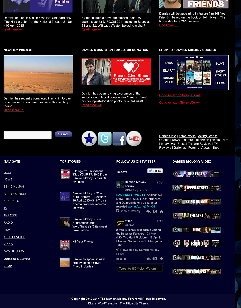
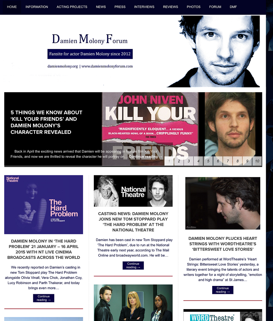
screenshots: http://i1049.photobucket.com/albums/s392/damienmolonyforum/wordpressscreen-1_zps9700093d.png
Any help with the above would be brilliant.
Thanks in advance,
Damien Molony ForumThe blog I need help with is: (visible only to logged in users)
-
Hi there,
1. This should center your header image for you.#header-image { float: none; margin-left: auto; margin-right: auto; }2 & 3. Have you tried the following, which sets the background of the midrow area using an RGB color with opacity of 0 (fully transparent)?
#midrow {
    background: rgba(0, 0, 0, 0);
}
The alignment on ipads and phones I’ll have to look into. We may have to change a couple of things to fix that.
-
Hello thesacredpath,
Thanks so much for your help again :)
Both your suggestions worked for the header and midrow footer, on all devices.
The alignment thing is a bit of a pain, if it is fixable that is great, but it is a bit of a deal breaker in terms of keeping this particular appearance, or just returning to the plain background, which would be a shame.
Appreciate your help,
Damien Molony Forum
-
On the iphone/ipad view, try adding the following.
.lay1 {
width: 950px;
}
It was set in the original CSS at 990px, which was forcing it outside the right margin and making the gap on the right.
-
Hi thesacredpath,
Thanks for your continued help.
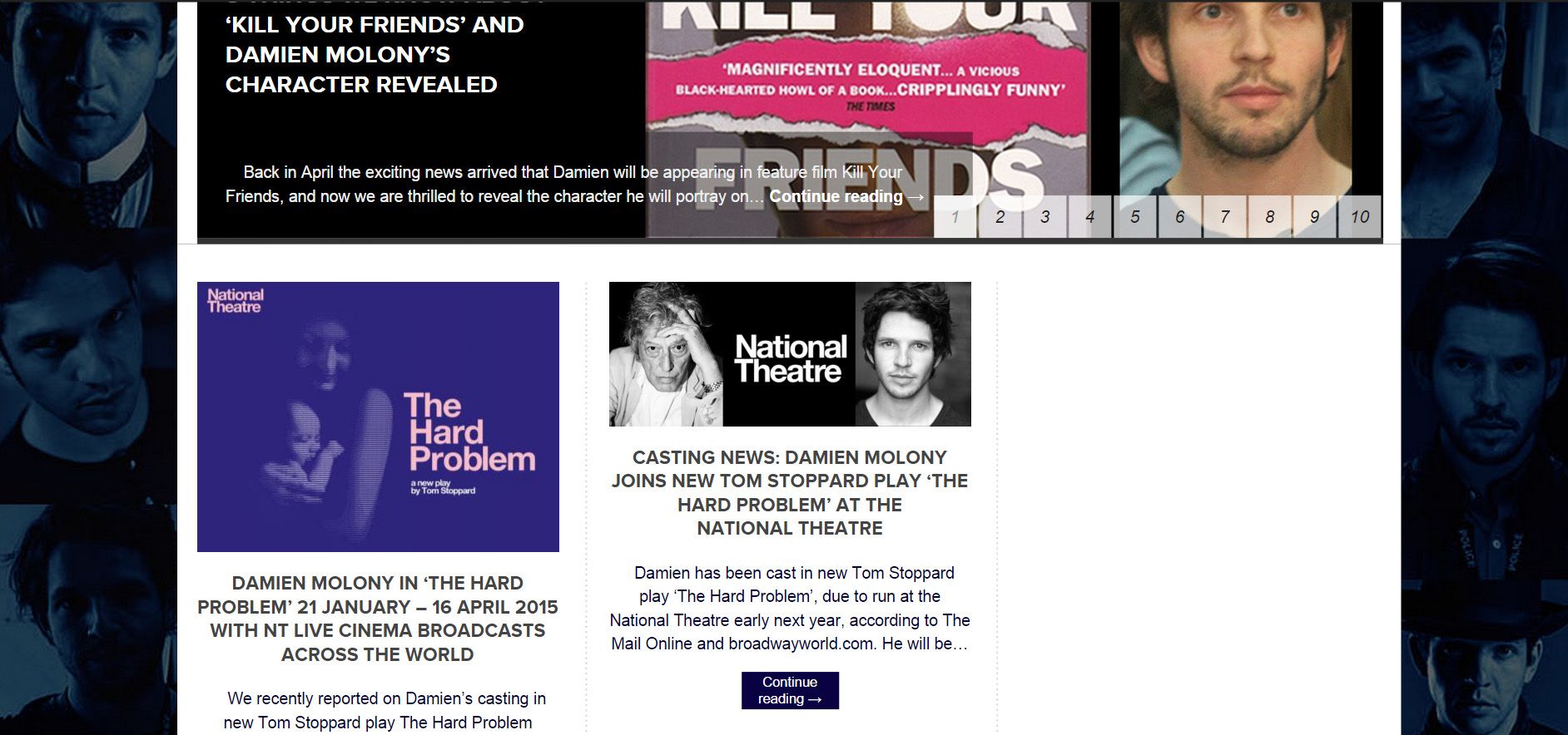
Ok, that appears to fix the ipad / iphone margin issue, but, it the forces the 3 columns on the front page into 2, with blank space on the right (same appearance on laptop)
Screengrab of preview: http://i1049.photobucket.com/albums/s392/damienmolonyforum/wordpressscreen-3_zps18440663.jpg
-
This is so strange. I’m going to have to work on this. I think we are going to have to “undo” some stuff and then “do” some other stuff.
-
I did have to adjust margins to make the header, slider, body container line up properly on the front page (on laptop) and it did get a bit fiddly! I have reached the full extent of my (very limited) CSS knowledge, so any ideas gratefully received :)
- The topic ‘Triton Lite display problems’ is closed to new replies.
 WordPress.com Forums