Tweeks to Edin theme
-
I am trying to make the featured image and accompanying text smaller on my page. I don’t want visitors to have to scroll down so much to see the rest of the page.
I’m also trying to take the carousel in the footer and expand it into Footer Widget 2.
Anyone know if this is possible? My skills are pretty basic.
Thanks in advance!
The blog I need help with is: (visible only to logged in users)
-
Hi there, on the image height, this is done with a top/bottom padding on the page title. Originally it is 180px. Add the following to your custom CSS and then you can adjust the 100px value I put in for testing.
.hero.with-featured-image, body[class*="front-page"] .hero {
    padding: 100px 0;
}
…and accompanying text smaller on my page
Which text are you wanting smaller, the title text such as About on your about page?
-
Thanks so much! The text I was referring to are just the titles next to the face (Director, Editor in Chief, etc.).
-
I managed to figure it out.
Any advice on keeping the front page as is in terms of pic size but not limiting the featured images on each page?
-
Can you explain a bit further what you are wanting with the images on the main page, and which images? Are you talking about the About, Publications and CV child pages?
-
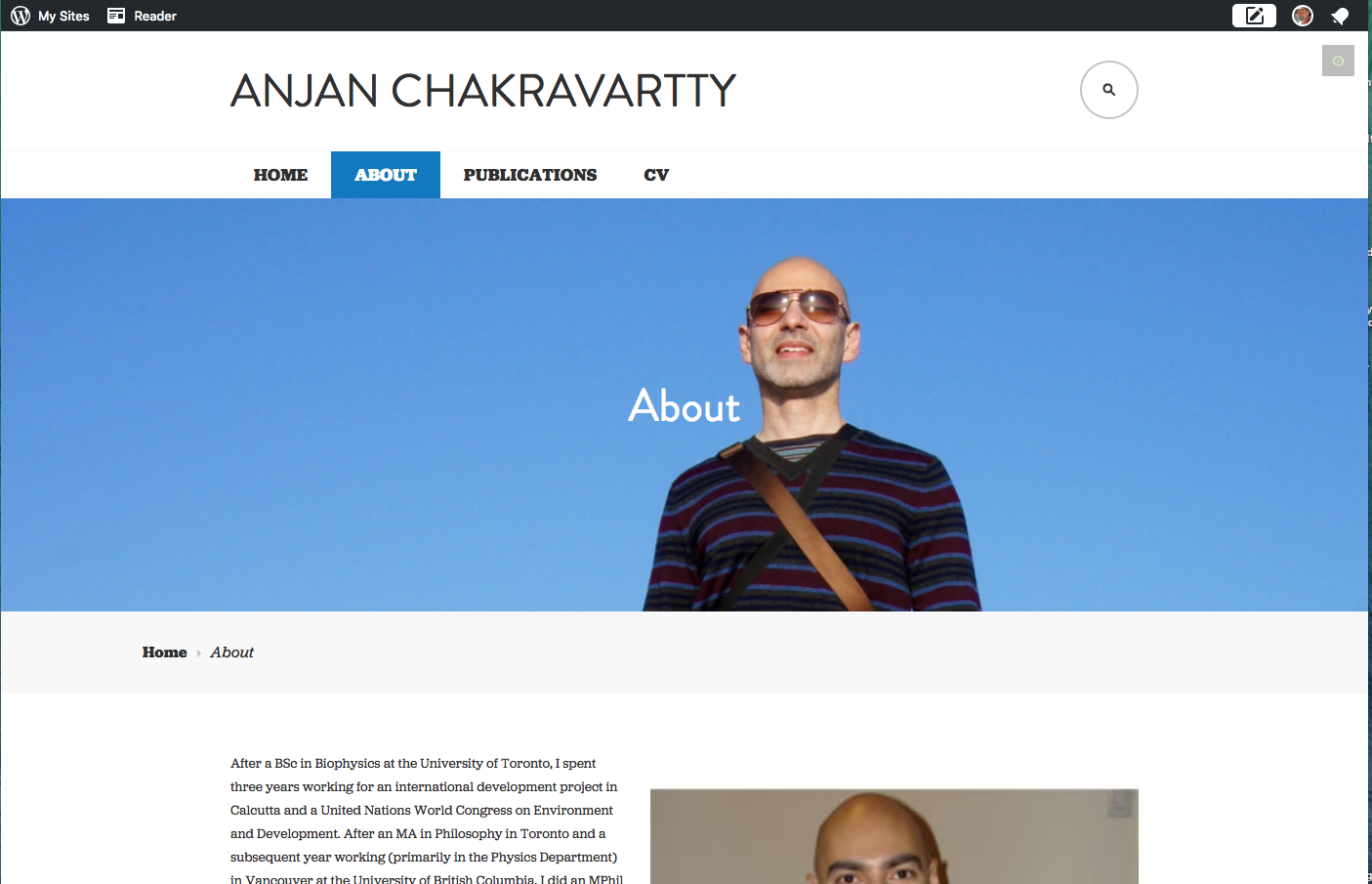
Once I click on the child pages, the image at the top in shrunken down to something kind of ridiculous. On the “About” page, it’s just a neck. I’d like all those images to stay the same. The only one I would like to shrink is the giant face on the front page.
Thanks for your help!
-
Hi there, this is what I see when I view your about page, and when I narrow my browser window I see pretty much the same thing all the way down to phone width although at times when narrowing the top of your head is cut off.. Screenshot: https://cldup.com/baBjCBsz0a.png
Give this a try, which uses Media Queries to adjust the top/bottom padding to keep your head from getting cut off. This also excludes these changes from the Home page and applies them just to the other static pages.
@media screen and (max-width: 1019px) {
	body.page:not(.home) .hero {
		padding: 100px 0;
	}
}
@media screen and (max-width: 750px) {
	body.page:not(.home) .hero {
		padding: 80px 0;
	}
}
@media screen and (max-width: 550px) {
	body.page:not(.home) .hero {
		padding: 60px 0;
	}
}
Let me know, and then we can work on the home page. Can you let me know how much smaller you want the image on the home page? With responsive designed themes, such as Edin, this can be a bit challenging to get things to look right, but we will see if we can get things to a point you are happy with.
- The topic ‘Tweeks to Edin theme’ is closed to new replies.
 WordPress.com Forums